
33 Beautiful Studio Apartment Color Schemes to Steal
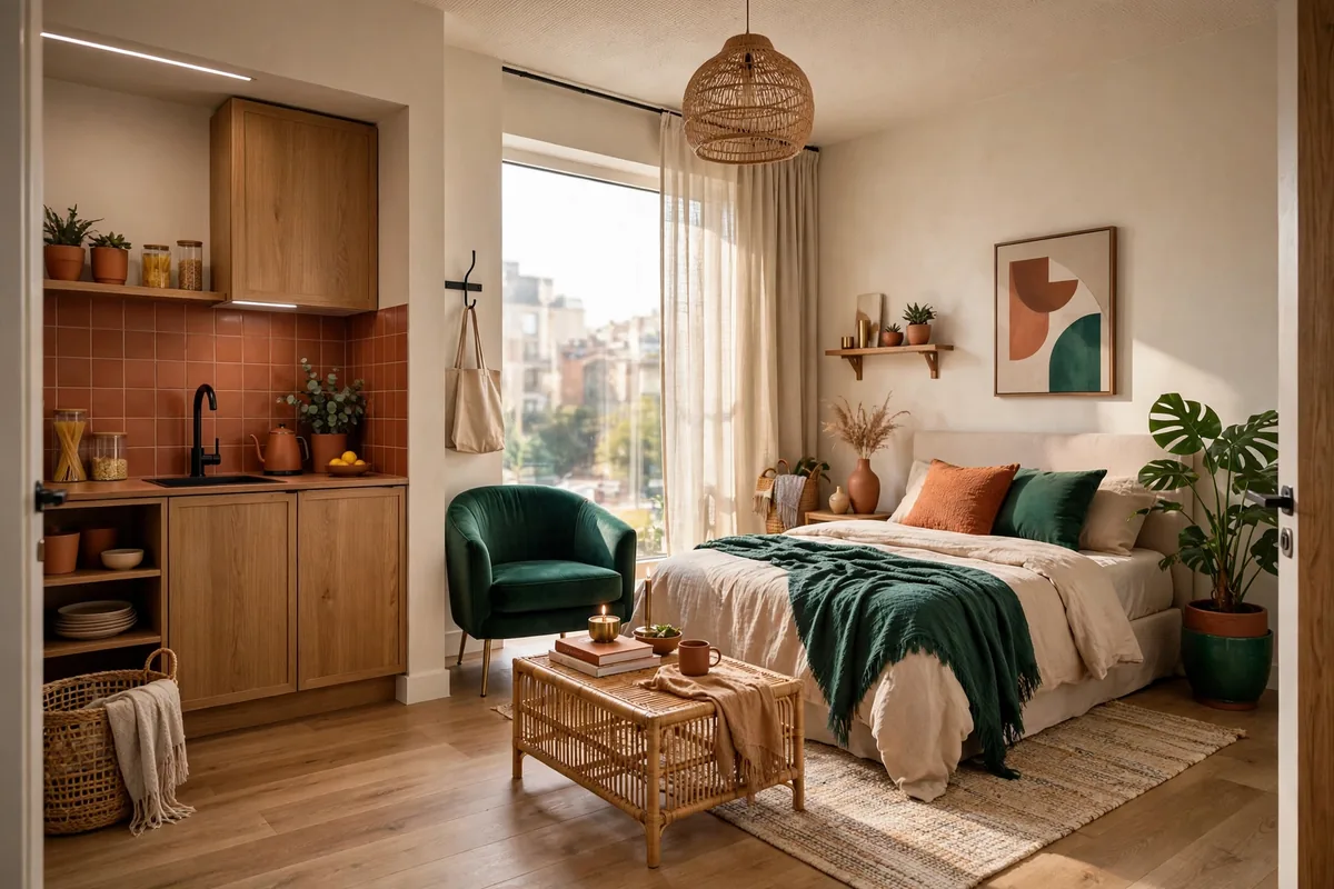
Choosing a color scheme might be the single highest-impact decision you’ll make for your studio apartment — and the hardest. In a one-room home, every color you pick shows up everywhere: the wall behind your bed is the same wall behind your sofa, your desk, and your dining table. Get it right and the whole space feels calm, cohesive, and twice its size. Get it wrong and it feels like four clashing rooms crammed into one.
The good news? Small spaces are actually the easiest places to nail a color palette, because you need fewer colors and every choice counts more. Below are 33 studio apartment color schemes that actually work in real rentals — grouped from foolproof warm neutrals to bold moody looks to completely renter-friendly tricks that need zero paint. Steal the one that feels like you.
Warm Neutrals That Never Fail
When in doubt, go warm. Warm neutrals flatter every skin tone, hide the sins of rental lighting, and make a studio feel like a hug. These are the schemes designers reach for first.
1. Warm White Walls + Honey Wood Tones
Paint (or imagine) your walls in Benjamin Moore White Dove OC-17 — a warm white that never goes sterile — then layer in honey-toned woods: oak shelves, a rattan chair, a walnut side table. The wood does all the color work while the walls stay quiet and bright. Studio tip: keep your big textiles (sofa, bedding) in the same warm-white family so the wood tones read as the “color” of the room.
2. Greige Walls With Cream Bedding
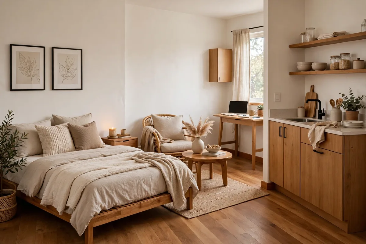
Greige — that perfect gray-beige hybrid — is the studio dweller’s secret weapon. Try Sherwin-Williams Accessible Beige SW 7036 on the walls (or a peel-and-stick wallpaper in the same tone), then pile your bed high with cream, ivory, and oatmeal bedding. The monochrome layering looks expensive and makes the sleeping zone feel serene. Studio tip: add one black accent — a lamp base, a frame — to keep all that softness from going sleepy.
3. Oatmeal + Terracotta Accents
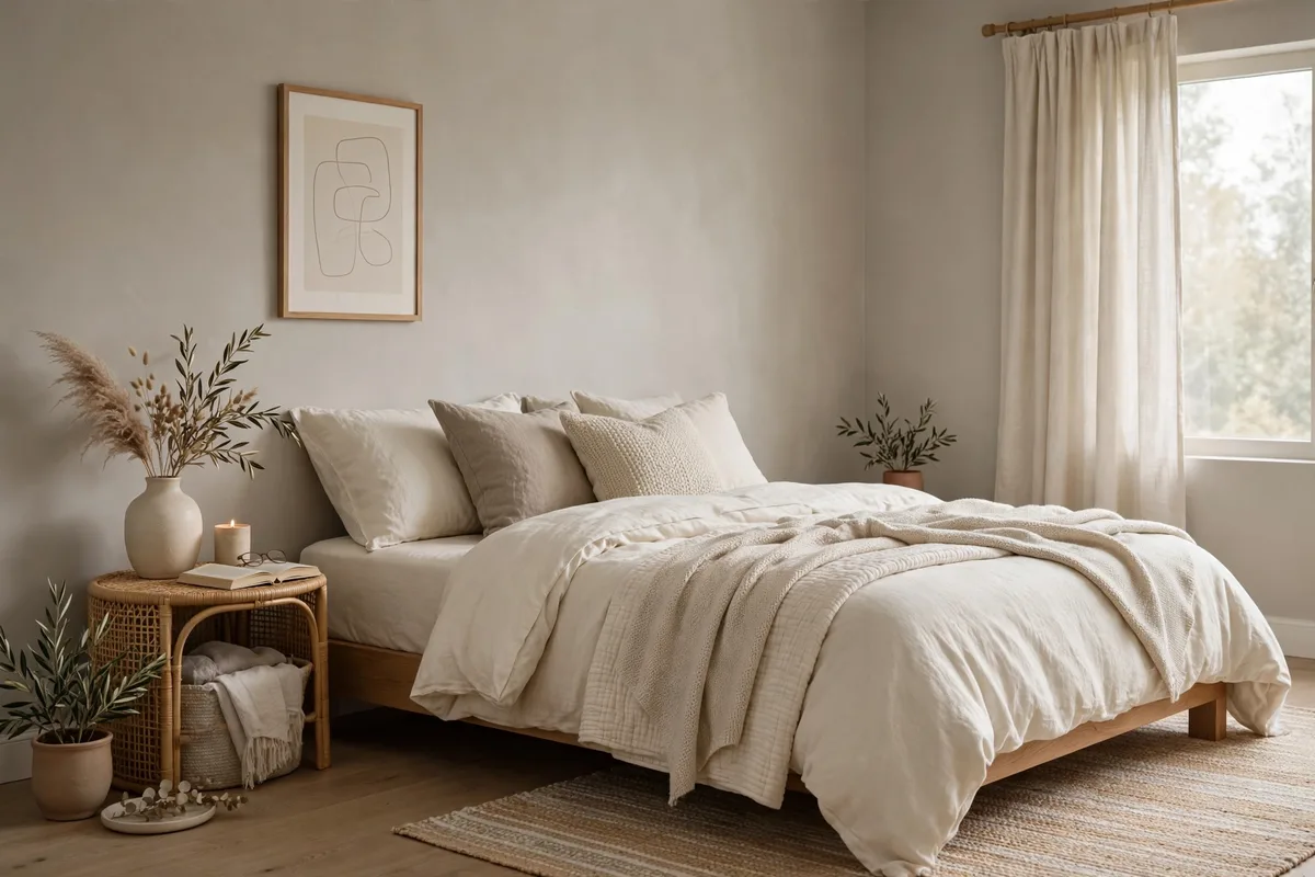
Start with an oatmeal base — think Behr “Wheat Bread” or just warm beige textiles — then punch it up with terracotta: a rust throw, clay pots, a burnt-orange art print. Terracotta is warm without being loud, and it flatters wood, white, and black equally. Studio tip: repeat the terracotta in at least three spots (pillow, pot, print) so it reads as a scheme, not an accident.
4. Mushroom Taupe All Over
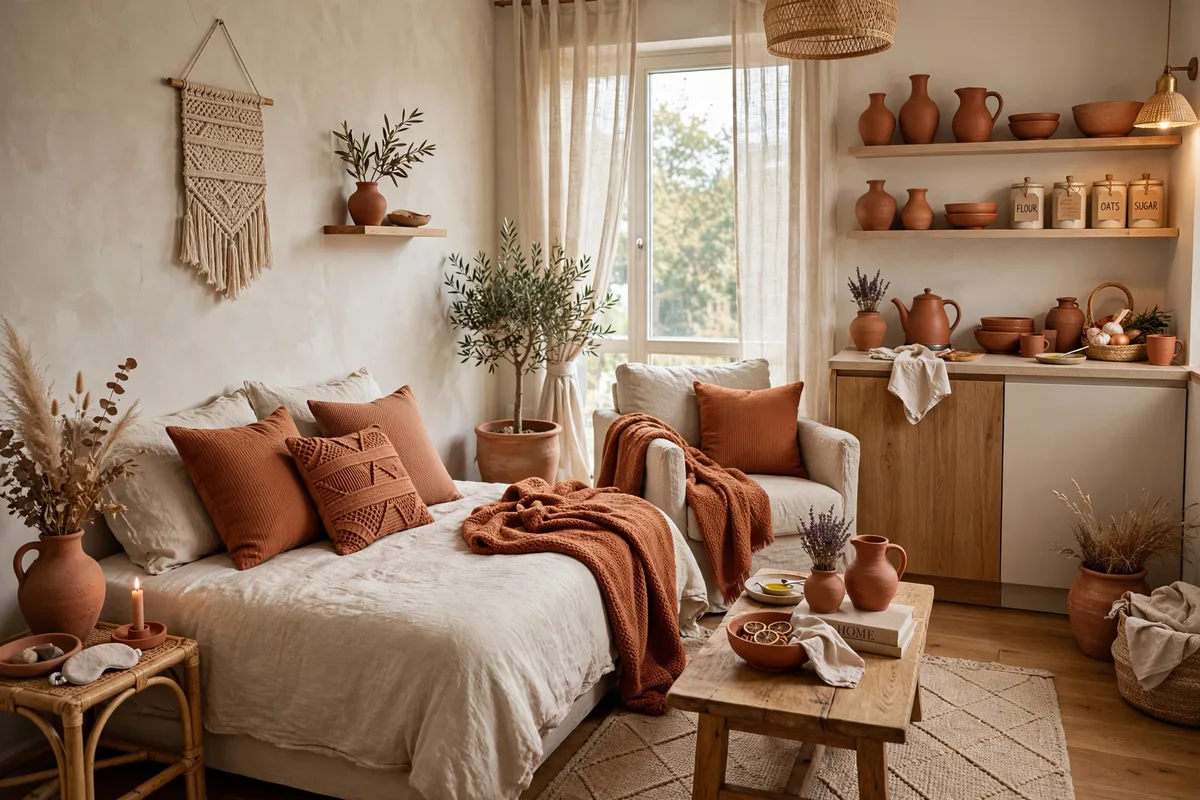
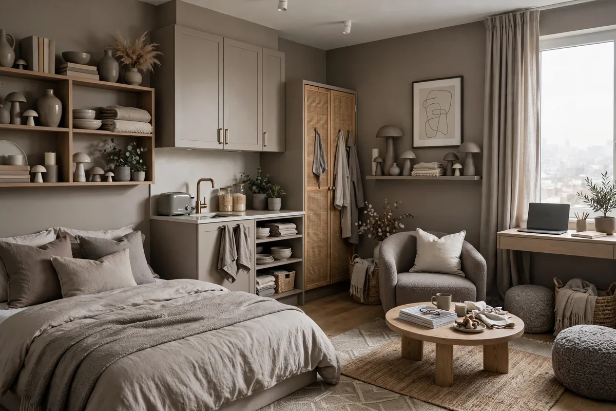
Mushroom taupe — Benjamin Moore’s “Revere Pewter” HC-172 is the classic — is the color equivalent of a deep breath. It’s darker than beige, softer than gray, and it makes small studios feel cocooning rather than cramped. Pair it with cream textiles and black metal accents for a look that’s calm but never boring. Studio tip: this color loves natural light, so use it on the wall opposite your windows where the light washes across it.
5. Warm Gray + Brass Details
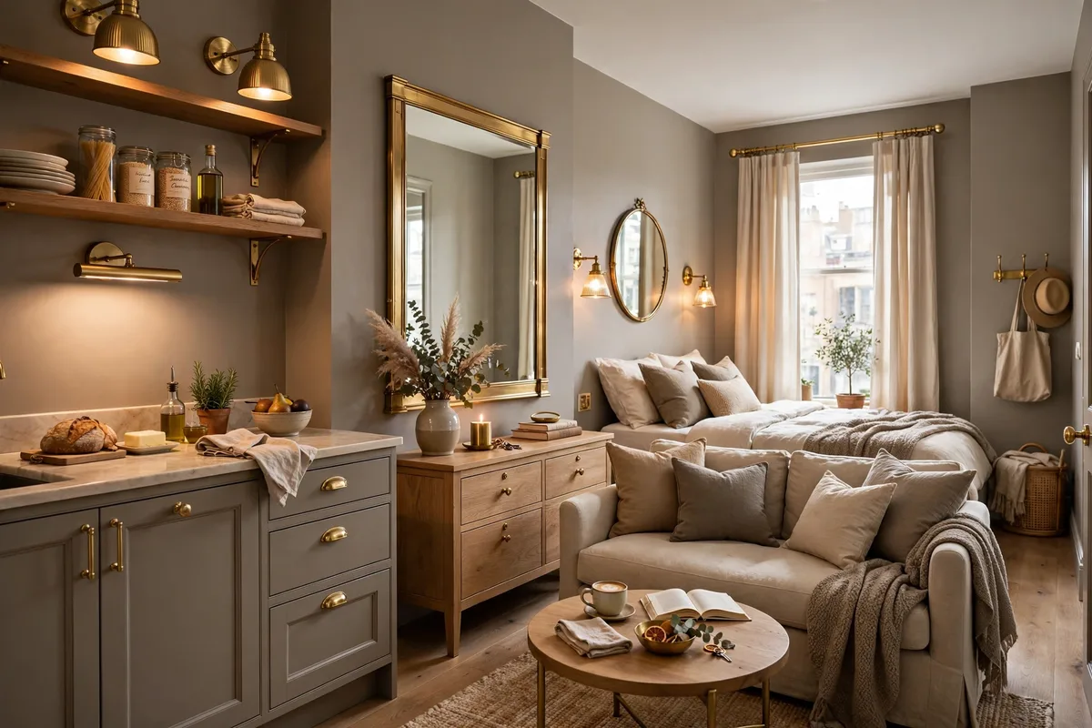
Cool grays can make a studio feel like a dentist’s office — warm grays do the opposite. Sherwin-Williams “Agreeable Gray” SW 7029 has a beige undertone that keeps it cozy, and brass or gold details (lamp bases, cabinet pulls, a mirror frame) warm it up further. The combo reads modern but inviting. Studio tip: brushed brass beats shiny gold in small spaces — it glows instead of glaring.
6. Sandy Beige + Crisp White Trim
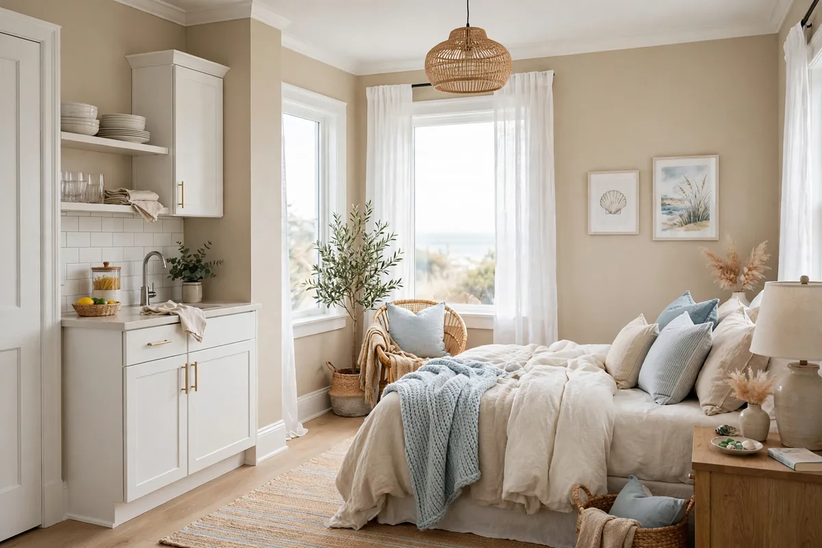
There’s a reason beach houses feel relaxing: sand tones. A sandy beige on the walls (Behr “Sandstone Cove” or similar) with crisp white on trim, ceiling, and bedding gives you a fresh coastal feel without a single seashell in sight. Add jute, linen, and light wood to complete it. Studio tip: this scheme is magic in dark studios — the sand tone reflects warm light that white walls would bounce back cold.
7. Camel + Chocolate Layered Tones
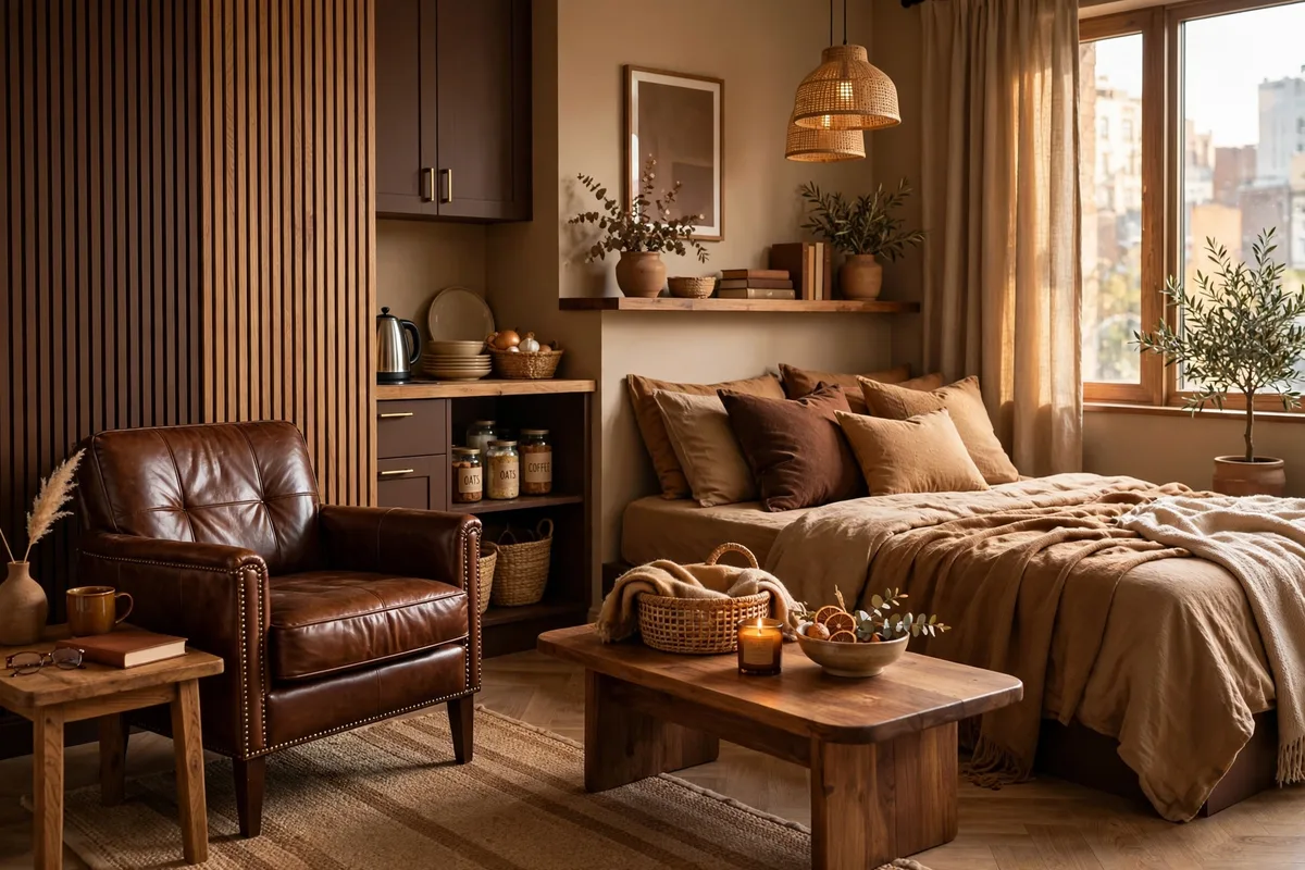
Go tonal: camel, caramel, cognac, and deep chocolate brown layered together create a rich, menswear-inspired palette that makes a studio feel like a boutique hotel suite. A camel sofa, chocolate throw, cognac leather chair — every piece in the same warm-brown family. Studio tip: vary the textures wildly (leather, wool, linen, wood) so the single-color-family scheme has depth instead of flatness.
Bold & Moody Color Schemes
Who says small spaces have to be white? Dark, saturated colors can make a studio feel intimate and dramatic — like a jewel box instead of a shoebox. The trick is committing fully and balancing with light textiles.
8. Deep Forest Green Accent Wall
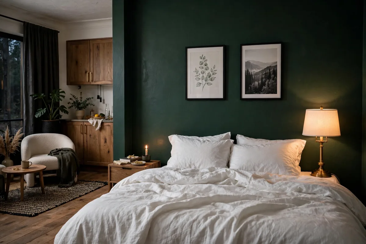
One wall in Benjamin Moore “Essex Green” HC-188 (or Sherwin-Williams “Evergreen Fog” SW 9130 for a softer take) behind your bed instantly creates a “bedroom” — the dark wall recedes visually and makes everything in front of it pop. Pair with warm white bedding and brass lamps for a look that’s moody but not cave-like. Studio tip: put the dark wall behind the bed, not behind the sofa — you want drama where you sleep, openness where you live.
9. Navy Blue + Warm Brass
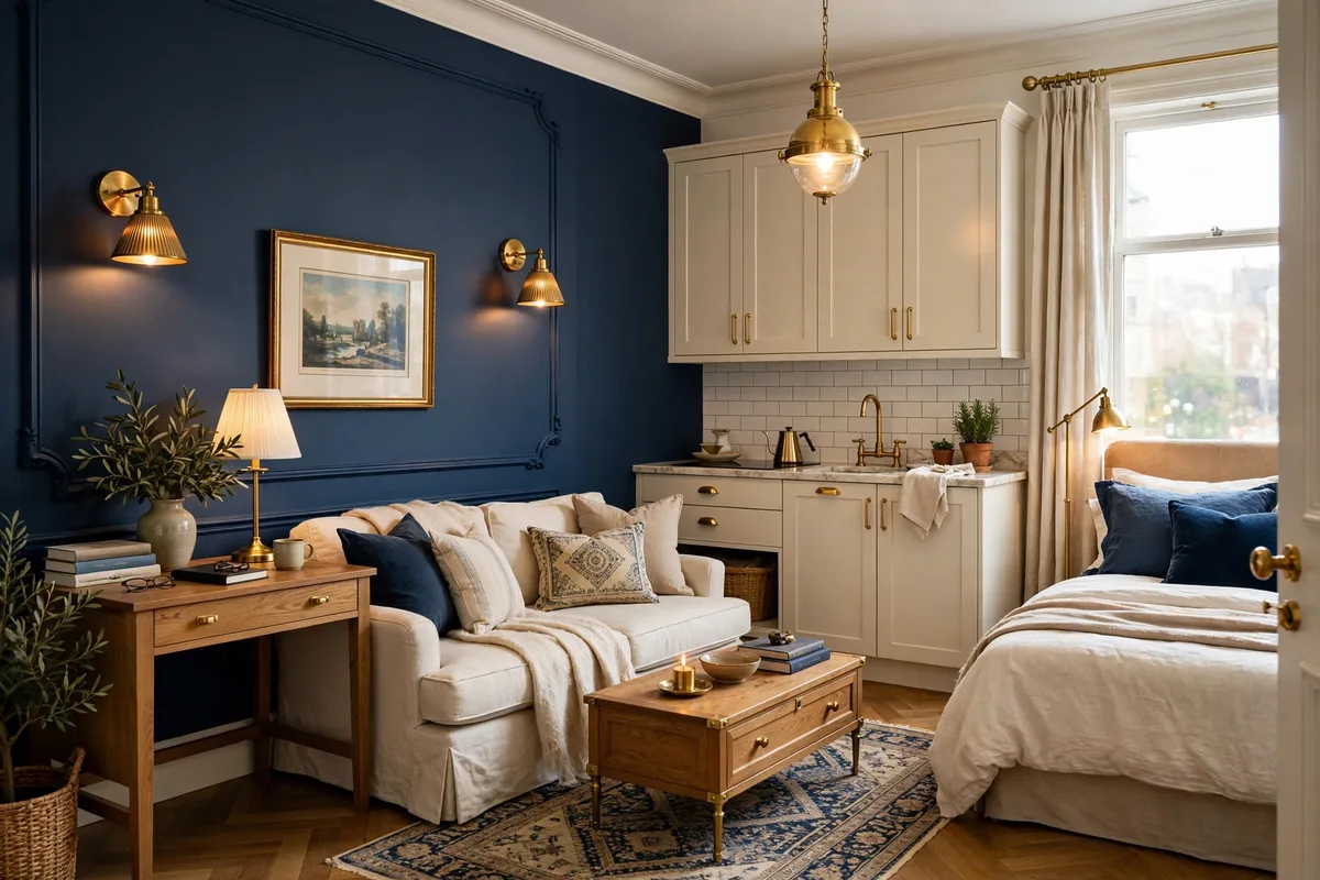
Navy is the most livable dark color — it reads as a neutral but with actual personality. Benjamin Moore “Hale Navy” HC-154 on an accent wall or even kitchen cabinets, warmed up with brass hardware and cognac leather, is timeless. It photographs beautifully too, which your future self will appreciate. Studio tip: navy loves natural texture — pair it with rattan, jute, and light oak so it never feels corporate.
10. Charcoal + Cognac Leather
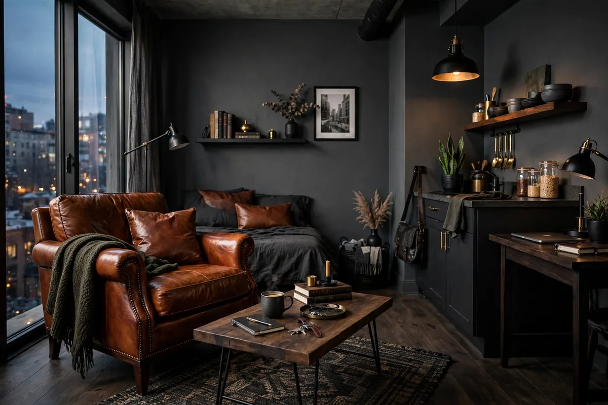
Charcoal walls (try Sherwin-Williams “Urbane Bronze” SW 7048 — technically a bronze-charcoal) with a cognac leather chair or ottoman is pure sophistication. The warm leather keeps the dark walls from feeling cold, and the whole scheme makes a studio feel like a private members’ club. Studio tip: keep the ceiling and trim bright white — the contrast makes the room feel taller and stops the darkness from closing in.
11. Black + White + One Bold Art Piece
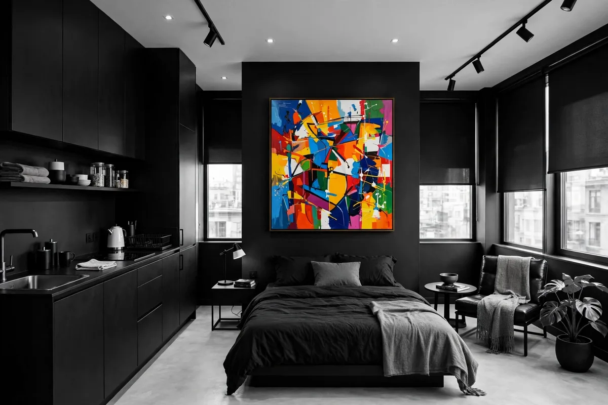
The highest-contrast scheme of all: black furniture or frames, white walls and bedding, and a single oversized piece of colorful art that carries the entire room’s color story. It’s graphic, gallery-like, and almost impossible to mess up because the art makes every decision for you. Studio tip: pull two or three colors from the artwork for small accessories — a pillow, a vase — and the room will feel professionally designed.
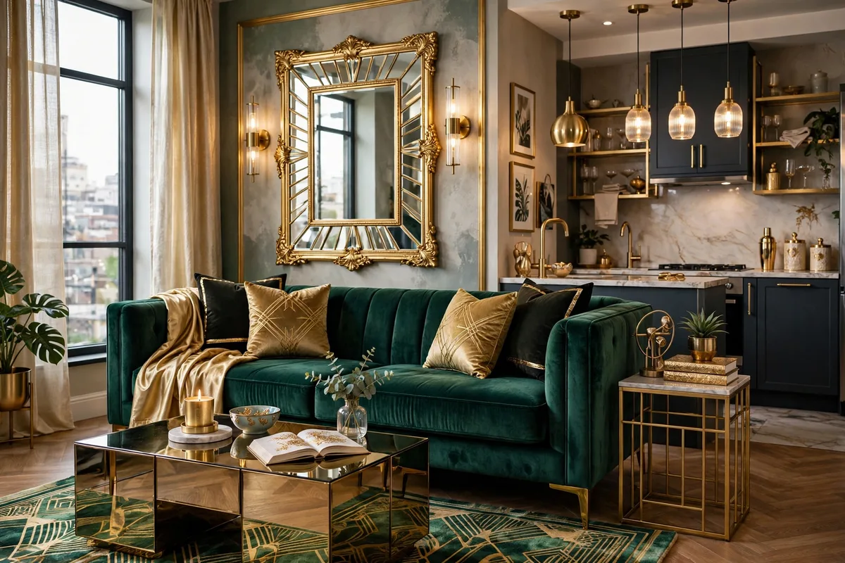
12. Emerald + Gold Glam
Emerald green (Benjamin Moore “Hunter Green” 2041-10) with gold accents is the “treat yourself” palette — rich, jewel-toned, unapologetically glamorous. An emerald velvet pillow or throw against cream bedding, gold lamp bases, a green glass vase or two. A little goes a long way in a studio. Studio tip: velvet is the texture that sells this scheme — even one velvet cushion in emerald changes the whole room’s register.
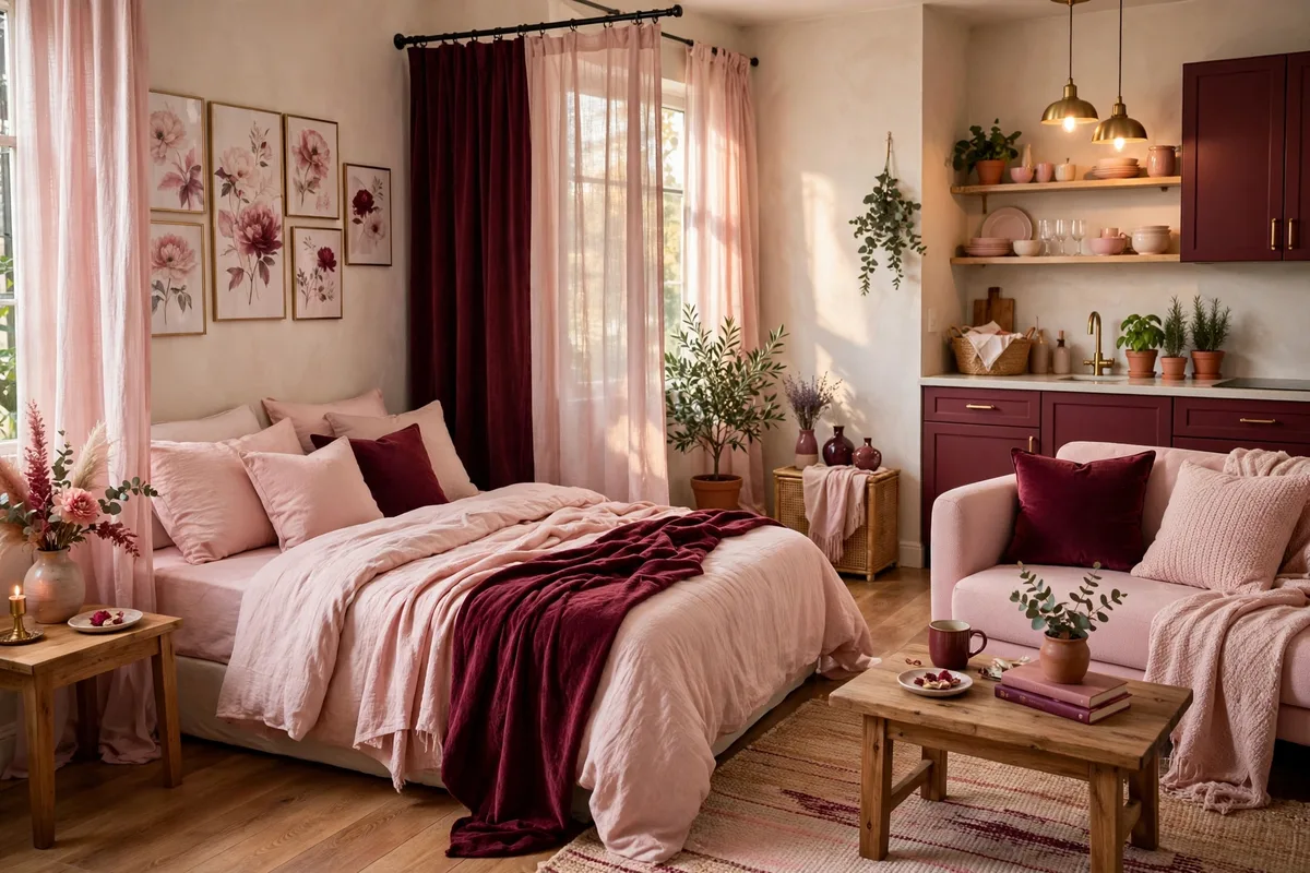
13. Burgundy + Blush Balance
Burgundy is having a moment, and it’s gorgeous in small doses: a burgundy throw, deep-red curtains, a wine-colored rug — balanced with blush pink and warm white so it stays romantic rather than heavy. Think “candlelit restaurant,” not “Victorian parlor.” Studio tip: burgundy and blush share the same red family, so they blend effortlessly — add cream to keep the mix from going too sweet.
Light & Airy Palettes
If your studio is short on windows or just feels tight, light colors are your best friend. But “light” doesn’t have to mean “boring white” — these palettes have real personality.
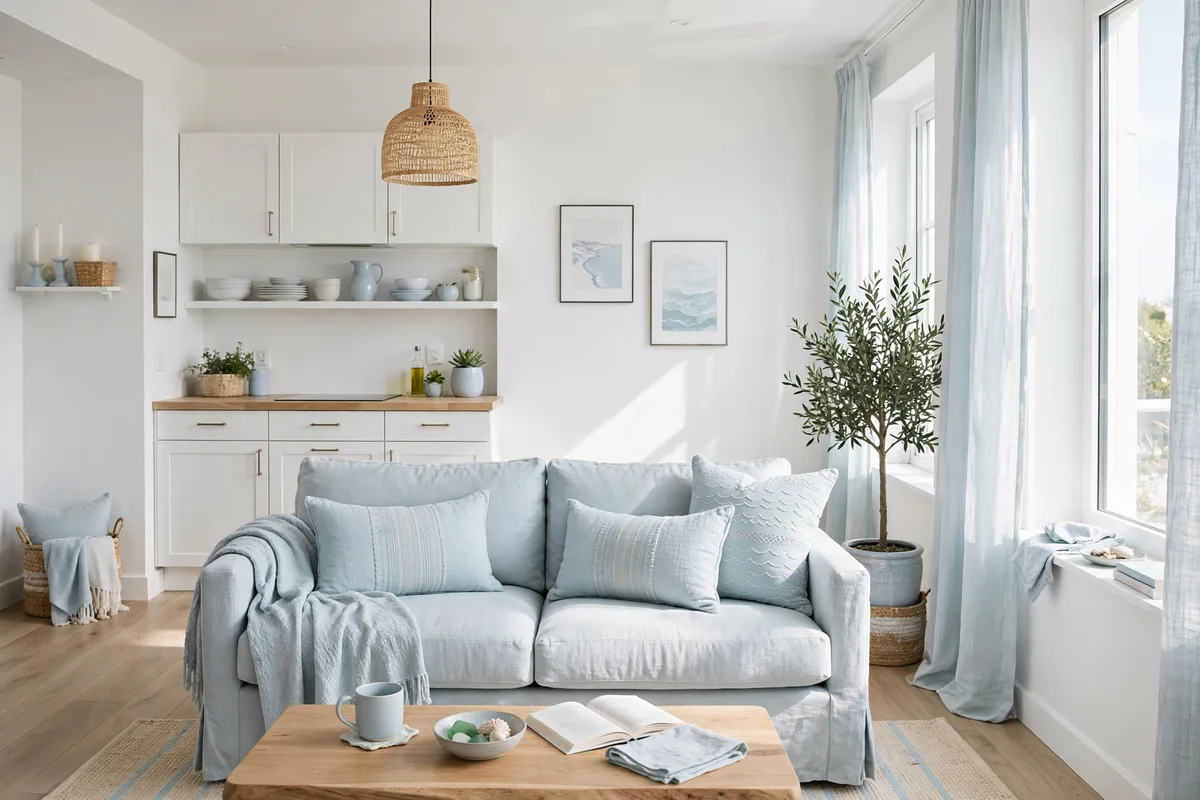
14. Crisp White + Pale Blue
White walls (Benjamin Moore “Chantilly Lace” OC-65, the cleanest white) with pale blue textiles — think dusty chambray bedding, a powder-blue throw — give you a fresh, breathable feel that makes ceilings look higher. It’s the palette equivalent of opening a window. Studio tip: add one natural wood piece to keep the white-and-blue from feeling chilly.
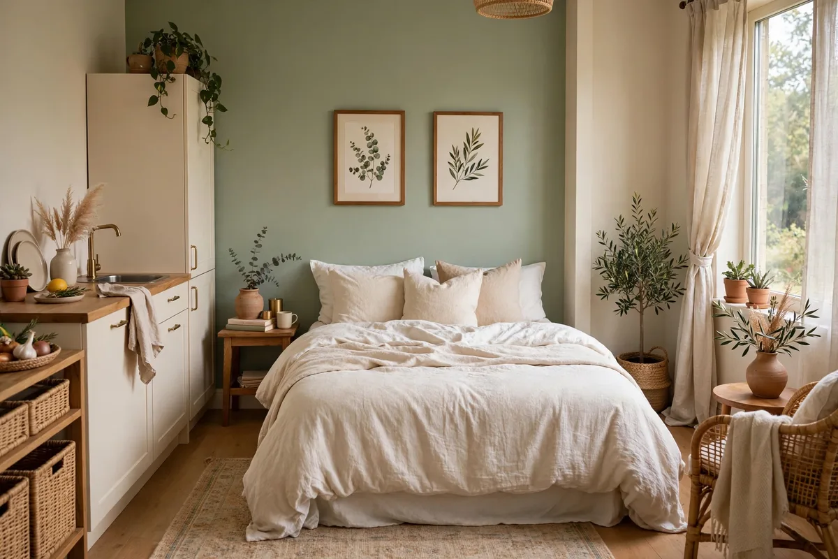
15. Soft Sage + Warm White
Sage green is the “it” neutral of the decade for a reason: it’s calming, it pairs with everything, and it brings the outdoors in. Sherwin-Williams “Evergreen Fog” SW 9130 on one wall (or sage bedding and curtains if you can’t paint) with warm white everywhere else. Studio tip: sage + real plants is a cheat code — the plants echo the wall color and the whole room feels alive.
16. Pale Gray + Blush Pink
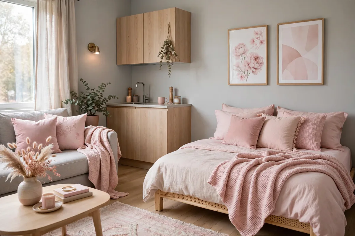
Pale warm gray walls with blush pink accents — a dusty-rose throw, pale pink art, a blush velvet cushion — is soft, modern, and surprisingly gender-neutral when the gray is warm enough. Benjamin Moore “Gray Owl” OC-52 keeps the gray from going cold. Studio tip: black or dark bronze hardware (lamp bases, frames) gives this pretty palette the backbone it needs.
17. Sky Blue + Sandy Neutrals
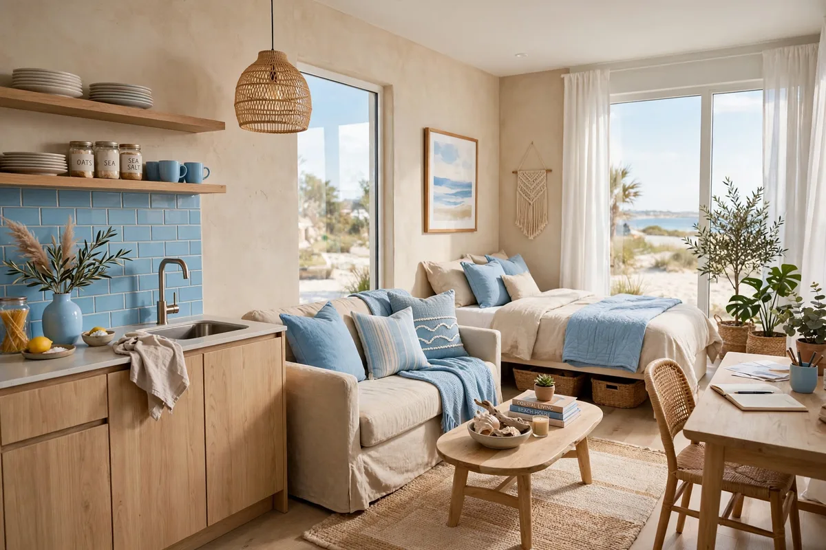
Sky blue walls or bedding with sandy beige and white is instant calm — it’s the palette of a perfect afternoon. Keep the blue pale (Benjamin Moore “Iceberg” 2122-50) so it reads as air, not color, and ground it with jute, oak, and cream. Studio tip: this scheme begs for texture — nubby linen, woven baskets, a shaggy rug — because the colors themselves are so quiet.
18. Mint + Cream Freshness
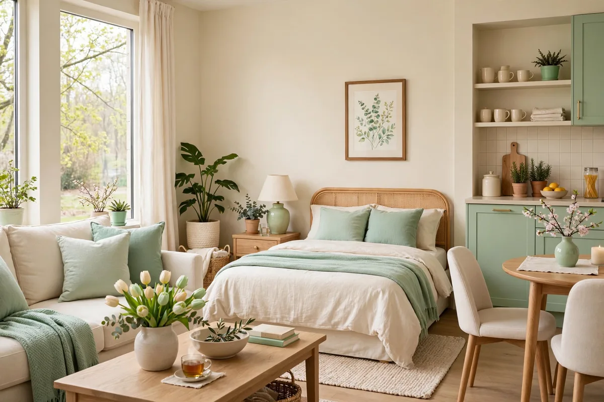
A whisper of mint — on a painted dresser, a throw, even just the bedding — with cream walls and white trim feels like spring all year. It’s retro in the best way (hello, 1950s kitchens) but reads completely fresh against modern furniture. Studio tip: mint + brass is a match made in heaven; the warm metal keeps the cool mint from feeling icy.
19. Lavender Gray + White
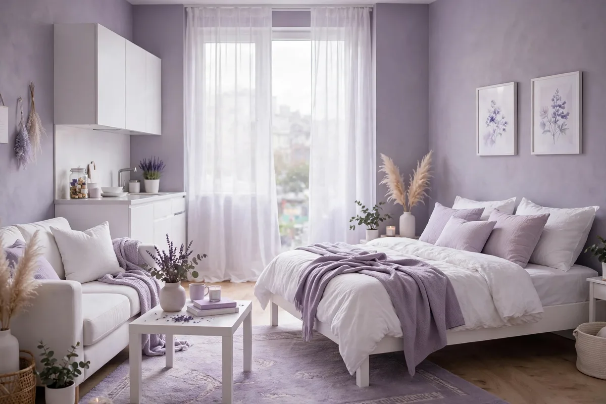
Lavender-gray (Benjamin Moore “Misty” 2124-30 or similar) is the most underrated small-space color — it’s light, it’s interesting, and it shifts beautifully between warm lamplight and cool daylight. Pair with white bedding and light wood for a serene, slightly dreamy studio. Studio tip: keep the rest of the palette minimal — this color is the star, and it doesn’t like competition.
Accent Color Ideas That Pop
Love color but scared to commit? These schemes keep the base neutral and let one glorious accent color do the talking. Easy to try, easy to change, impossible to get wrong.
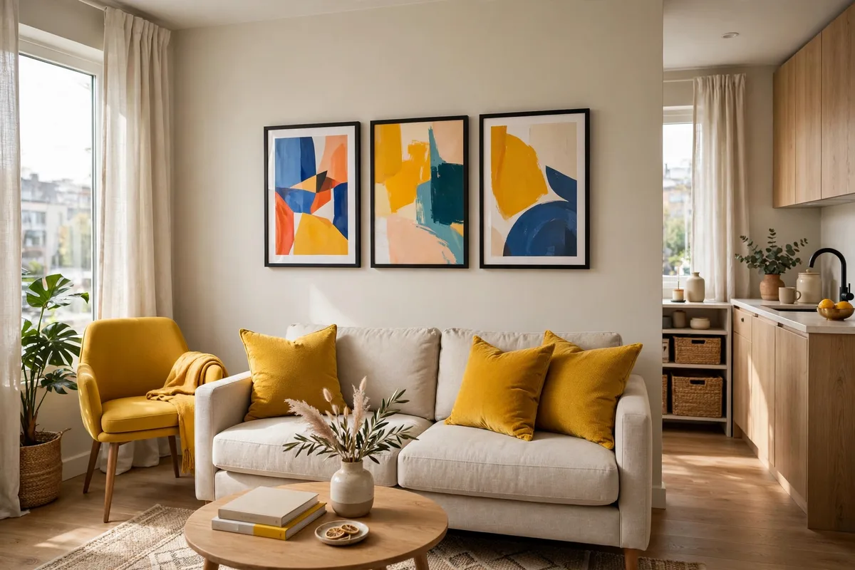
20. Mustard Yellow Pops
Mustard yellow is the happiest accent color — a mustard throw pillow, a saffron curtain panel, a golden art print against warm white walls. It energizes a neutral studio instantly without overwhelming it, and it pairs beautifully with gray, navy, and brown. Studio tip: mustard loves dark wood — the contrast makes both colors richer.
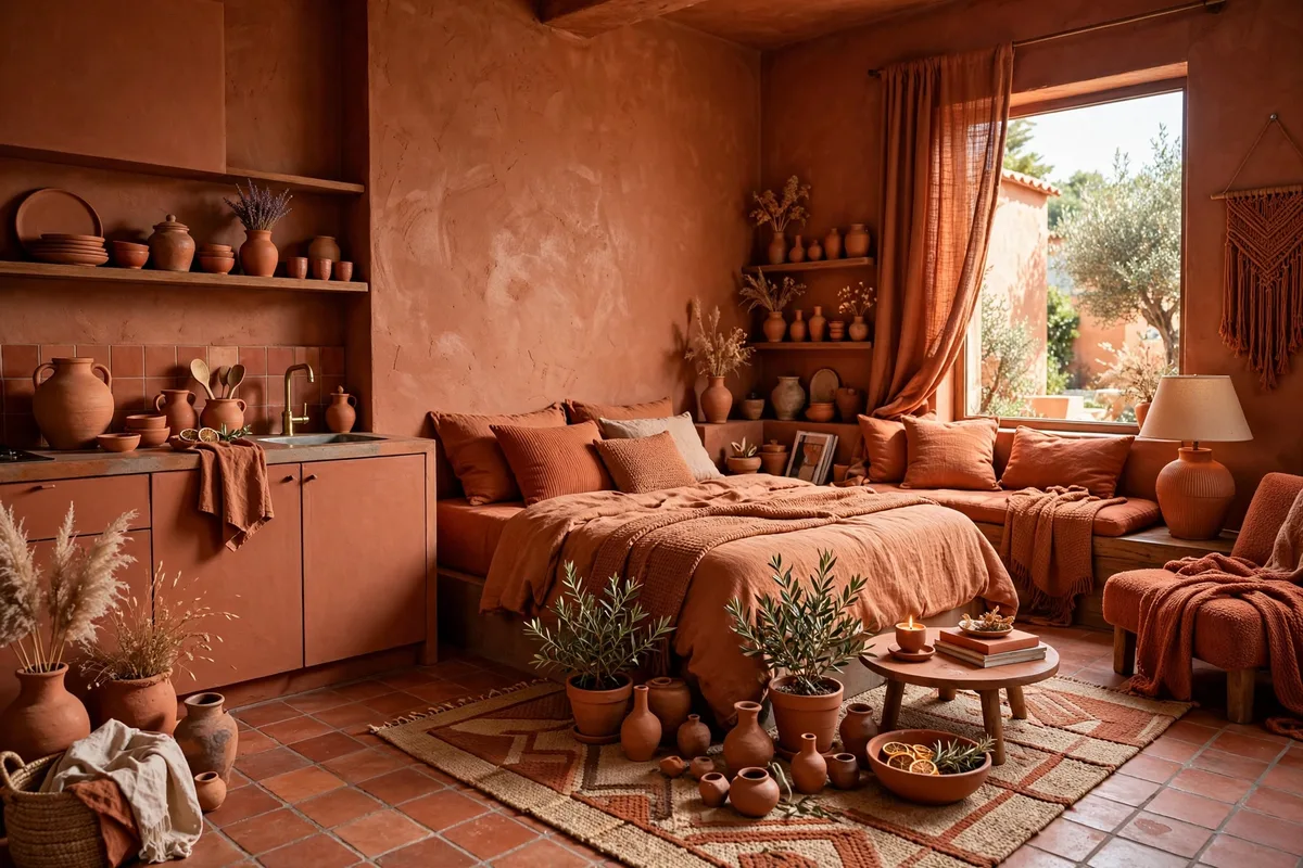
21. Terracotta Everywhere
Go all-in: terracotta walls (or peel-and-stick in a clay tone), rust bedding, burnt-orange pottery. A full terracotta scheme makes a studio feel like a sun-baked Mediterranean villa — warm, earthy, and deeply cozy. Studio tip: balance all that warmth with crisp white bedding or curtains so the room breathes.
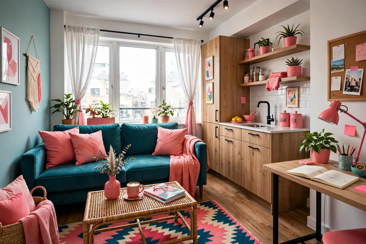
22. Teal + Coral Energy
Teal and coral are complementary colors, which means they make each other vibrate — in the best way. A teal accent chair with coral pillows, or coral curtains against a teal-painted nook, gives a studio vacation energy year-round. Studio tip: keep the ratio about 70/30 (mostly teal, pops of coral) so it feels designed rather than chaotic.
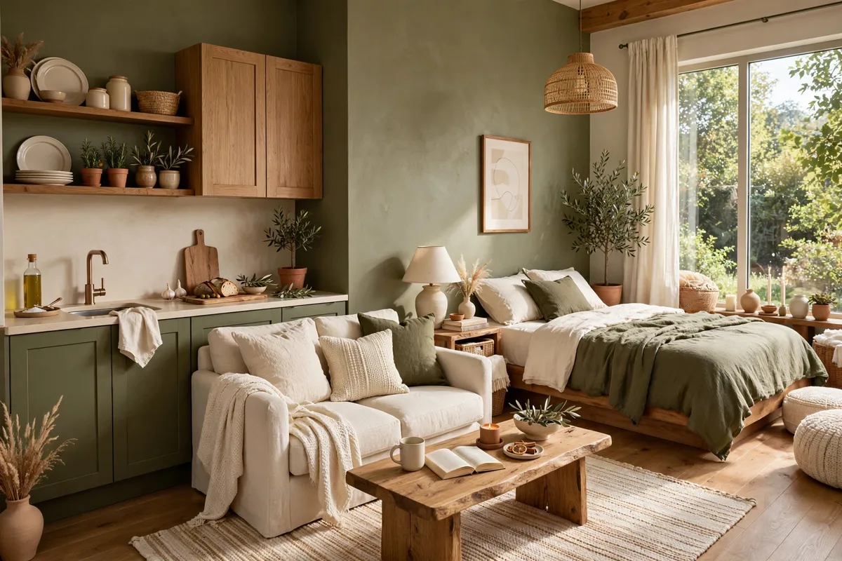
23. Olive Green Grounding
Olive green is the grown-up way to do green — earthy, calm, and endlessly pairable. An olive sofa or olive bedding with cream walls and black accents feels organic and sophisticated, like a really good olive oil. Studio tip: olive + cognac leather is one of the great underrated combos — try it on a chair and ottoman.
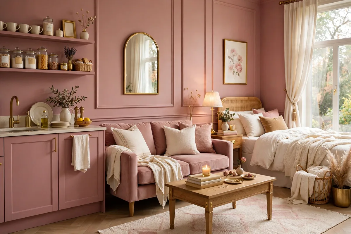
24. Dusty Rose Romance
Dusty rose — deeper and more muted than blush — on curtains or bedding with warm gray walls is romantic without being saccharine. It’s the color of dried roses, vintage silk, and really good sunsets. Studio tip: pair dusty rose with dark wood or black metal to keep it sophisticated; all-pink-everything is a different article.
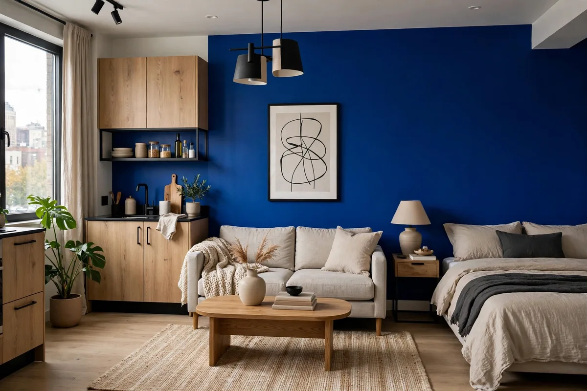
25. Cobalt Blue Statement
One cobalt blue piece — a velvet armchair, a bold rug, lacquered side table — in an otherwise neutral studio is like an exclamation point in a quiet sentence. Cobalt is electric but classic, and it makes everything around it look more intentional. Studio tip: cobalt demands confidence elsewhere too — keep the rest of the room tailored and clutter-free so the statement lands.
Renter-Friendly Color Without Paint
Can’t paint? Don’t want to? Color doesn’t require a roller — these schemes build a full palette from textiles, furniture, and clever removable products. Your landlord will never know.
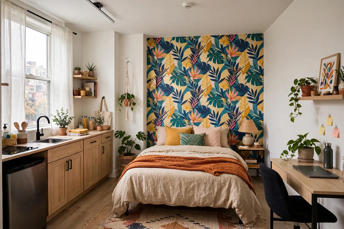
26. Peel-and-Stick Wallpaper Color
Peel-and-stick wallpaper is the renter’s paint: one accent wall behind your bed in a bold botanical, a subtle grasscloth texture, or a moody mural changes the entire room’s color story for $50–$120 — and peels off cleanly at move-out. Studio tip: pull two colors from the wallpaper pattern for your bedding and pillows, and the whole studio will look custom-designed. If you’re decorating a studio apartment on a budget, this is the highest-impact dollars-per-change you can make.
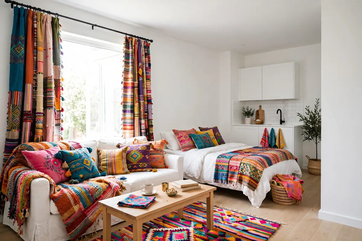
27. Color Through Textiles Only
Keep walls white and build your entire palette from textiles: colored curtains, a patterned duvet, a vibrant rug, coordinated pillows. Textiles are the easiest color to change — swap the duvet cover and you’ve redecorated. Studio tip: choose a 3-color textile palette (say, rust + cream + charcoal) and repeat each color at least twice around the room for cohesion.
28. One Bold Rug Defines the Palette
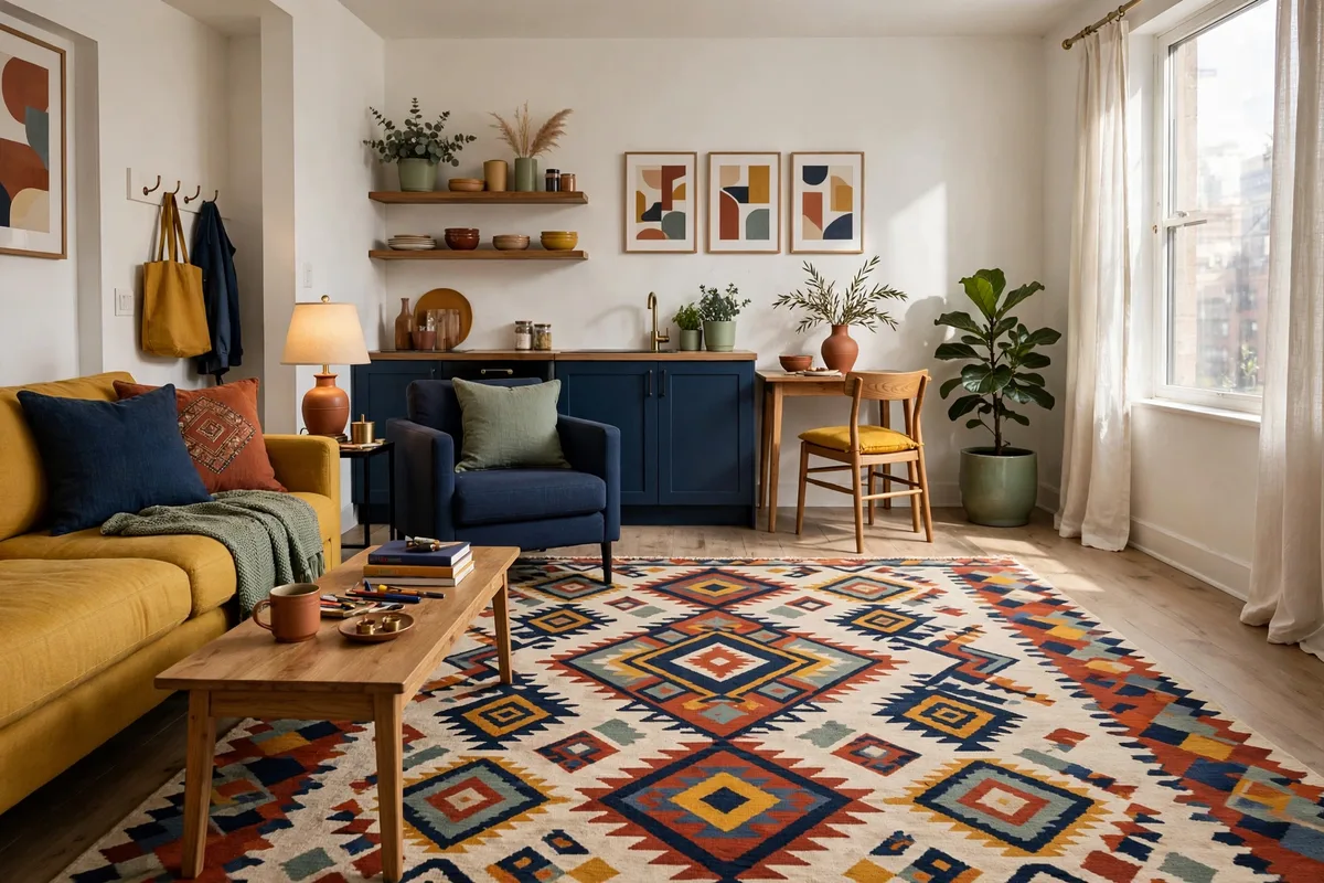
Buy the rug first, then let it dictate everything: pull two or three colors from a bold patterned rug for your pillows, throws, and art. The rug becomes the room’s color constitution, and every other choice is just ratifying it. Studio tip: a rug with a cream or beige background keeps a bold pattern from overwhelming a small studio.
29. Curtain Color Commitment
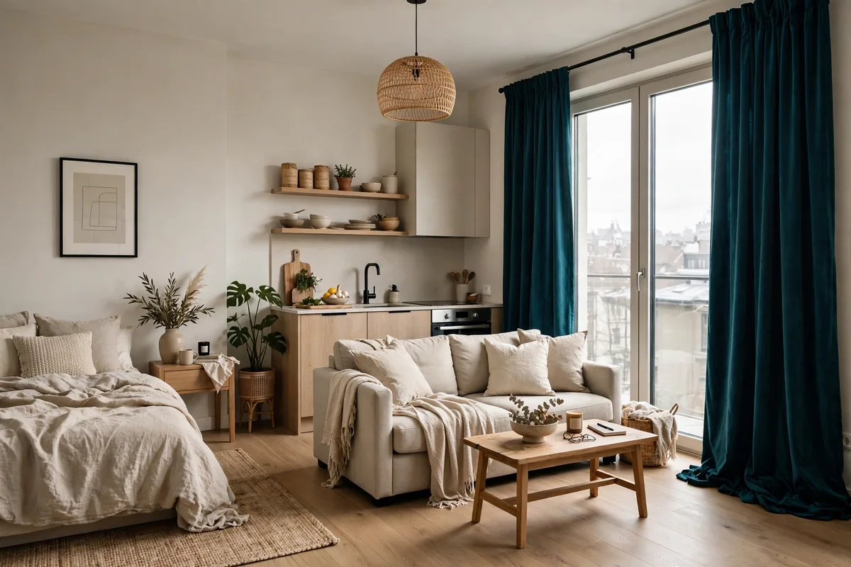
Floor-to-ceiling curtains in a rich color — deep green, warm rust, navy — are basically a removable accent wall. They add more color per dollar than almost anything else, soften acoustics, and can be taken down in minutes. Studio tip: hang them high and wide (4–6 inches above the frame) so the color reads as architecture, not just window dressing.
30. Art-Led Color Scheme
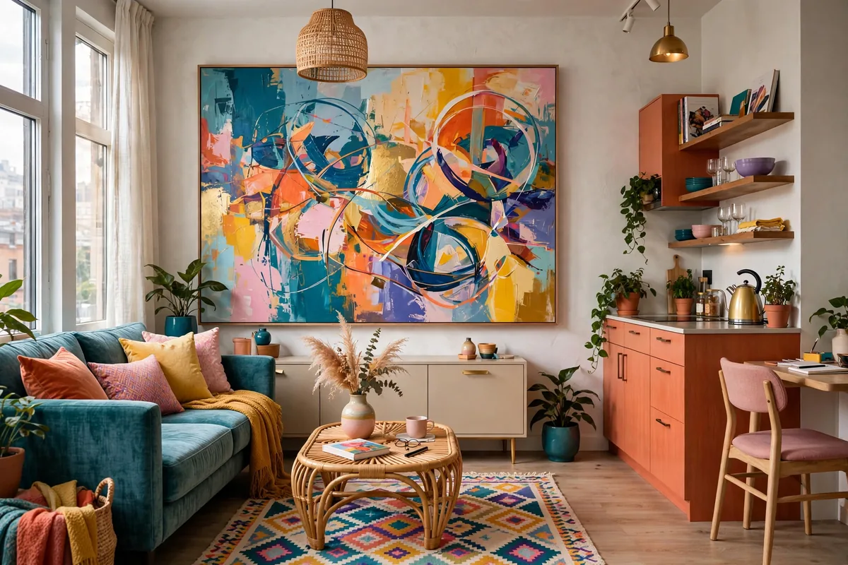
Start with one large piece of art you love and build the room’s palette from its colors — it’s the oldest designer trick in the book and it works because artists already solved the color harmony for you. Pull the dominant color for textiles, the secondary for small accents. Studio tip: oversized art (36 inches or wider) has more color authority in a studio than a cluster of small pieces.
31. Plant Green as Your Accent
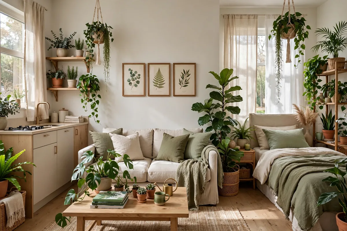
Here’s a free color scheme: white walls + wood furniture + a LOT of plants. The green of living plants is a legitimate accent color — varied, textured, and literally alive — and it pairs with every palette on this list. Studio tip: group plants in odd numbers at varying heights; a “plant corner” reads as intentional design, while one lonely succulent reads as an afterthought.
32. Two-Tone With Furniture
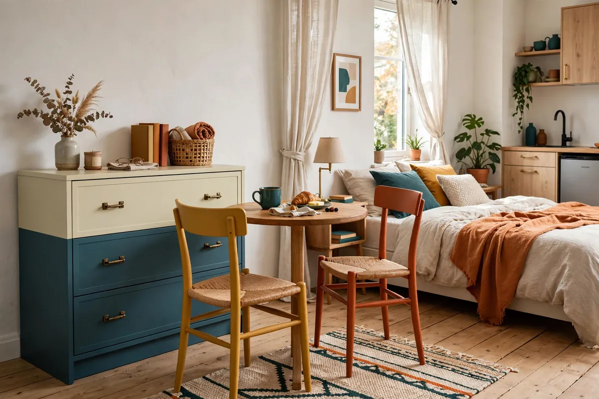
Create a two-tone scheme without touching the walls: paint (or buy) your large furniture in two coordinated colors — say, a sage green dresser with a warm white bed frame, or navy nightstands flanking a cream bed. The furniture becomes the color blocking. Studio tip: thrifted wood furniture is perfect for this — a $30 dresser plus a $15 quart of paint in your accent color.
33. Seasonal Color Swaps
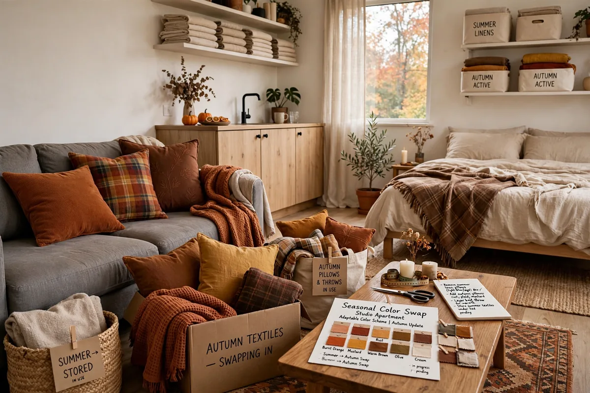
The smartest renters don’t pick one palette — they pick a neutral base and swap accent colors seasonally: warm rusts and mustards for fall, fresh greens and blues for spring, all through pillow covers, throws, and a $30 duvet cover. Studio tip: store off-season textiles in one labeled bin (under the bed is perfect) so the swap takes twenty minutes, not a weekend.
Frequently Asked Questions
What is the best color scheme for a small studio apartment?
Warm neutrals — warm white, greige, oatmeal — are the safest best because they make one room feel calm and cohesive instead of chopped up. That said, the “best” scheme is the one you’ll love living inside: a dark moody green you adore beats a beige you resent. If you want to divide your studio visually as well as colorfully, pair your palette with our guide to studio apartment divider ideas — color plus a physical divider is the ultimate zone-maker.
Should a studio apartment be all one color?
Not necessarily all one color, but it should be one palette — two to four colors that harmonize, repeated throughout the space. The biggest studio color mistake is treating the bed corner, living corner, and kitchen corner as separate rooms with separate colors. One cohesive scheme across all zones is what makes a studio feel bigger, not smaller.
What colors make a studio apartment look bigger?
Light, warm colors with low contrast between walls, trim, and large furniture visually expand a space — the eye flows without stopping. But contrast isn’t the enemy: a single dark accent wall can actually add depth and make a studio feel larger by creating a sense of distance. Avoid chopping the room with many competing bold colors at once.
How can renters add color without painting?
Textiles are your paint: curtains, bedding, rugs, and pillows in your chosen palette deliver 90% of a painted room’s color impact with zero landlord drama. Peel-and-stick wallpaper covers the remaining 10% — one accent wall transforms the room and removes cleanly. Colored furniture (even just painted thrift finds) fills any gap in between.
How many colors should a studio apartment have?
The classic designer rule: three colors — a dominant (60%, usually walls/large furniture), a secondary (30%, textiles), and an accent (10%, small decor). In a studio, you can stretch to four if one is a plant-green or wood tone that reads as neutral. More than four distinct colors and the room starts to feel busy instead of designed.
Do dark colors work in a studio apartment?
Absolutely — dark colors don’t shrink rooms, visual clutter does. A deep green or navy accent wall adds depth and drama, especially behind the bed where it creates a cocooning sleep zone. The keys: keep the ceiling and trim light, balance dark walls with light textiles, and make sure you have decent lighting so the dark color reads as “moody” rather than “murky.”
Final Thoughts
Here’s the truth about studio apartment color schemes: there is no universally “right” palette — there’s only the palette that makes you exhale when you walk in the door. Start with how you want the room to feel (calm? energized? cozy? dramatic?), pick your 60-30-10 colors from there, and repeat them until the whole studio sings one song.
And remember: in a rental, nothing is permanent. Try the bold curtain, hang the moody wallpaper, swap the duvet — the worst case is you learn something about your taste for the price of a pillow cover. Steal one of these 33 schemes, make it yours, and enjoy the only room you’ve got.
