
34 Living Room Color Palettes for Every Style
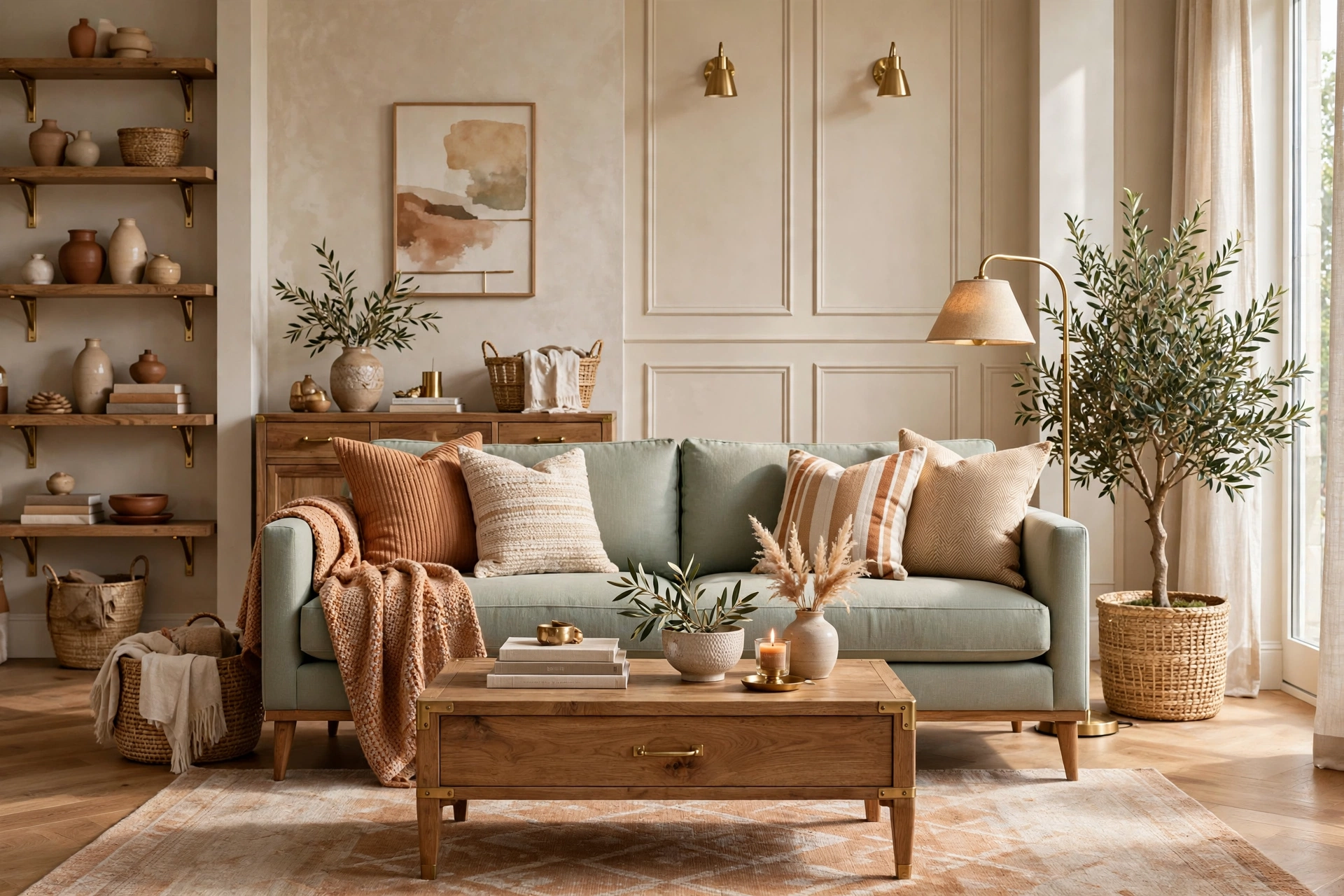
34 Living Room Color Palettes for Every Style
The living room is where your home’s personality lives — and nothing defines that personality faster than color. A well-chosen palette can make a small living room feel airy and calm, turn a dark corner into a cozy reading nook, or give a rental the polished look of a designer space without changing a single wall permanently. The secret isn’t picking one perfect color; it’s building a palette — a wall tone, a grounding neutral, a wood finish, a textile color, and one accent that ties it all together. Below you’ll find 34 living room color palettes that actually work in real homes, from sun-washed coastal whites to dramatic charcoal-and-brass combinations. Each palette includes the exact colors to use, where to put them, and budget-friendly ways to get the look with paint, textiles, and thrifted finds. Whether you lean Scandinavian minimal, boho eclectic, or modern classic, there’s a palette here with your name on it.
Light & Airy Palettes
1. Warm White & Natural Oak
The can’t-miss classic: warm white walls (think Benjamin Moore White Dove or a $30 gallon of warm-white paint) paired with natural oak furniture and jute textures. This palette makes even a north-facing living room glow, and it’s the most forgiving backdrop for renters because everything you own already matches it. Layer in cream linen curtains ($25–$40 per panel), a light oak coffee table ($120–$250), and one green plant for contrast. The warmth in the white keeps it from feeling sterile — the difference between “hospital” and “haven” is literally one undertone. Pro tip: test three warm whites on the wall and check them at noon and at dusk — the right one stays creamy in both lights, the wrong one turns yellow or gray.
2. Sage Green & Cream
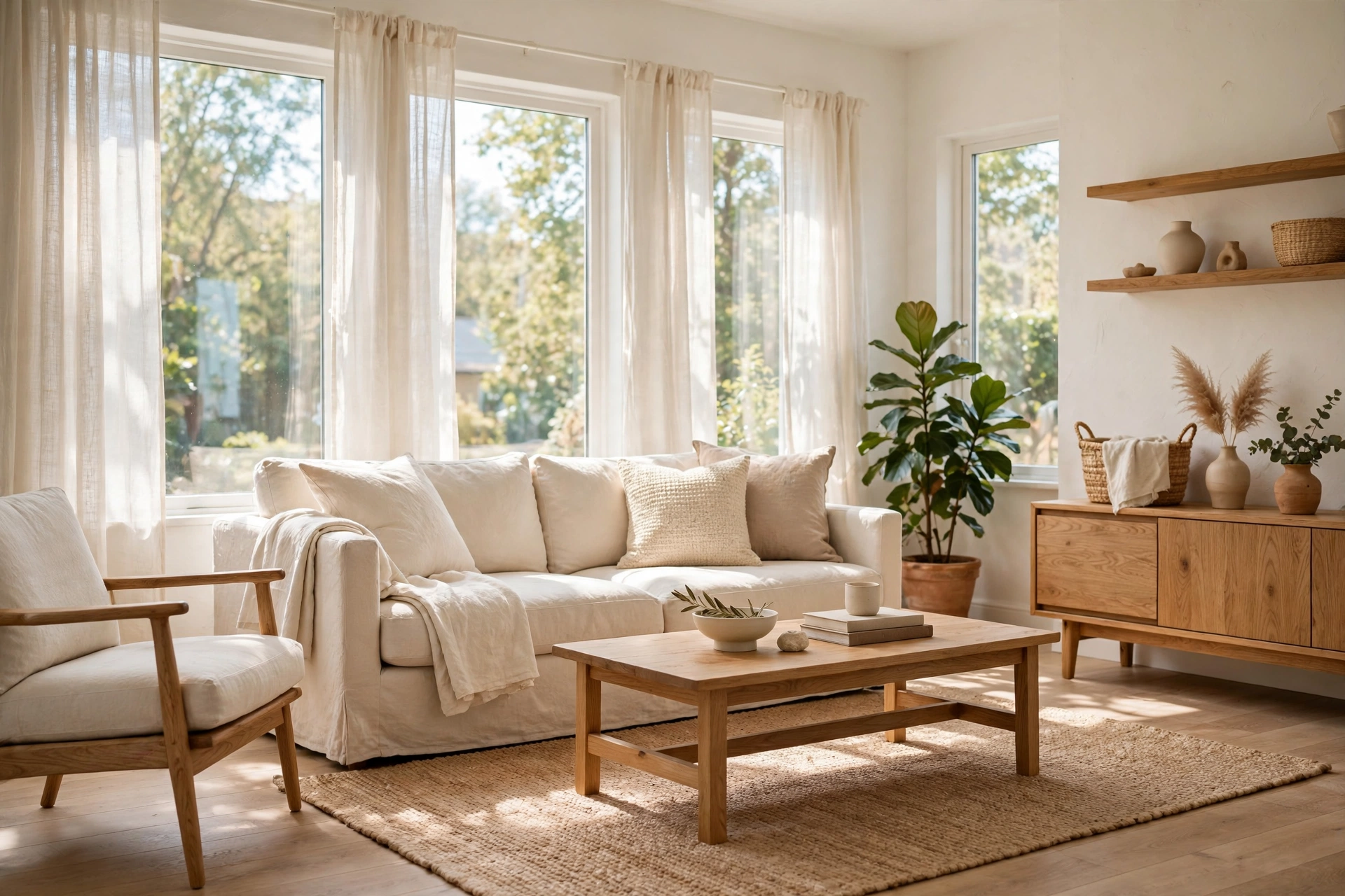
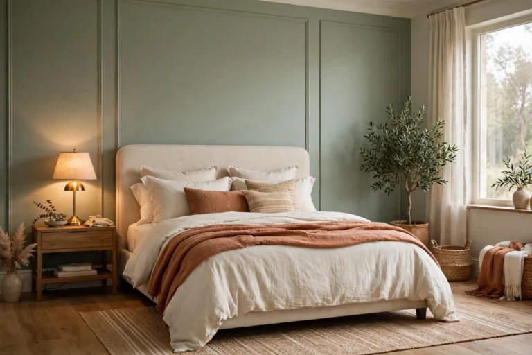
Sage green is the color of calm — muted enough for walls, rich enough for a velvet sofa. Pair a sage accent wall ($30–$45 for paint) with cream upholstery and light wood floors for a palette that feels like a deep breath. Sage works beautifully with brass picture frames ($8–$15 each) and linen throw pillows ($15–$25). It’s one of the few greens that flatters both warm and cool light, which is why designers reach for it in tricky rooms. If painting feels risky, start with a sage sofa or curtains — the effect is 80% of a painted wall at a fraction of the commitment. Pro tip: sage pairs best with warm metals (brass, gold) rather than chrome — the warmth keeps the green from reading cold or institutional.
3. Sky Blue & Crisp White
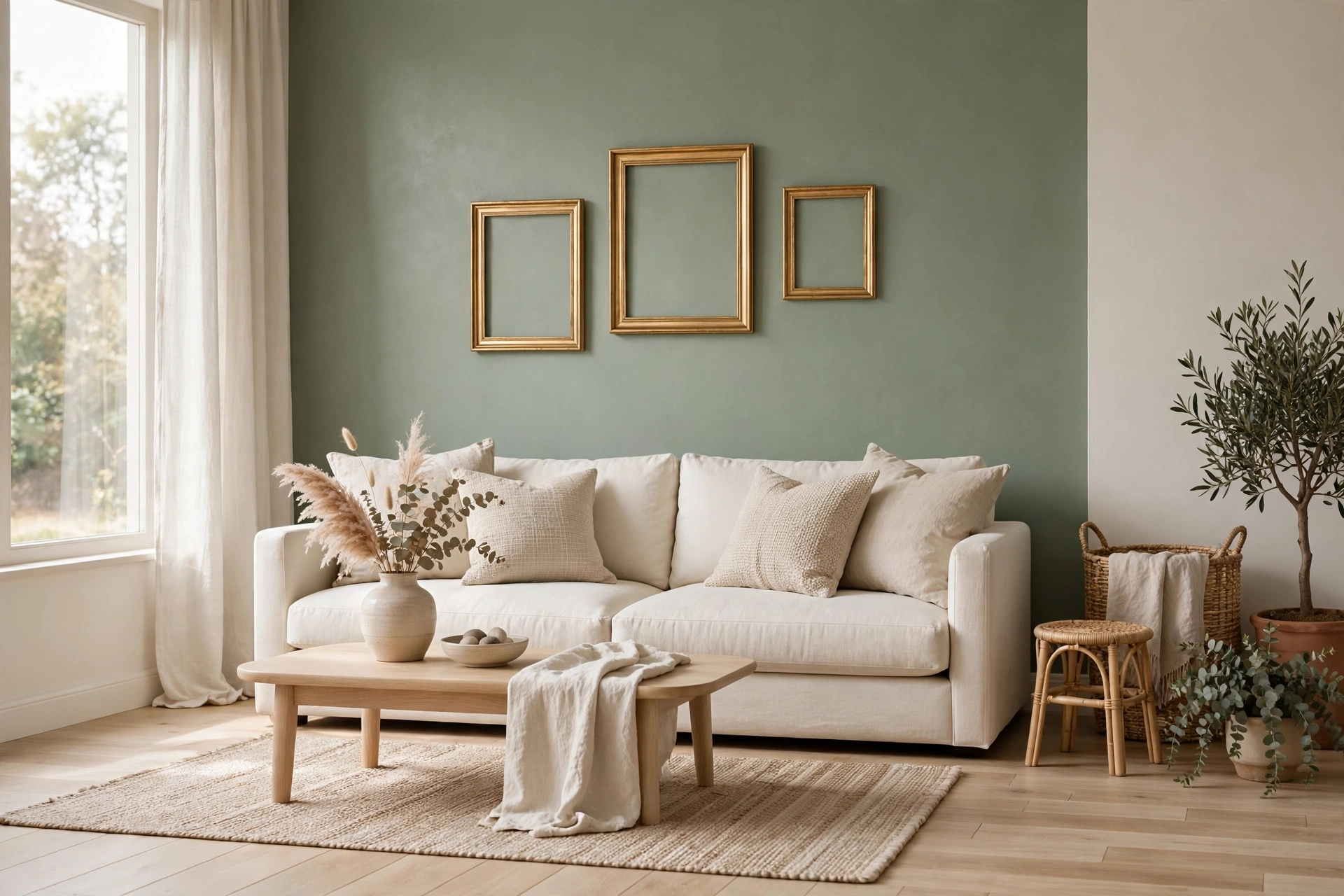
Sky blue brings the outdoors in — perfect for living rooms that need an energy lift. Use it on one wall or through textiles: sky-blue curtains ($20–$35 per panel), a white slipcovered sofa ($300–$600), and natural seagrass baskets ($15–$30) for texture. This palette is practically made for minimalist spaces because it stays light while adding personality. The trick is keeping the blue soft and powdery — go too saturated and it reads as a kid’s bedroom. Add one navy throw pillow to ground it and keep the look grown-up. Pro tip: sky blue looks best with white trim and ceilings — the crisp contrast is what gives this palette its fresh, coastal energy.
4. Greige & Soft Linen
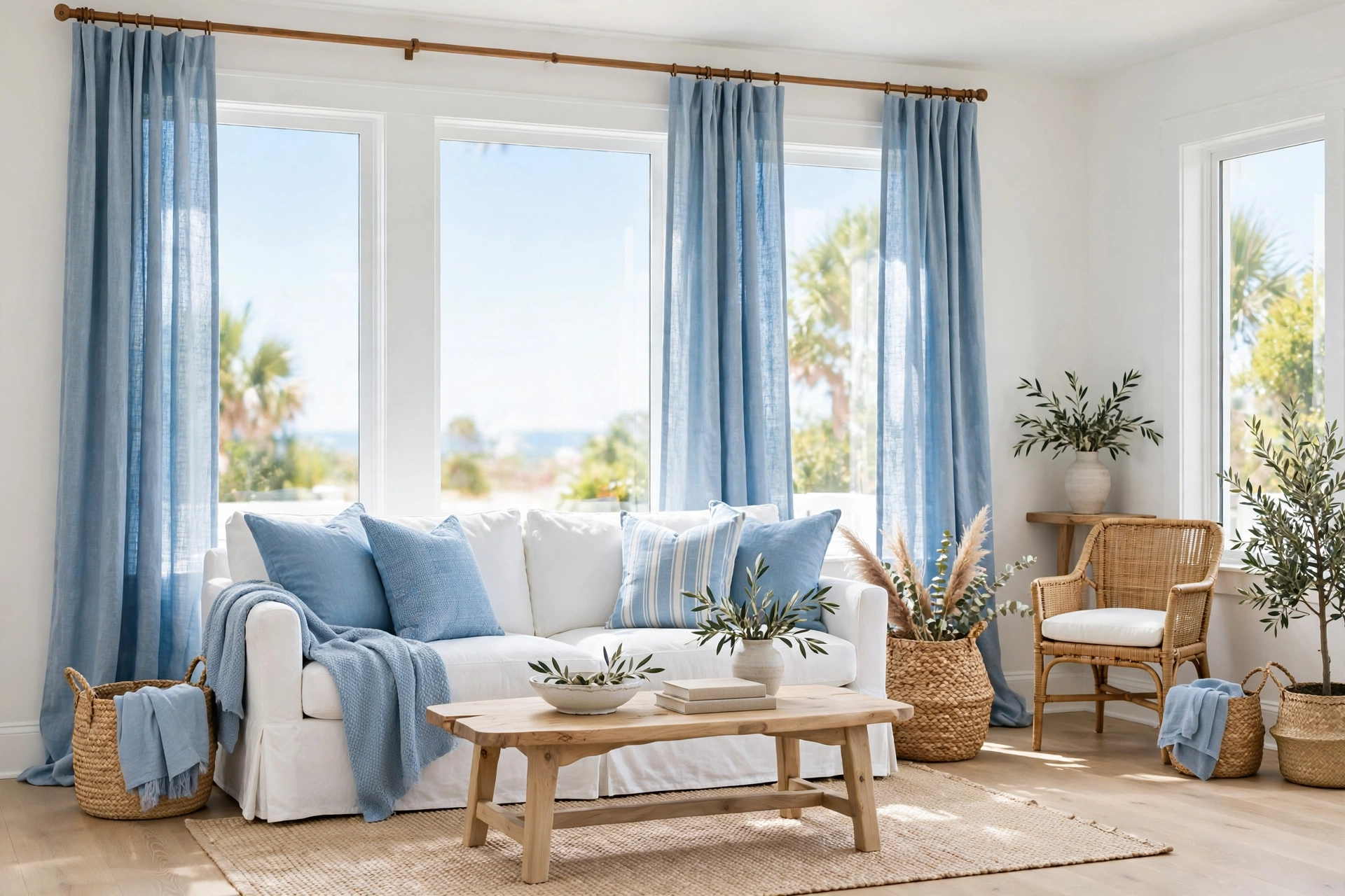
Greige — the love child of gray and beige — is the designer’s neutral of choice because it works with literally everything. Paint walls in a warm greige ($30–$45), then layer soft linen in ivory and oatmeal ($20–$40 per pillow cover). Add a light wood side table ($60–$120) and the room feels expensive without trying. Greige is especially kind to open-plan living rooms because it flows into kitchens and hallways without clashing. It’s the palette equivalent of a great white shirt: boring on the hangar, perfect on. Pro tip: greige needs texture to avoid flatness — mix linen, boucle, jute, and raw wood so the eye has something to travel across.
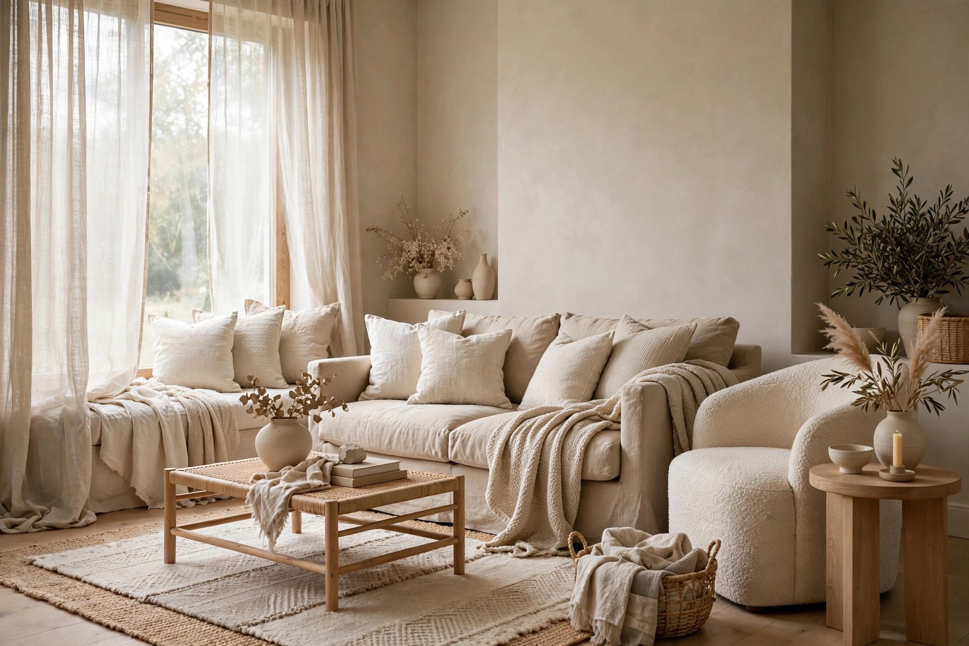
5. Blush Pink & Warm Gray
Blush pink grew up — it’s no longer just for nurseries. Paired with warm gray walls and walnut wood, blush becomes sophisticated: a blush velvet armchair ($180–$350), gray linen sofa ($400–$800), and brushed-gold floor lamp ($80–$150). This palette flatters skin tones, which is why it photographs beautifully and feels welcoming in person. Keep the pink dusty and muted — think dried roses, not bubblegum. One blush piece is a statement; three is a theme. Pro tip: blush loves natural light but can look washed out under cool LEDs — use warm 2700K bulbs to keep the pink rosy instead of gray.
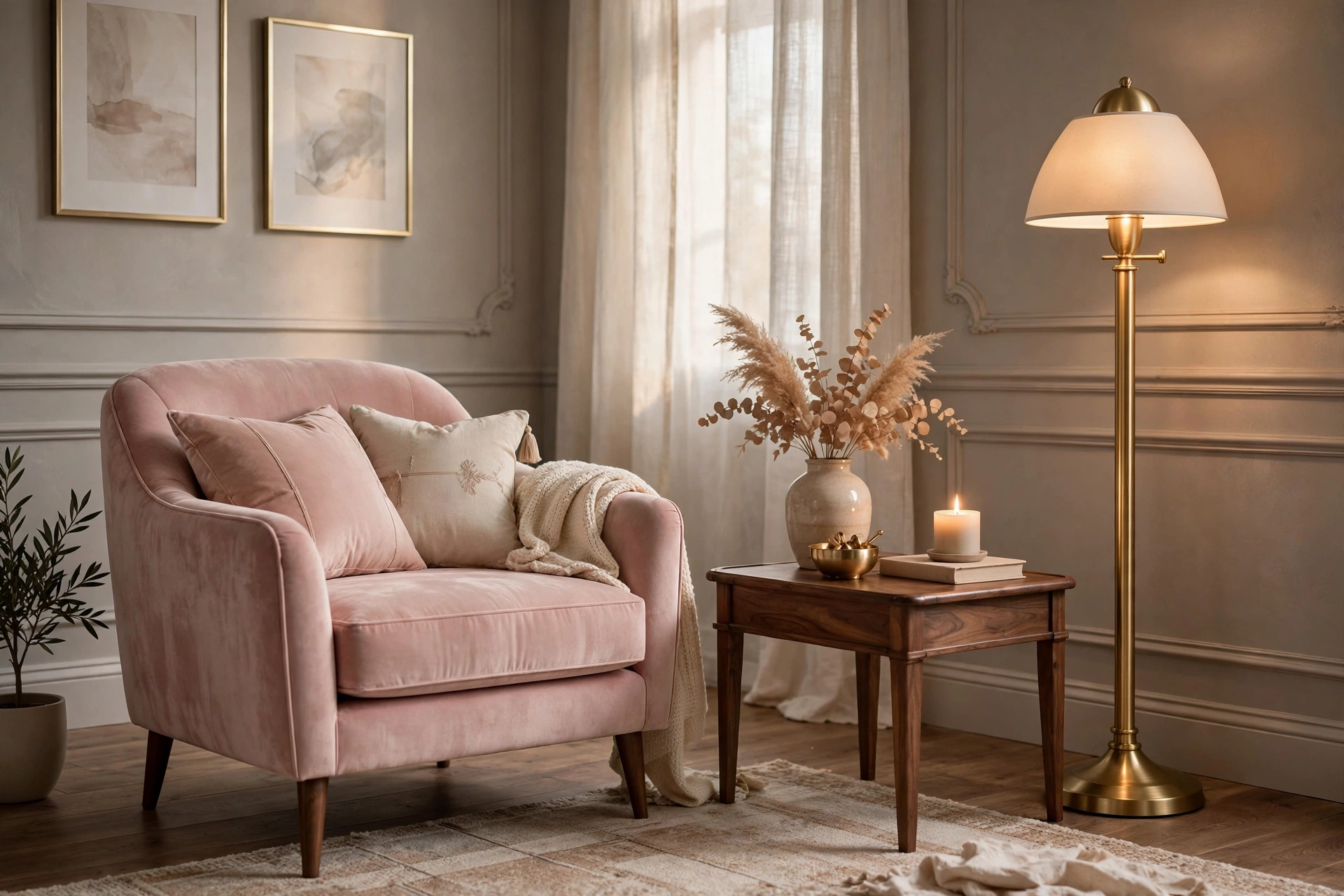
6. Cream & Honey Wood
Cream walls with honey-toned wood is the palette of slow Sunday mornings — warm, golden, and effortlessly inviting. The honey wood (think vintage teak or warm oak, $50–$300 thrifted) does the heavy lifting while cream keeps things light. Add caramel leather accents ($40–$90 for a throw pillow) and a cream boucle chair ($200–$400) for texture. This combination is endlessly forgiving: dust is invisible, mismatched woods blend in, and everything looks intentional. It’s also one of the cheapest palettes to build because honey-wood furniture is abundant secondhand. Pro tip: keep metals warm here — brass and bronze ($10–$25 for small decor) — since chrome or nickel will fight the golden undertones.
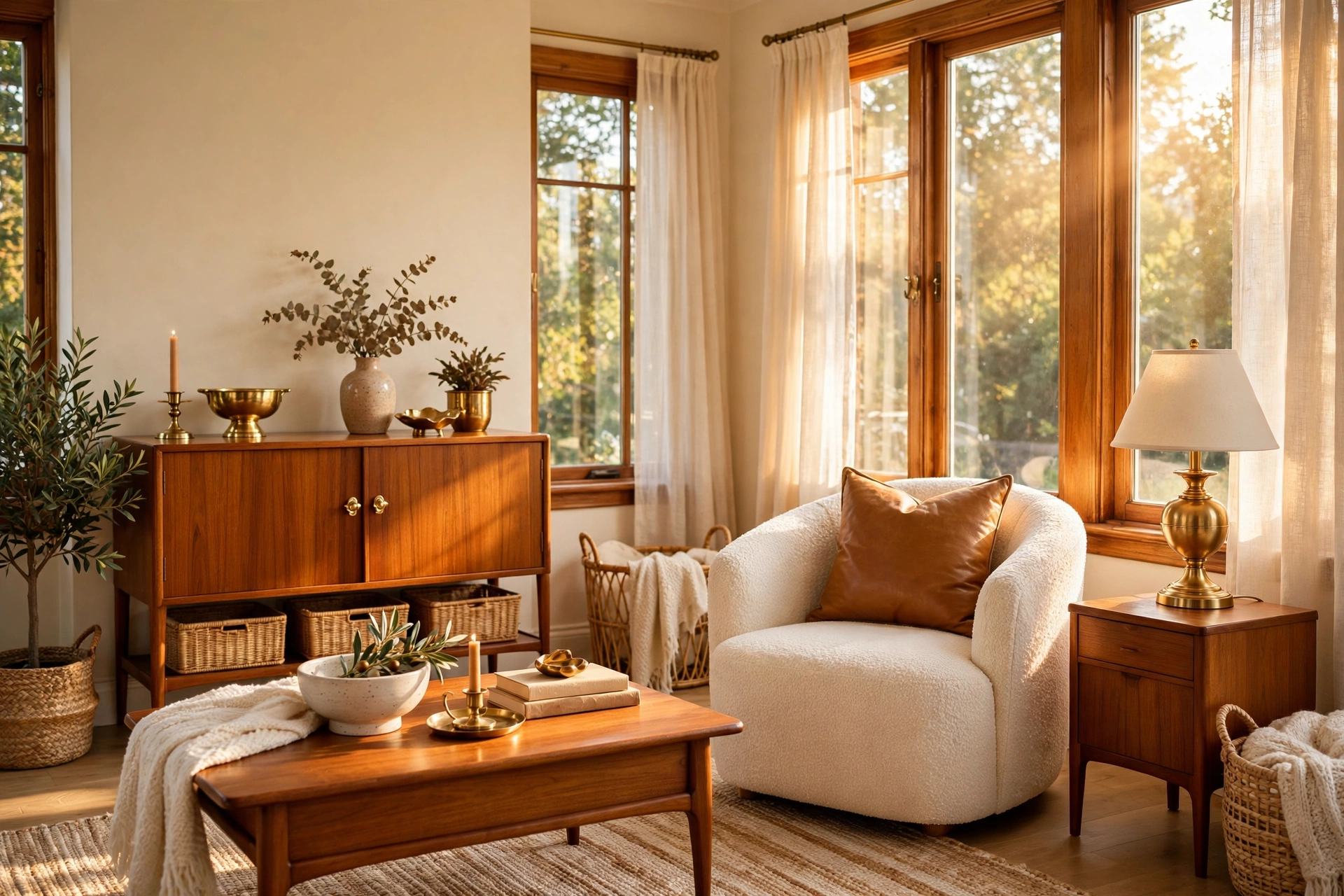
7. Pale Yellow & White
A whisper of pale yellow — butter, not banana — brings sunshine to living rooms that never get any. Paint one wall or use yellow in textiles: pale-yellow curtains ($20–$35), white sofa, light oak floors. This palette is a mood-lifter backed by actual color psychology: soft yellows are associated with optimism and warmth. It works especially well in small living rooms because light yellow reflects more light than white with cool undertones. Pair with wicker and rattan ($15–$40) for a sunroom feel year-round. Pro tip: keep yellow below 20% of the room — as an accent it glows, as a dominant it overwhelms and can feel anxious rather than cheerful.
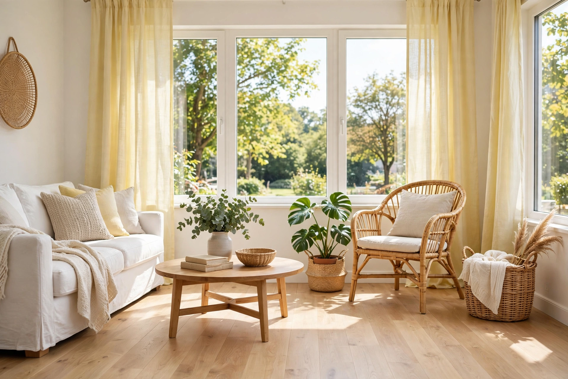
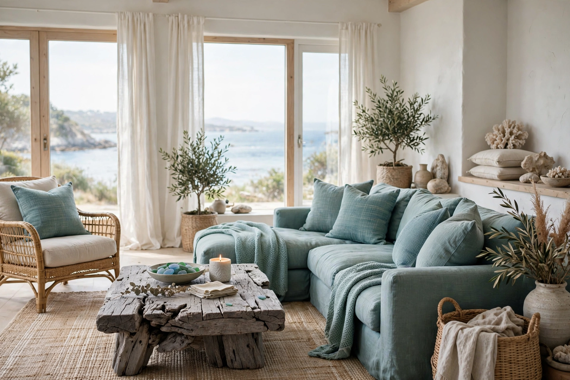
8. Sea Glass & Driftwood
Sea glass green-blue with weathered driftwood gray is the coast without the clichés — no anchors, no “beach house” signs, just the colors. Use sea-glass on textiles ($15–$30 per pillow), driftwood-gray on a reclaimed wood coffee table ($100–$250), and keep walls a soft white. This palette stays serene because both colors are desaturated; nothing shouts. It pairs naturally with the calm neutrals of Japandi style if you want to blend aesthetics. Add one piece of actual driftwood or sea glass collected on a trip for a personal touch. Pro tip: this palette needs one warm element — a brass lamp or cognac leather ottoman ($60–$120) — or it can feel chilly, especially in winter.
Warm & Earthy Palettes
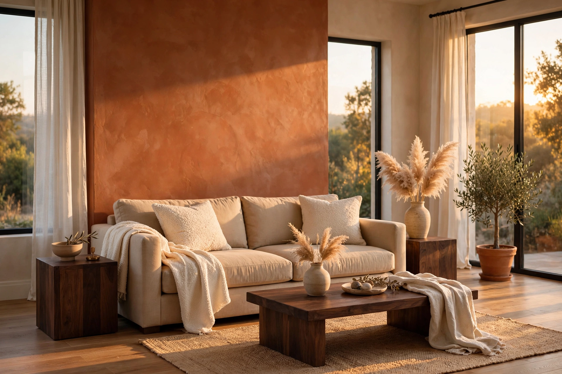
9. Terracotta & Warm Sand
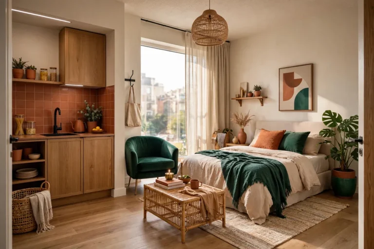
Terracotta is having a decade-long moment, and for good reason — it’s warm without being orange, earthy without being dull. A terracotta accent wall ($30–$45) with warm sand-colored upholstery creates a living room that feels like golden hour all day. Layer in cream boucle ($25–$50 per pillow), dark walnut wood ($80–$200 for side tables), and dried pampas grass ($10–$20) for the full effect. This palette loves natural light and looks stunning in rooms with big windows. For renters, get the look with a terracotta sofa or curtains instead of paint. Pro tip: terracotta intensifies in direct sun — what looks perfect in the paint store can glow neon in a south-facing room, so always test a large swatch first.
10. Olive Green & Walnut
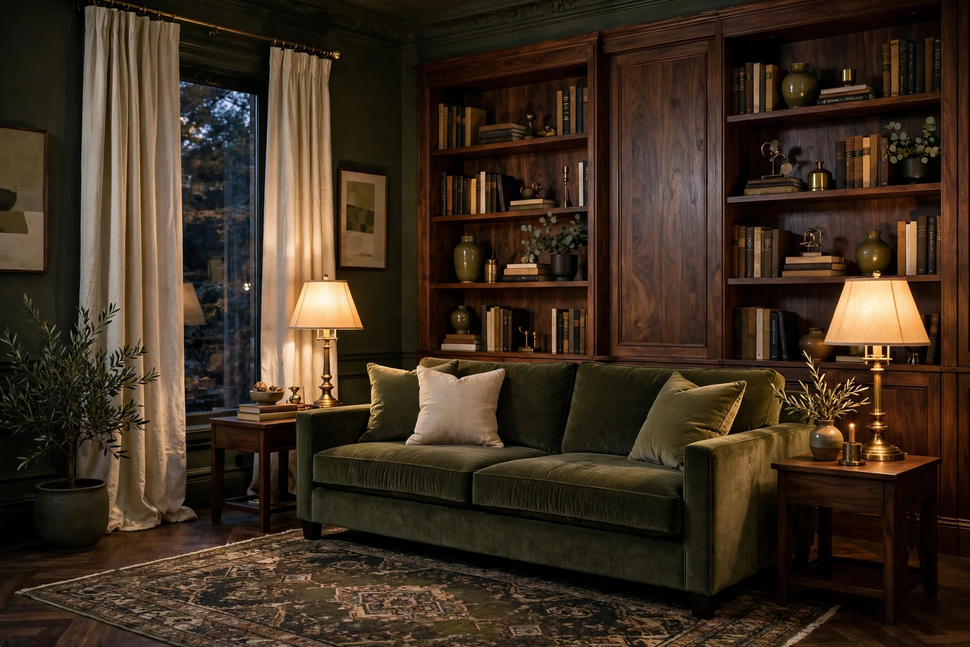
Olive green with deep walnut wood is the palette of a well-read library — sophisticated, grounded, quietly luxurious. An olive velvet sofa ($500–$900) against walnut bookshelves ($150–$400) creates depth that flat neutrals can’t match. Add brass table lamps ($40–$80 each) and cream curtains to keep it from getting too dark. Olive is remarkably versatile: it reads neutral enough for commitment-phobes but interesting enough for design lovers. It also hides pet hair and everyday wear better than almost any other color. Pro tip: olive velvet shows pressure marks — fluff cushions weekly and vacuum with an upholstery attachment monthly to keep the nap even.
11. Clay & Natural Linen
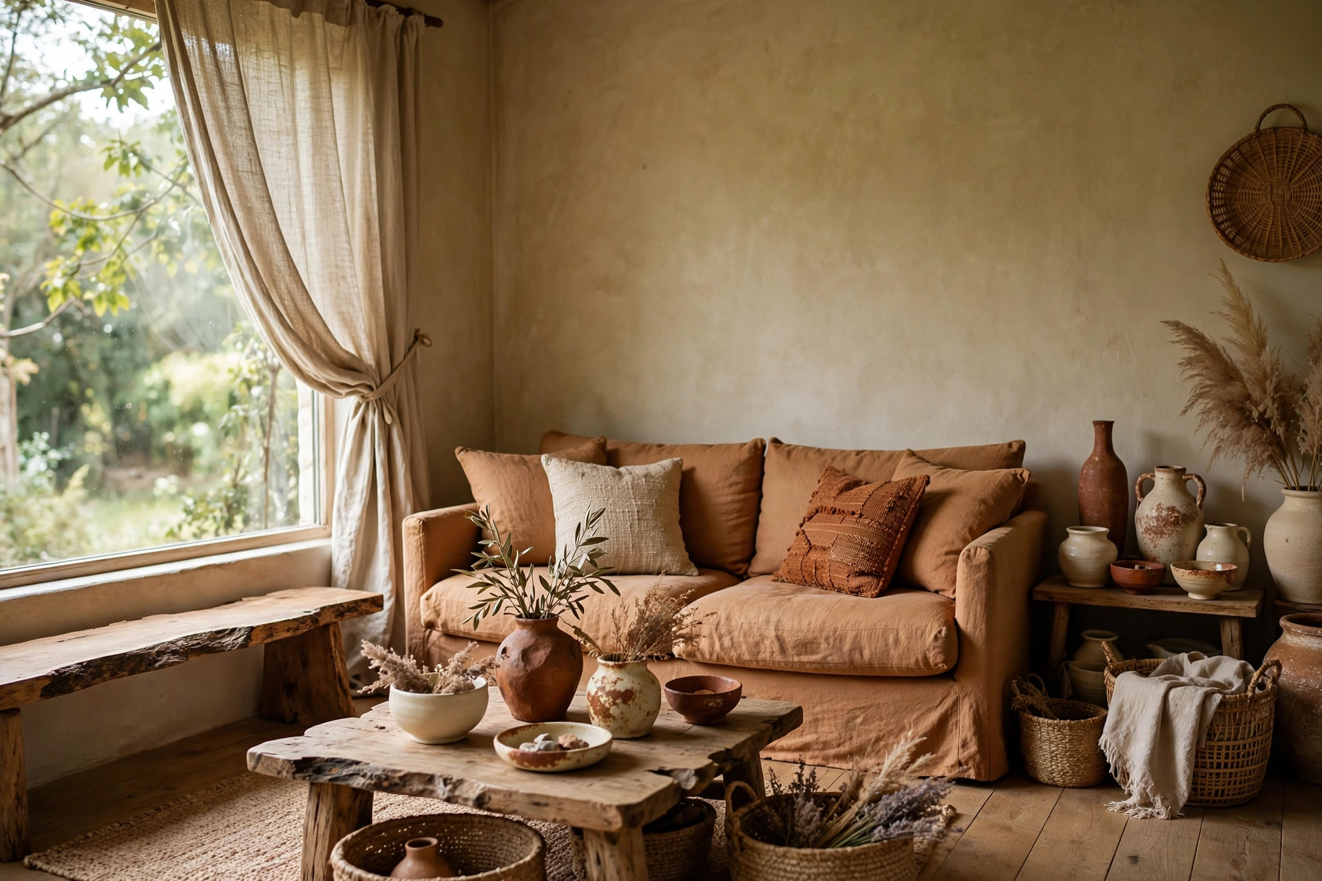
Clay — softer than terracotta, pinker than tan — paired with natural linen is the palette of artisan studios and slow living. Clay-colored walls or a clay linen sofa ($400–$700) with oatmeal linen curtains ($25–$40 per panel) and raw-edge wood ($60–$150 for a bench) feels handmade and human. This combination is incredibly photogenic, which matters if your living room doubles as a content backdrop. Add handmade ceramics ($15–$40 each) in cream and rust to complete the story. Pro tip: clay tones vary wildly between brands — bring a fabric swatch to the paint store and match in natural daylight, not under store fluorescents.
12. Rust & Denim Blue
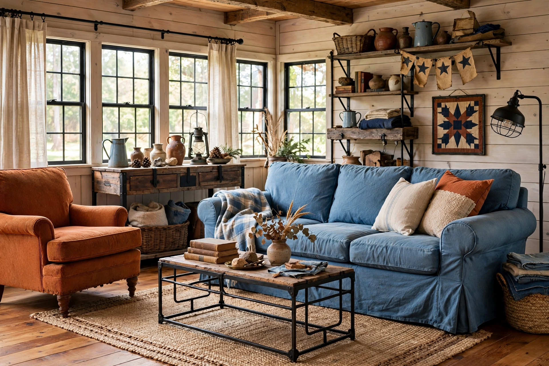
Rust orange with washed denim blue is the palette of vintage Americana done right — think well-worn leather boots and favorite jeans. A rust armchair ($200–$400) with denim-blue slipcovered sofa ($350–$700) and warm wood floors hits the sweet spot between rustic and refined. This combination works because the colors are complementary on the color wheel, so they vibrate pleasantly without clashing. Add black metal accents ($10–$25) and a cowhide or jute rug ($80–$200) to ground it. Pro tip: keep both colors muted and dusty — bright rust with bright blue reads as a sports team, while the faded versions read as design.
13. Cognac & Cream
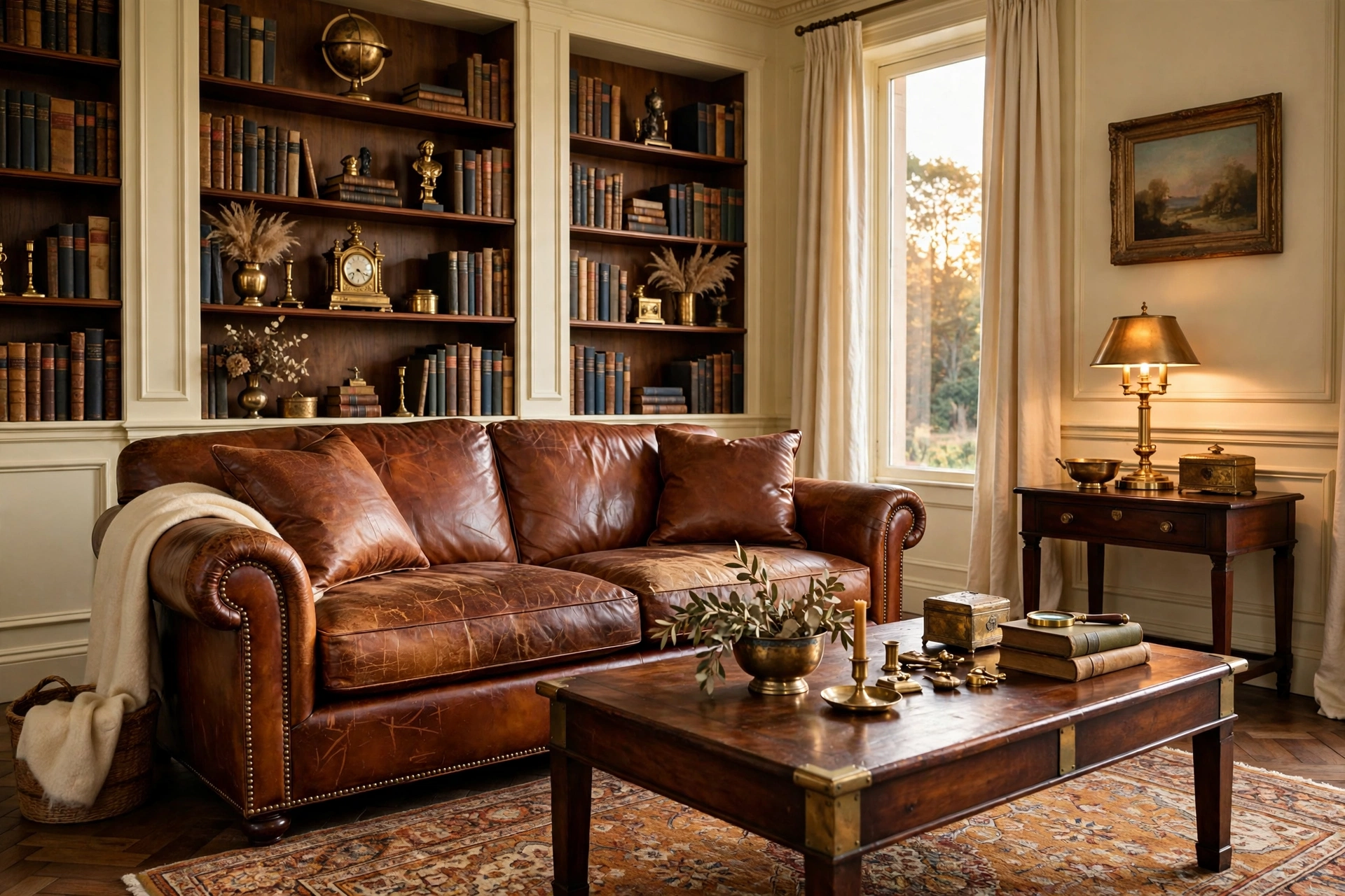
Cognac leather with cream upholstery is the palette of old-money libraries and well-aged style — it only gets better with time. A cognac leather sofa ($800–$1,500, or $200–$400 thrifted) develops a patina that no new furniture can fake, while cream walls and curtains keep the room light. Add dark wood ($100–$300 for a coffee table) and brass ($15–$40 for decor) for the full heritage look. This is a buy-once palette: the pieces are timeless and the colors never date. Pro tip: condition cognac leather twice a year ($12 for cream) — dry indoor heating is leather’s enemy, and ten minutes of care prevents cracking for decades.
14. Warm Beige & Espresso
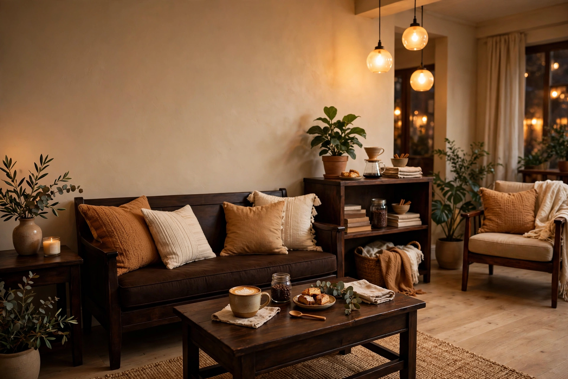
Warm beige walls with espresso-dark wood is the coffee-shop palette — comforting, familiar, and impossible to get wrong. The dark wood (espresso-stained or naturally dark walnut, $80–$250 for key pieces) adds the contrast that all-beige rooms lack, while beige keeps things soft. Layer in caramel and cream textiles ($15–$35 per pillow) for depth. This palette is a landlord-special killer: it makes beige rental walls look intentional instead of default. It’s also the easiest palette to shop for because every store carries these tones. Pro tip: the magic ratio is 70% beige, 20% espresso, 10% accent — too much dark wood and the room feels heavy; too little and it feels washed out.
15. Apricot & Sage
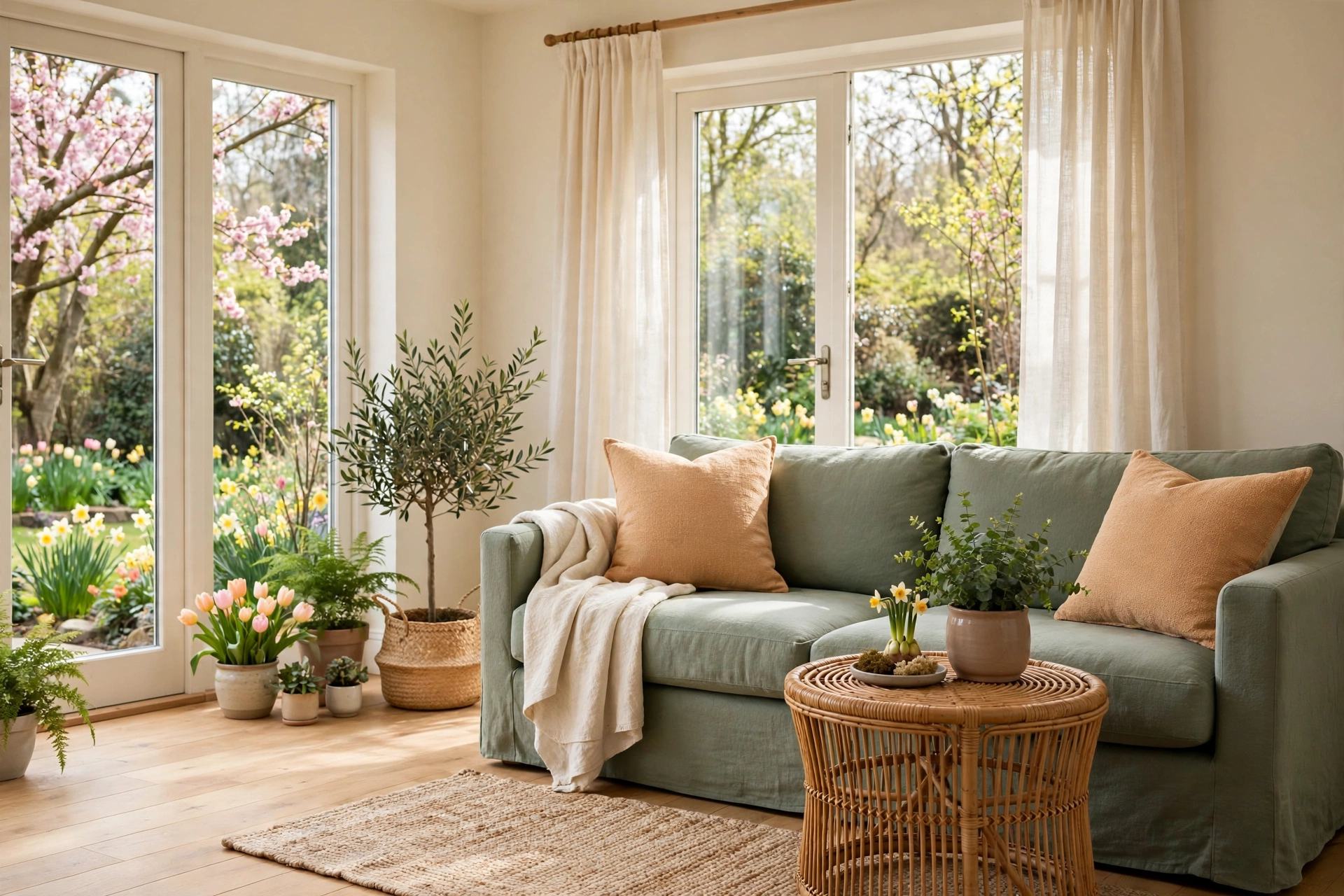
Apricot — peach’s more sophisticated sibling — with sage green is the palette of spring gardens and fresh starts. It’s unexpected, which is exactly why it works: apricot throw pillows ($15–$30) on a sage sofa ($400–$700), cream walls, light wood floors. The combination is complementary-adjacent on the color wheel, creating gentle tension that feels alive. This palette suits well-lit living rooms where the colors can glow. Add rattan ($20–$50) for texture and keep metals light — brushed nickel or light brass. Pro tip: apricot fades in direct sun — use it in pillows and throws you can rotate, not in curtains that bake in a south window all day.
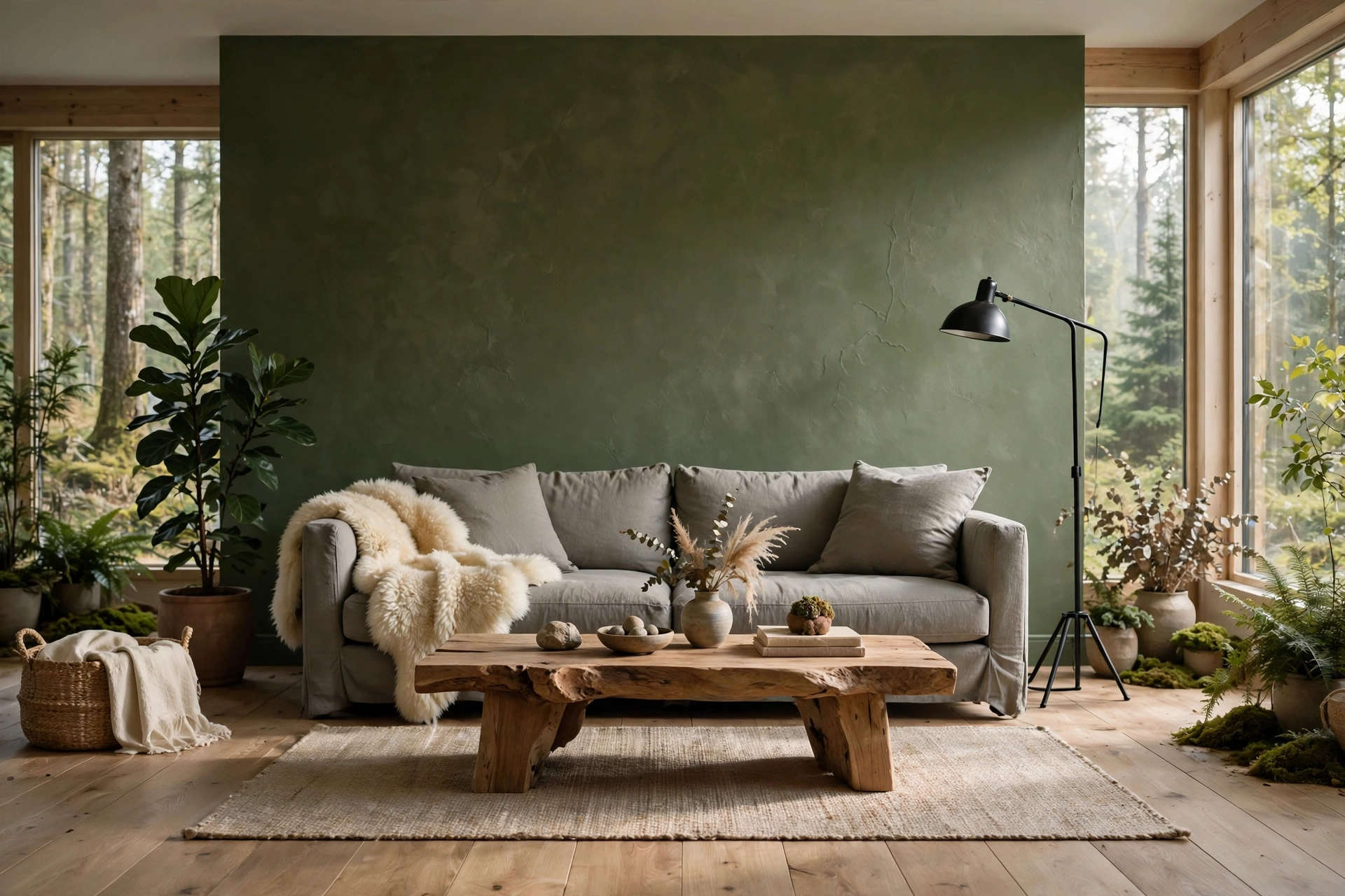
16. Moss & Natural Stone
Moss green with stone gray is the palette of forest floors — grounding, organic, deeply restful. A moss-green accent wall ($30–$45) or sofa ($450–$800) with stone-gray upholstery and raw wood creates a living room that lowers your blood pressure. This combination is biophilic design at its simplest: it brings nature’s most calming colors indoors without a single plant (though plants love this palette too). Add cream sheepskins ($25–$45) for softness and black metal ($10–$20) for definition. Pro tip: moss green needs good lighting or it goes muddy — if your living room is dark, use moss in smaller doses (pillows, art) and keep walls light.
Bold & Dramatic Palettes
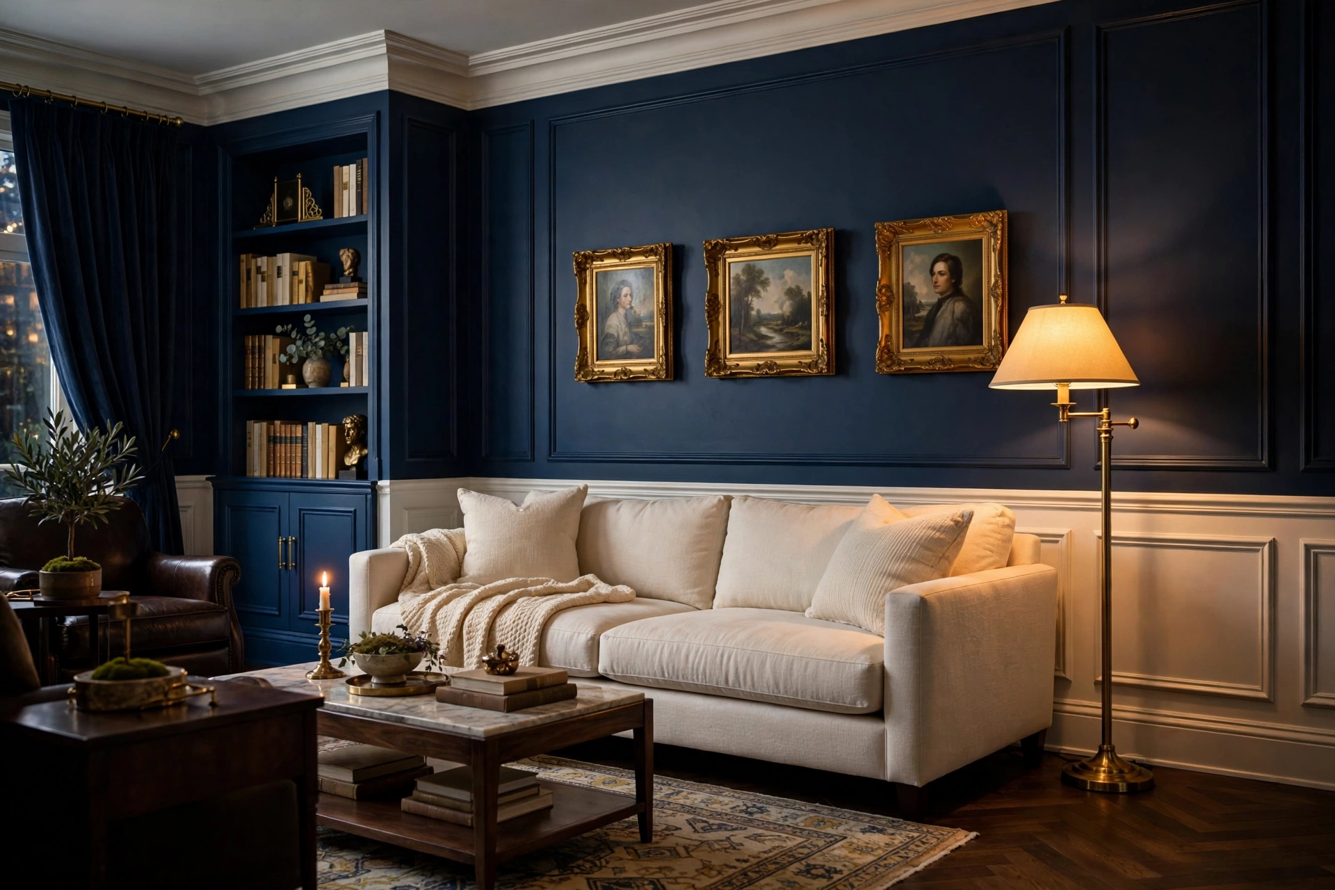
17. Navy Blue & Brass
Navy walls with brass accents is the palette of private clubs and confident design — dramatic but never tacky. A navy accent wall ($30–$45) behind a cream or camel sofa ($400–$800) with brass floor lamp ($80–$160) and gold-framed art ($15–$30 per frame) creates instant sophistication. Navy is the most livable dark color: it recedes like black but feels warmer and more interesting. It also makes white trim pop beautifully. For renters, navy curtains ($25–$45 per panel) give 70% of the effect with zero paint. Pro tip: navy needs warm light — cool white bulbs turn it flat and cold, while 2700K warm bulbs make it glow like ink.
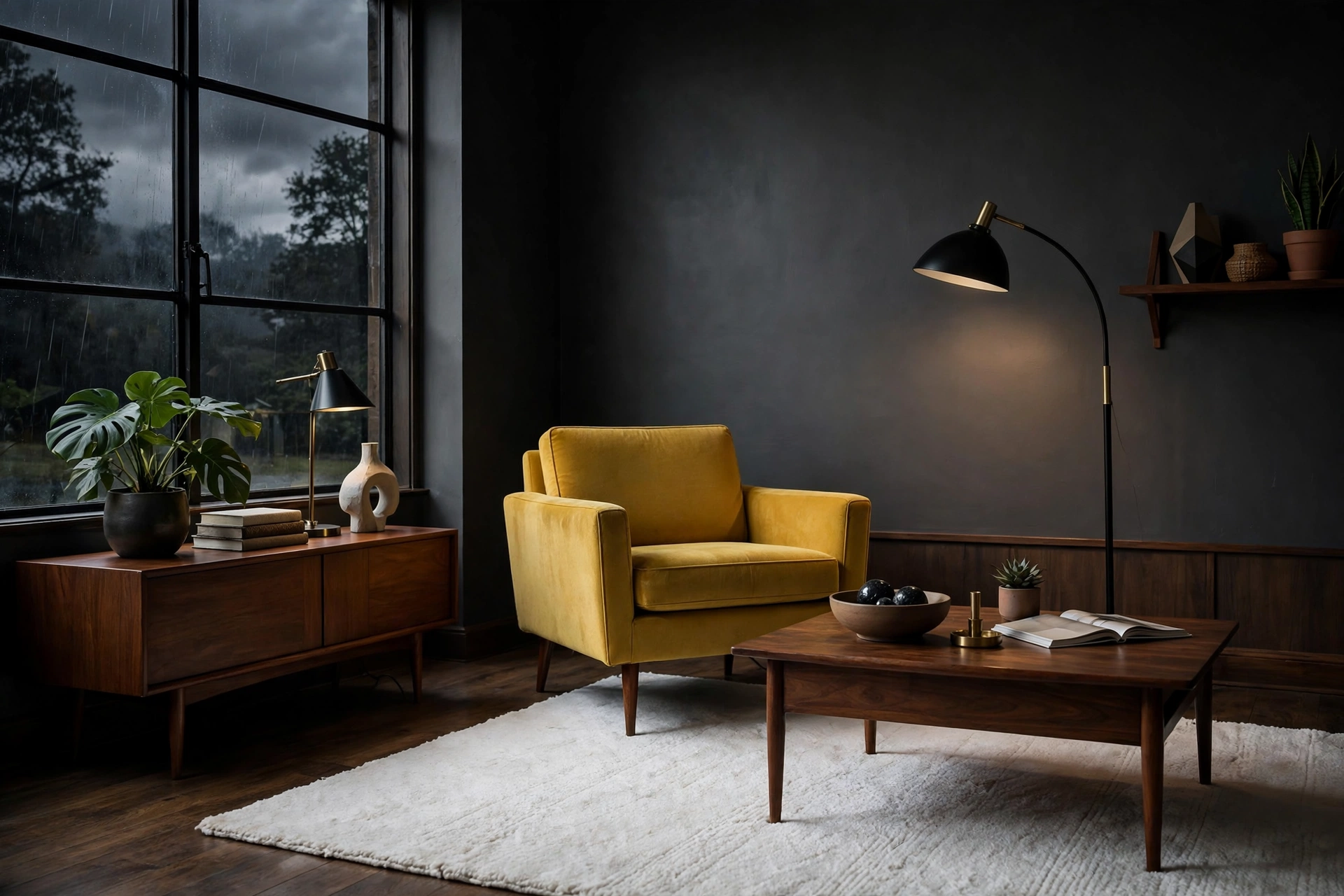
18. Charcoal & Mustard
Charcoal gray with mustard yellow is the palette of mid-century cool — graphic, confident, endlessly stylish. Charcoal walls ($30–$45) or a charcoal sofa ($450–$850) with mustard armchair ($180–$350) and walnut wood creates the contrast that makes both colors sing. This is a high-impact palette that works in small living rooms because dark walls recede, making the space feel larger, not smaller. Add white for breathing room — a white rug or curtains prevents the charcoal from closing in. Pro tip: mustard is powerful — limit it to 10-15% of the room (one chair, a few pillows) or the accent becomes the whole story.
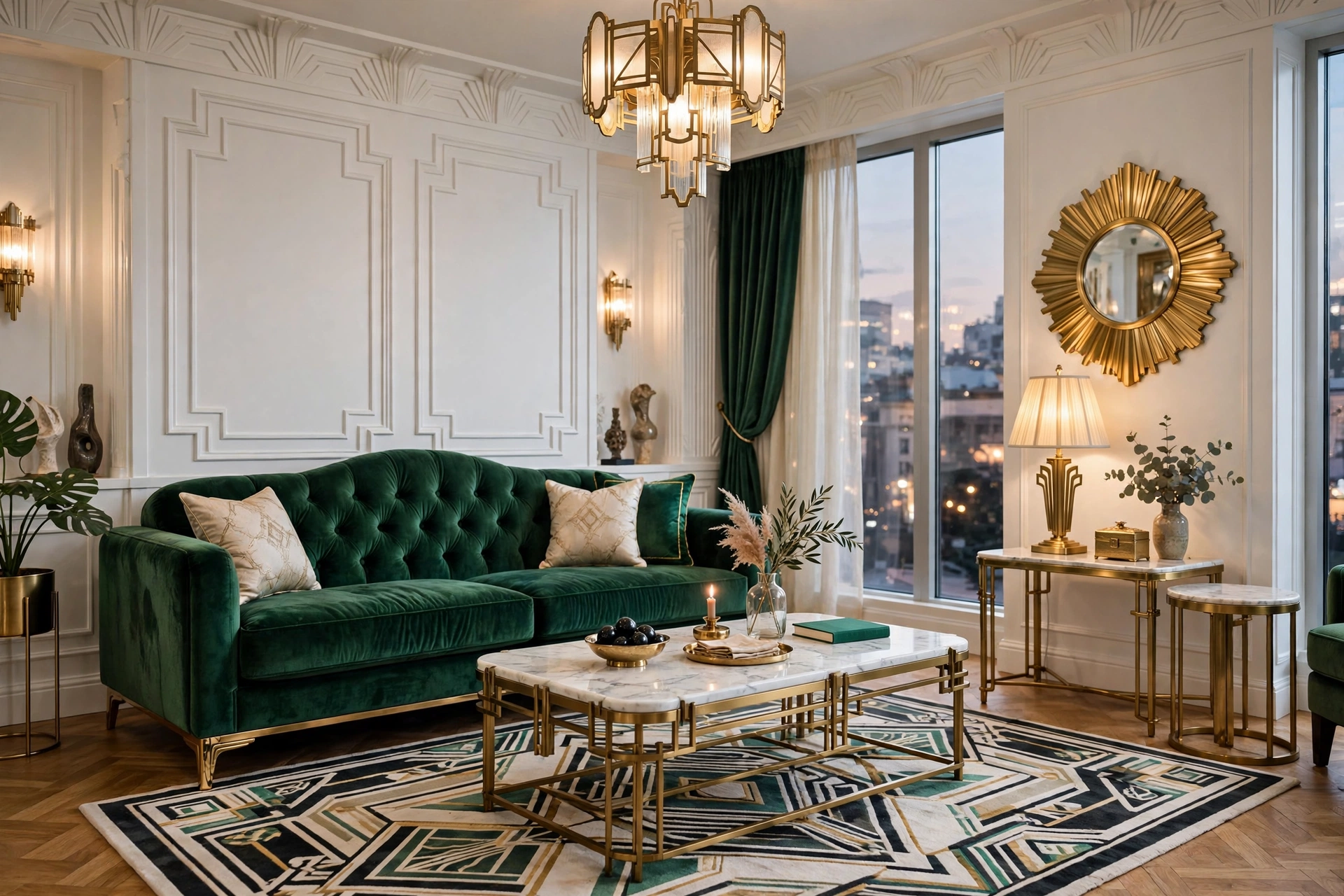
19. Emerald Green & Marble White
Emerald green with crisp white marble is the palette of Art Deco glamour — jewel-toned, luxurious, unapologetic. An emerald velvet sofa ($500–$1,000) against white walls with a marble coffee table ($150–$400) and brass accents ($15–$40) creates a living room that feels like a boutique hotel. Emerald is the green that loves the spotlight — it needs good lighting to show its depth. This palette suits living rooms that double as entertaining spaces because it photographs beautifully and impresses guests. Pro tip: emerald velvet shows every impression — vacuum monthly with an upholstery attachment and rotate cushions to keep the nap even.
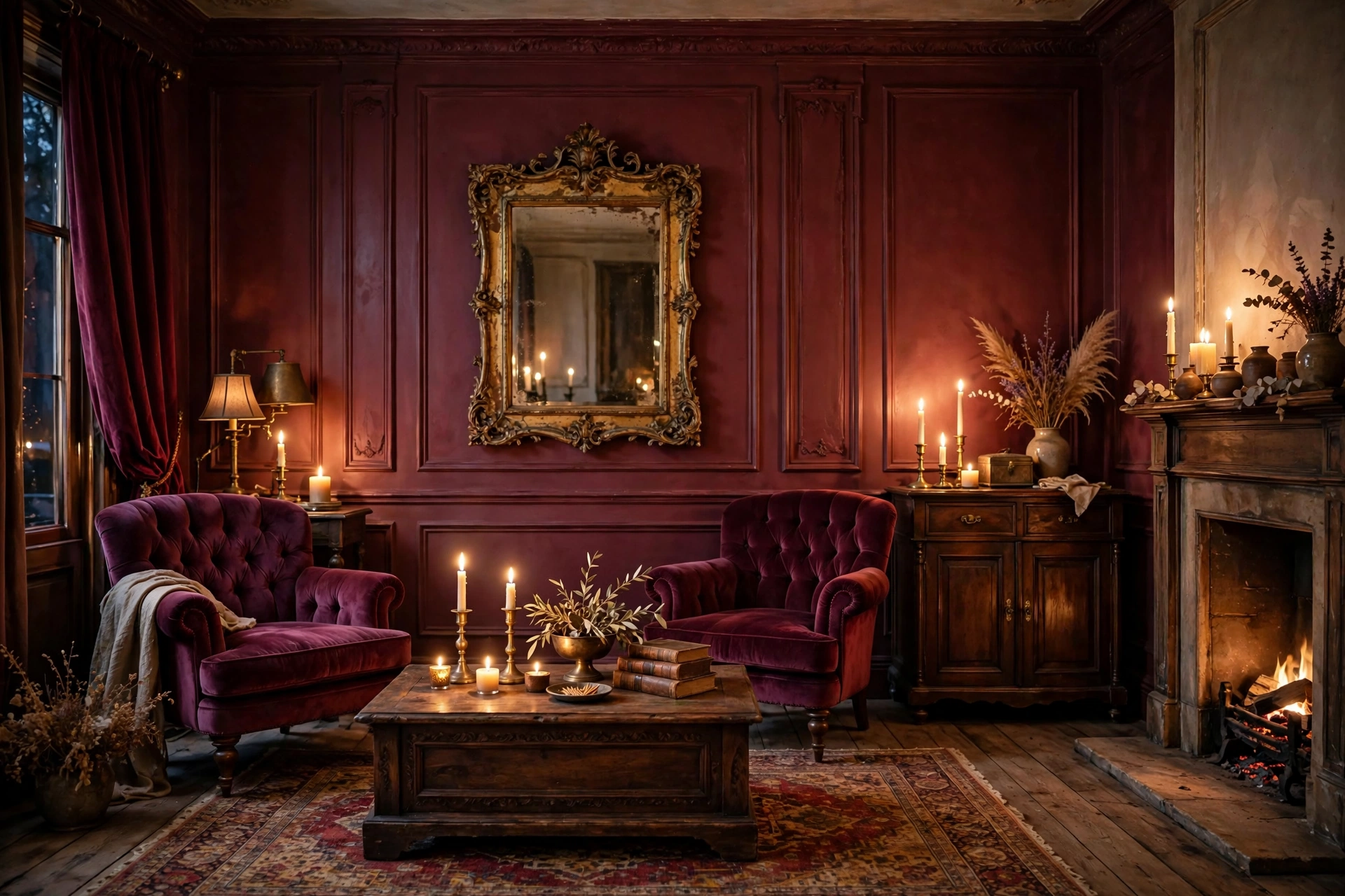
20. Burgundy & Antique Gold
Burgundy with antique gold is the palette of old-world romance — rich, warm, enveloping. A burgundy accent wall ($30–$45) or velvet chairs ($200–$400 each) with aged-gold mirrors ($40–$90) and dark wood creates a living room that feels like a hug. This combination is at its best in fall and winter when the colors echo the season, but it works year-round with the right lighting. Keep the gold aged and brushed, not shiny — patina is what keeps this palette sophisticated instead of gaudy. Pro tip: burgundy absorbs light aggressively — you’ll need 30% more lighting than in a light room, so layer table lamps, floor lamps, and candles.
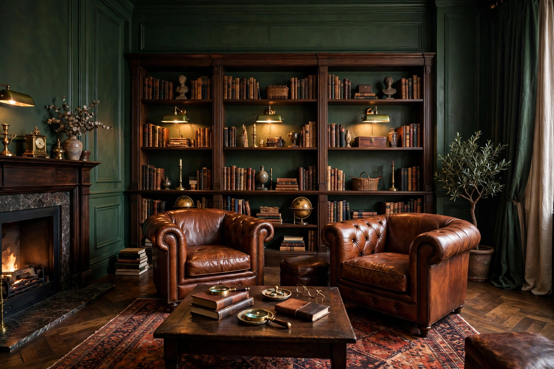
21. Forest Green & Cognac Leather
Forest green walls with cognac leather is the palette of a gentleman’s study — deep, rich, timeless. The green ($30–$45 for paint) provides the enveloping backdrop while cognac leather chairs ($300–$600 each) add the warmth and patina. Add brass library lamps ($50–$100) and dark wood bookshelves ($150–$400) for the full effect. This is a palette that rewards patience: the leather improves yearly, the green never dates, and the whole room feels more valuable over time. Pro tip: forest green can feel flat without texture — add grasscloth wallpaper ($80–$150 per roll) or limewash paint ($40–$60) for depth that flat paint can’t deliver.
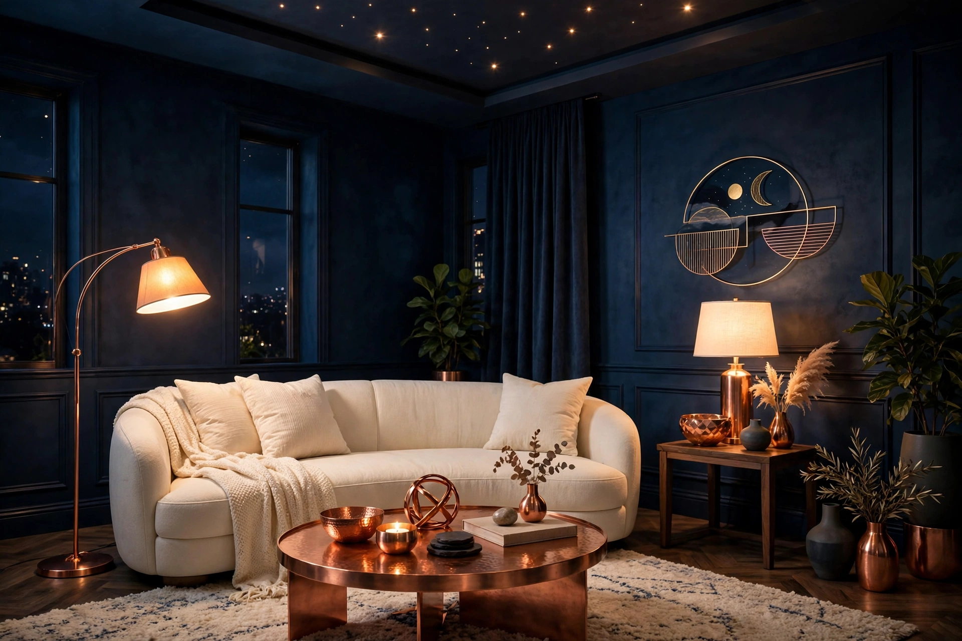
22. Midnight Blue & Copper
Midnight blue — nearly black, but bluer — with warm copper is the palette of night skies and modern luxury. The blue recedes dramatically, making walls disappear, while copper ($20–$50 for decor pieces) catches light and adds warmth. Use it with light upholstery to prevent cave-feel: a cream sofa ($400–$750) against midnight walls is stunning. This palette is made for evening entertaining — it glows under lamplight in a way light rooms can’t match. Pro tip: real copper tarnishes — if you love the bright penny look, choose lacquered copper or copper-toned metal that keeps its shine without polishing.
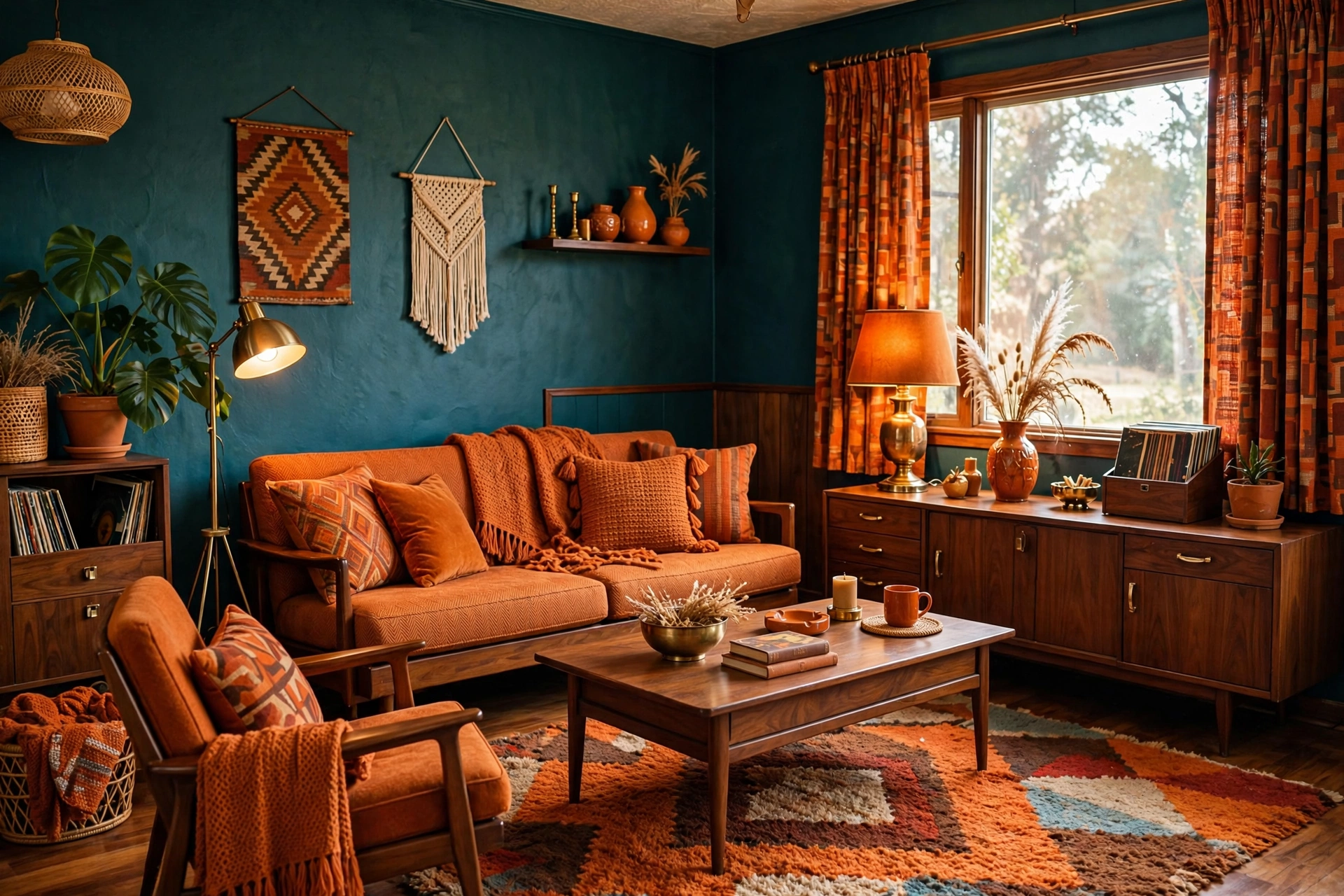
23. Deep Teal & Burnt Orange
Deep teal with burnt orange is the palette of 1970s design at its best — bold, warm, and surprisingly livable. The teal ($30–$45) provides the cool anchor while burnt orange textiles ($15–$35 per pillow) add the sunset warmth. This is a complementary color pairing, so the contrast is electric — use the 80/20 rule (80% teal, 20% orange) to keep it sophisticated. Add walnut wood ($80–$200) and brass ($15–$30) to bridge the two. Pro tip: this palette is light-sensitive — teal goes green in warm light and blue in cool light, so test your paint under your actual bulbs before committing.
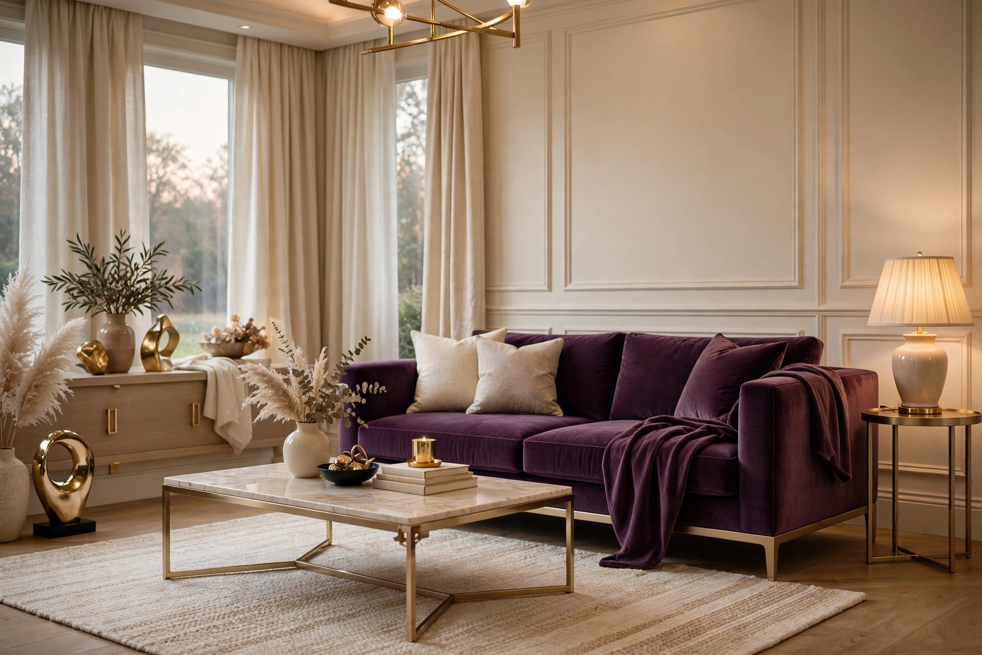
24. Plum & Champagne
Plum purple with champagne gold is the palette of quiet luxury — unexpected, refined, memorable. A plum accent wall ($30–$45) or velvet sofa ($450–$850) with champagne-toned metals ($20–$50) and cream upholstery creates depth without darkness. Plum is the purple that adults can love — it’s wine-dark, not Barney-bright. This palette suits small living rooms on a budget because one plum piece transforms the whole room. Pro tip: plum pairs beautifully with both warm and cool tones, making it one of the most flexible dark colors — it works with gray, beige, white, and wood alike.
Modern & Versatile Palettes
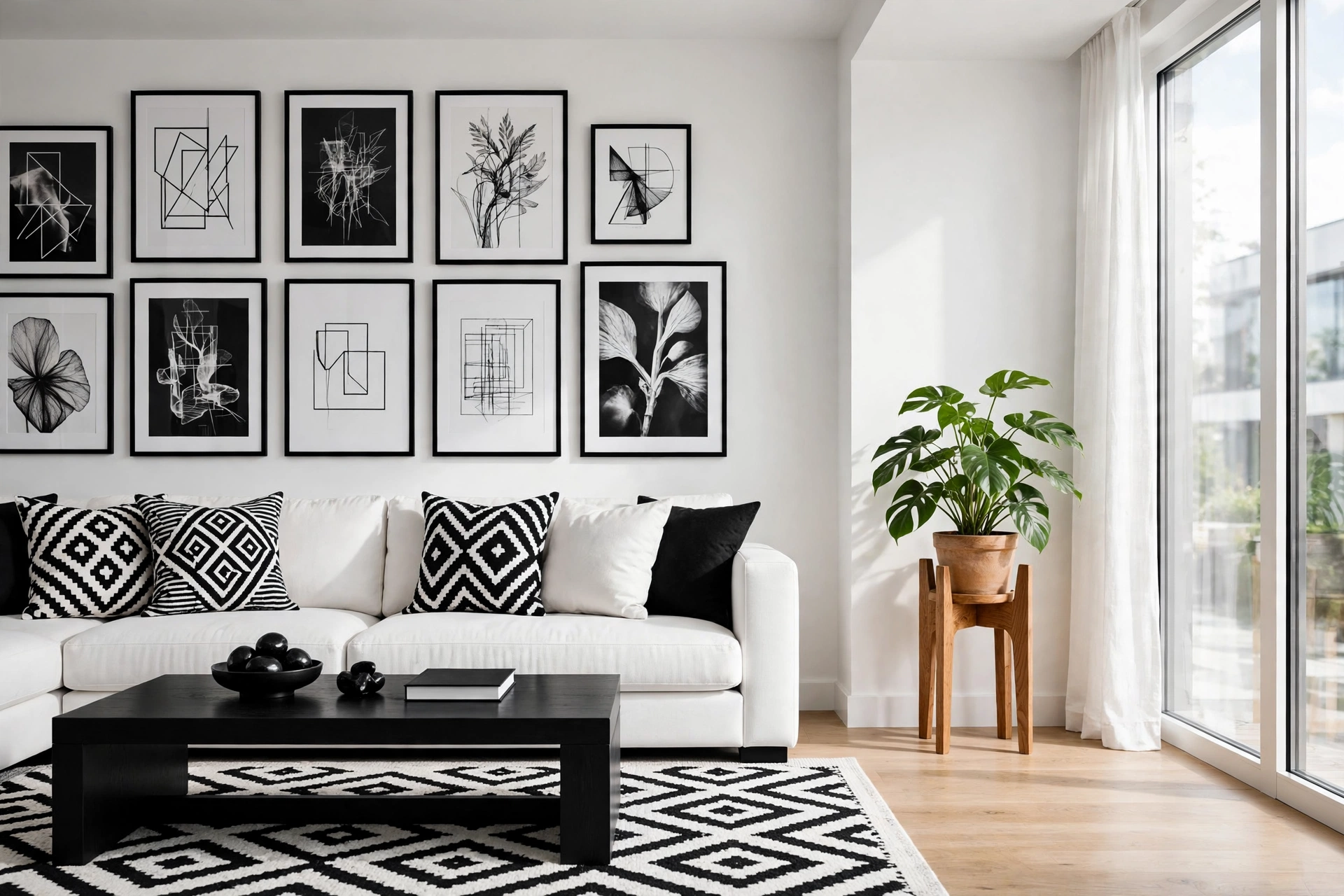
25. Black & White (Modern Monochrome)
Black and white never goes out of style — it’s the palette of graphic designers and timeless interiors. The trick is the ratio and the textures: 70% white, 20% black, 10% wood or metal to warm it up. A white sofa ($400–$800), black coffee table ($100–$250), black-and-white art ($20–$50 per print), and one natural element (wood, plant, jute) prevents the starkness. This palette is the ultimate backdrop for colorful art — the room becomes a gallery. It’s also the cheapest to maintain because everything matches. Pro tip: pure white walls with black accents can feel harsh — use soft white (not blue-white) and add at least three textures (linen, wood, wool) for warmth.
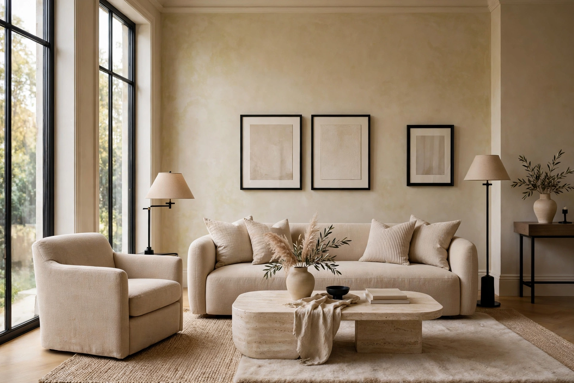
26. Beige & Black Accents
Warm beige with sharp black accents is the palette of quiet luxury — soft where it counts, defined where it matters. Beige walls and upholstery ($300–$700 for a sofa) with black window frames, black lamp bases ($30–$70), and black picture frames ($8–$15) creates the contrast that makes beige interesting. This is the grown-up version of all-beige: the black adds the edge. It’s incredibly livable — beige hides everything, black adds structure, and the combination works with any wood tone. Pro tip: distribute black in at least three places (not just one) — a single black item looks like a mistake, while three looks like a decision.
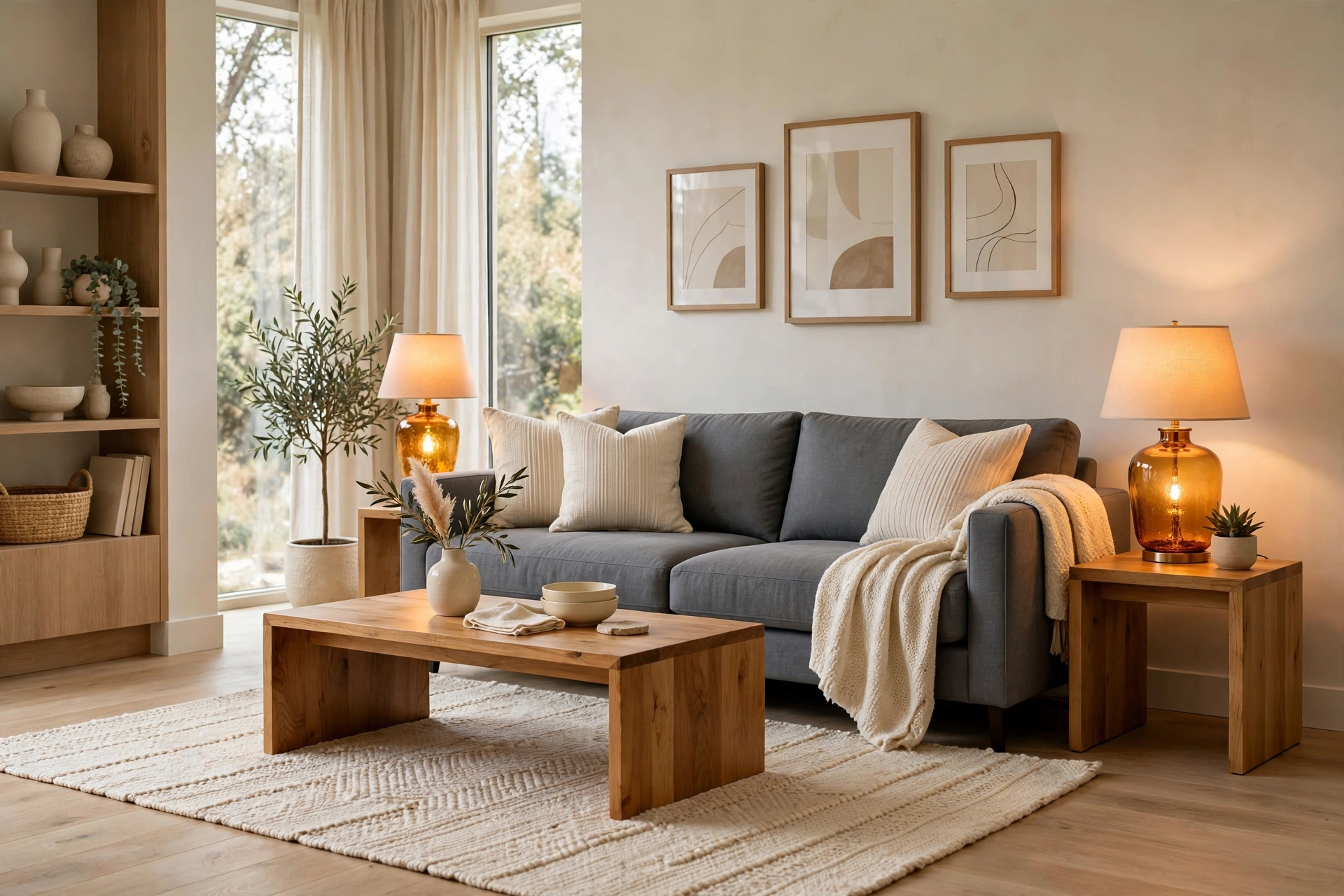
27. Slate Gray & Amber
Slate gray with warm amber is the palette of cozy modernism — cool enough to feel current, warm enough to feel human. Slate walls ($30–$45) or a slate sofa ($450–$850) with amber glass lamps ($40–$80), honey wood ($60–$150), and cream textiles creates the balance. Amber is gray’s best friend because it adds the warmth that gray alone lacks. This palette works beautifully in open-plan living rooms because it’s neutral enough to flow but interesting enough to define the space. Pro tip: slate gray shifts with light — test it on a large board and move it around the room through the day before painting.
28. Ivory & Dark Walnut
Ivory walls with dark walnut furniture is the palette of classic interiors that never date — it’s been working for a century and will work for another. The high contrast between light walls and dark wood creates the definition that makes rooms feel designed. Add brass ($15–$40) and cream linen ($20–$40 per pillow) for softness. This palette is forgiving of mixed styles — mid-century, traditional, and modern pieces all coexist happily in ivory and walnut. It’s also ideal for showcasing art because the neutral backdrop doesn’t compete. Pro tip: walnut’s richness needs light to show — position dark wood pieces where they’ll catch natural or lamp light, not in dark corners where they disappear.
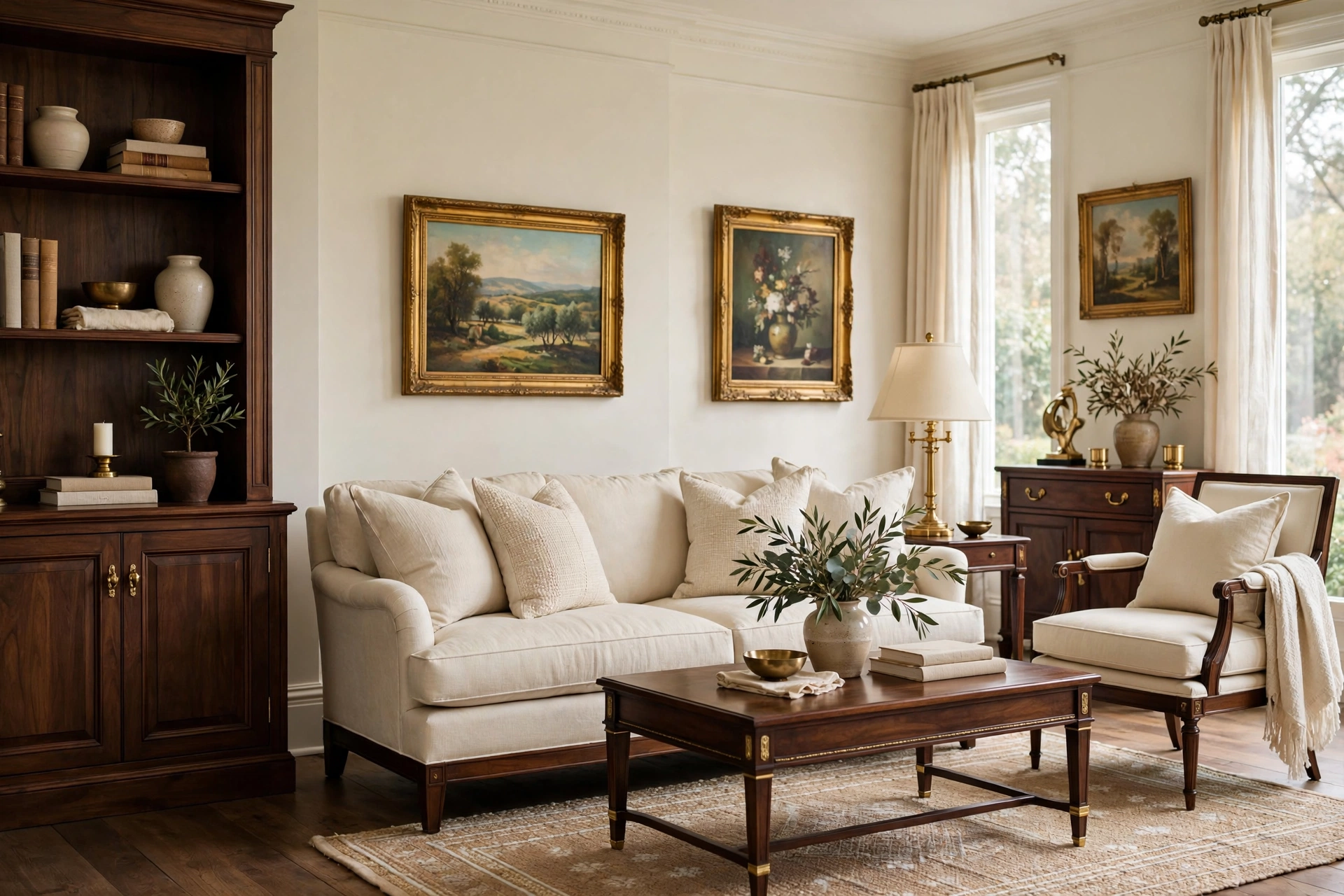
29. Teal & Coral Accents
Teal with pops of coral is the palette of playful sophistication — the teal keeps it grounded while coral adds the joy. Use teal on walls ($30–$45) or a sofa ($450–$800), then add coral in pillows ($15–$30), art, and one statement chair ($180–$350). The coral should be 10-15% max — it’s the exclamation point, not the sentence. This palette loves white trim and light wood floors. It’s a great choice for living rooms that need personality without going full maximalist. Pro tip: coral fades fast in sunlight — use it in easily replaceable items (pillows, throws) rather than expensive upholstery if your room gets strong sun.
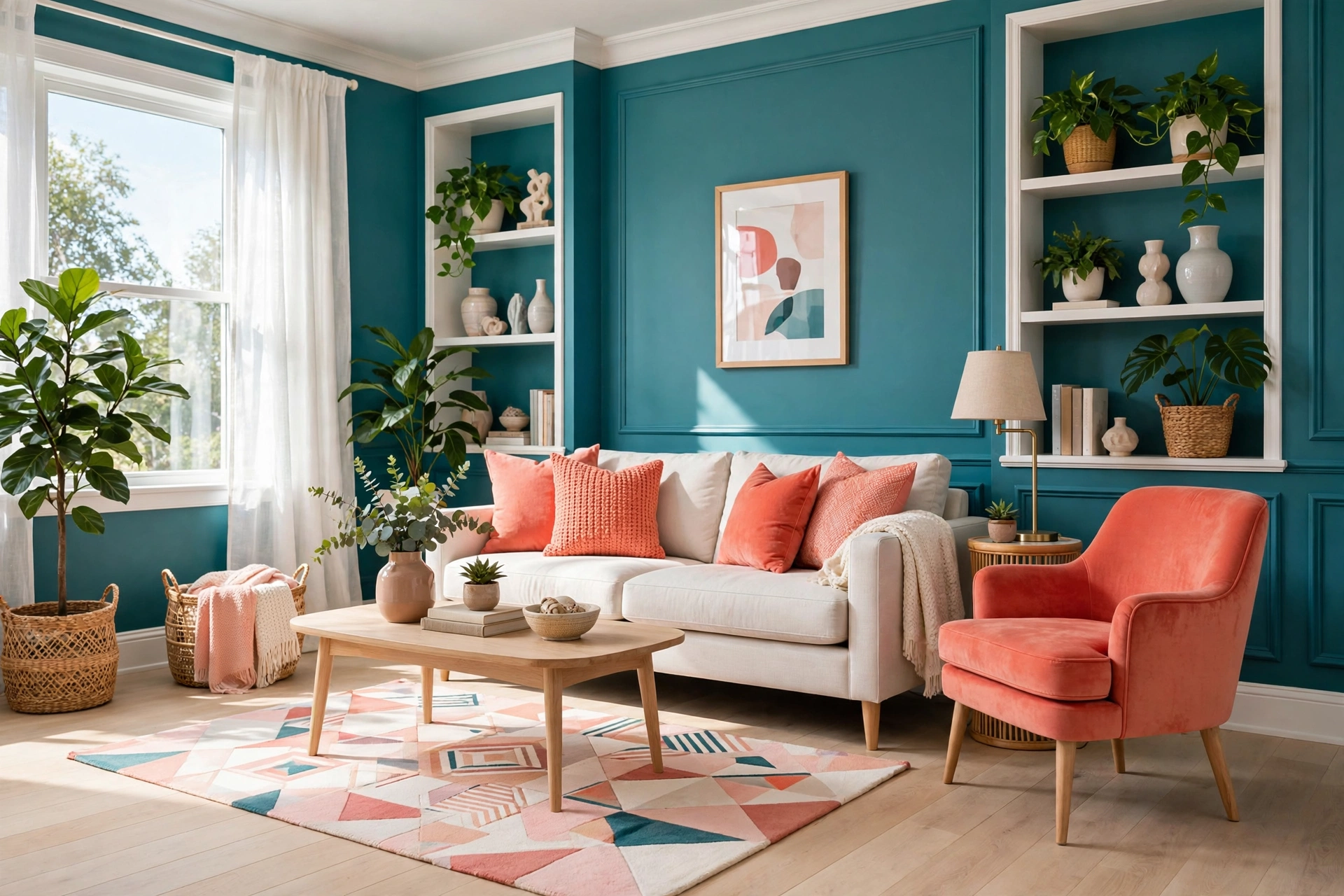
30. Champagne & Warm Taupe
Champagne beige with warm taupe is the palette of understated elegance — it’s what “neutral” looks like when done by a professional. The colors are so close they create a tonal, layered effect that’s incredibly soothing. Use champagne on walls ($30–$45), taupe on upholstery ($400–$750), and add texture through boucle, linen, and wool ($20–$50 per textile). This palette is the ultimate backdrop for beautiful objects — art, ceramics, and books all shine against it. It’s also the most resale-friendly palette if you’re decorating to sell. Pro tip: tonal palettes live or die on texture — with minimal color contrast, you need maximum textural contrast (smooth with rough, matte with sheen).
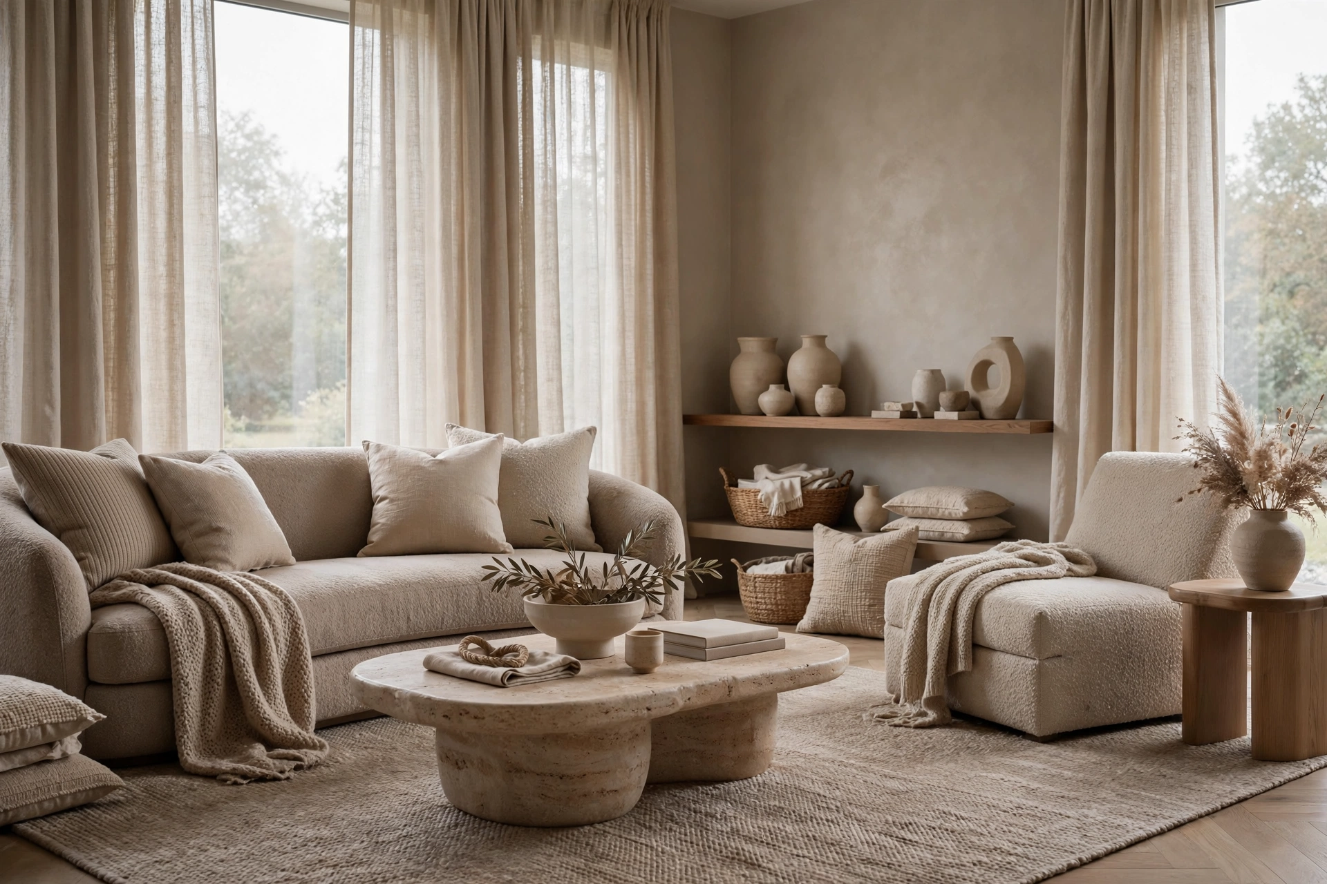
31. Dusty Blue & Warm Wood
Dusty blue — blue with a drop of gray — with warm wood is the palette of Scandinavian calm meets natural warmth. It’s blue without the beach-house cliché, wood without the cabin feel. A dusty-blue sofa ($450–$800) with oak floors and white walls creates a living room that’s serene but not boring. Add cream sheepskins ($25–$45) and black accents ($10–$20) for the full Scandi look. This palette is scientifically calming — blue tones are proven to lower heart rate, making it ideal for living rooms meant for unwinding. Pro tip: dusty blue looks different in every light — it can read gray, blue, or even lavender, so test it in your specific room before committing to large pieces.
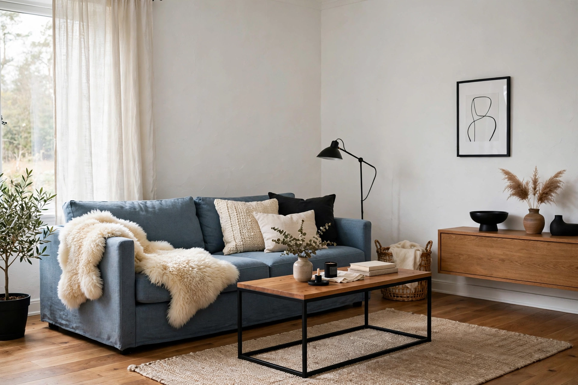
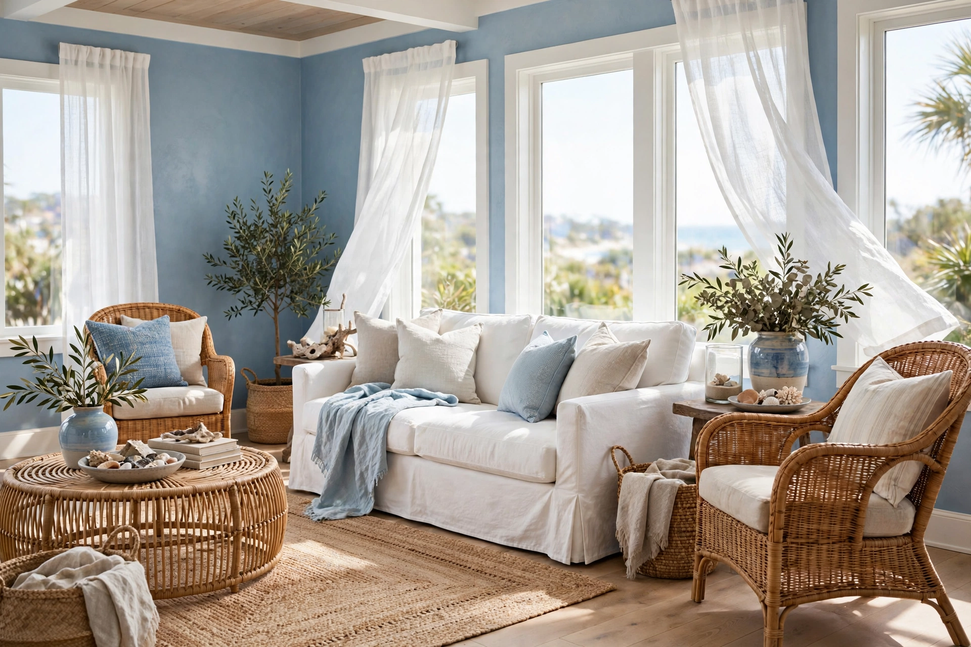
32. Powder Blue & Natural Rattan
Powder blue with natural rattan is the palette of breezy, collected interiors — light, textured, effortlessly charming. Powder-blue walls ($30–$45) or textiles with rattan chairs ($80–$200 each), jute rugs ($60–$150), and white slipcovers creates a room that feels like a permanent vacation. This palette is naturally budget-friendly because rattan and jute are affordable and powder blue paint is cheap. It works year-round — fresh in summer, cozy with added throws in winter. Pro tip: natural rattan varies in tone — buy rattan pieces together or embrace the variation as part of the collected charm.
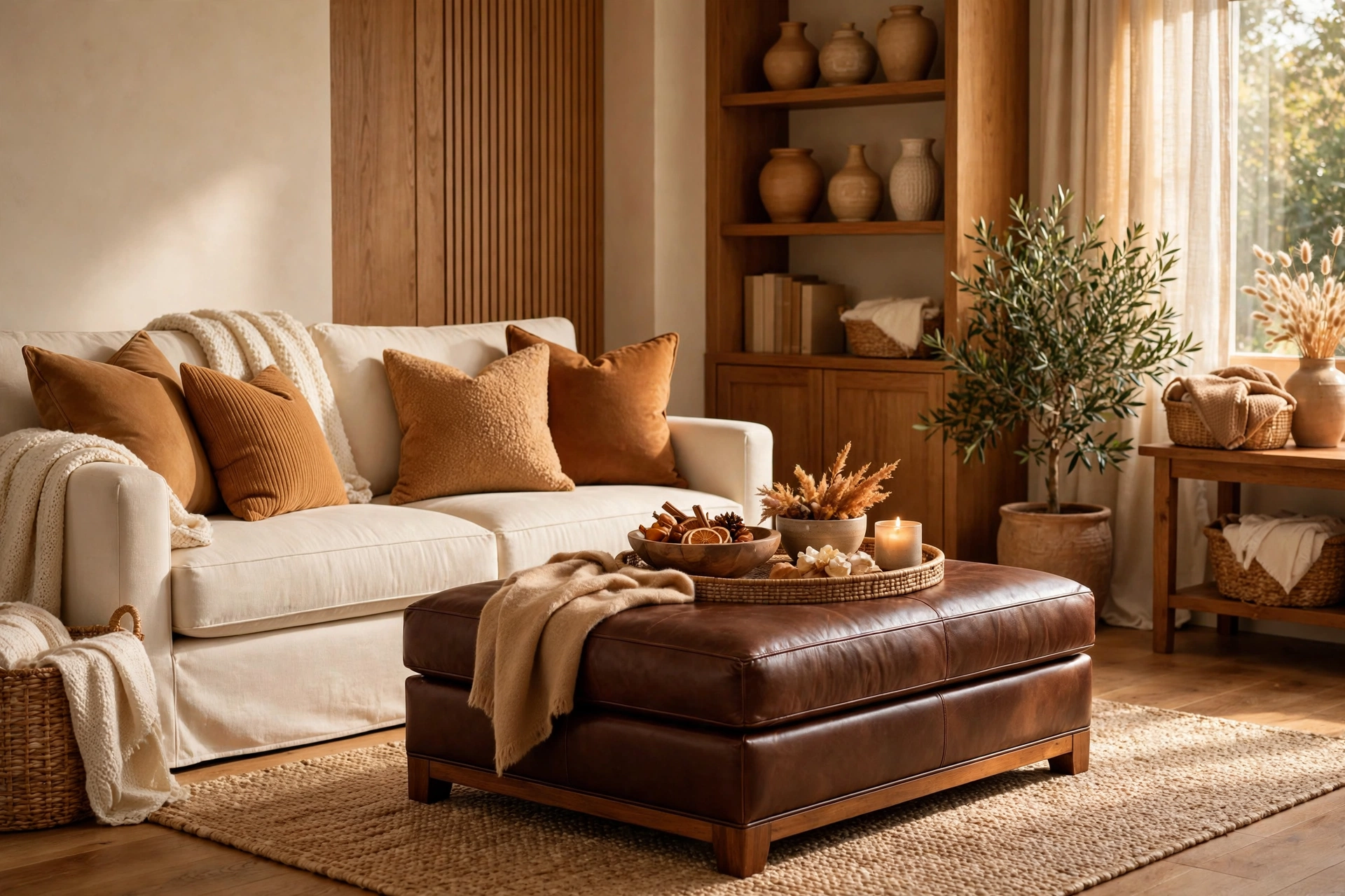
33. Cream & Chocolate Brown
Cream with rich chocolate brown is the palette of desserts — sweet, comforting, indulgent. Cream walls and upholstery ($350–$700 for a sofa) with chocolate-brown leather or wood ($100–$300) creates the contrast that makes both colors richer. Add caramel accents ($15–$35) to bridge the two. This palette is incredibly cozy — it’s the color equivalent of hot chocolate. It works in both traditional and modern rooms because the contrast is classic. For a modern edge, use the chocolate in clean-lined pieces rather than ornate ones. Pro tip: chocolate brown can feel heavy in small rooms — use it in lower pieces (coffee table, ottoman) and keep eye-level elements light.
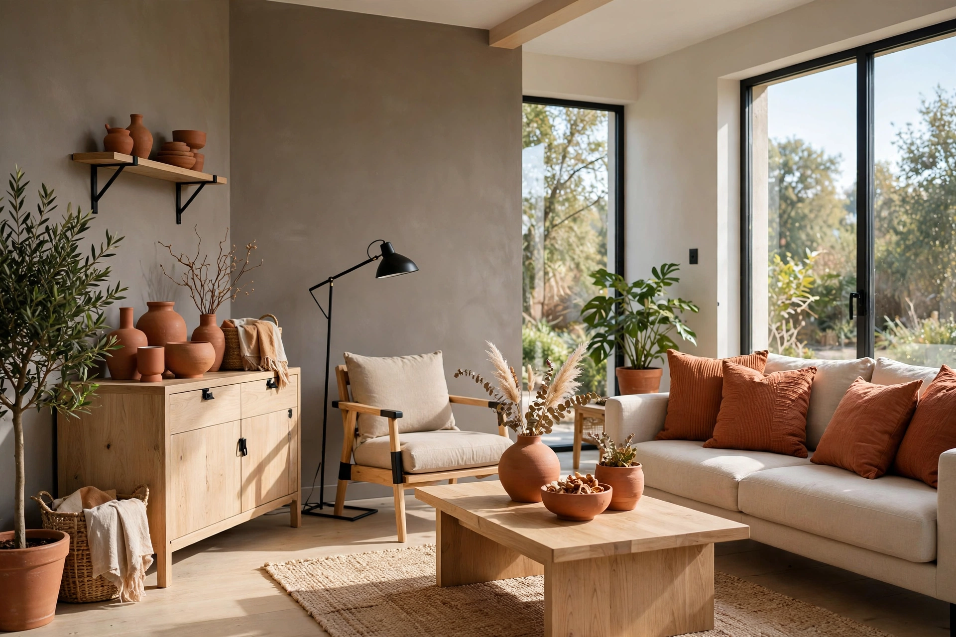
34. Warm Gray & Terracotta Accents
Warm gray walls with terracotta accents is the palette of modern earthiness — the gray keeps it current while terracotta adds the soul. This is the 2026 way to do gray: not the cold corporate gray of the 2010s, but a warm, enveloping gray ($30–$45) warmed further by terracotta pillows ($15–$30), throws, and ceramics ($15–$40). Add light wood ($60–$150) and black metal ($10–$25) for the complete modern-organic look. It’s the palette for people who want neutral but not boring. Pro tip: warm gray is all about undertone — pink-beige undertones feel cozy, green-gray undertones feel fresh. Choose based on the mood you want, then match your terracotta to it.
Frequently Asked Questions
How do I choose a color palette for my living room?
Start with your fixed elements — flooring, existing furniture you love, and the room’s natural light. Then pick one dominant color (walls or sofa, 60% of the room), one secondary (curtains, rug, 30%), and one accent (pillows, art, 10%). Test paint colors on large boards in your actual light before committing. If you’re overwhelmed, start with a neutral base (warm white, greige) and add color through textiles you can change cheaply.
What is the most popular living room color palette right now?
Warm neutrals dominate 2026 — warm whites, greiges, warm beiges, and soft taupes paired with natural wood and one earthy accent (terracotta, olive, or clay). The cold grays of the 2010s have given way to colors with warmth and life. That said, the “most popular” palette matters less than the one that suits your light, your furniture, and how you actually live.
Can I use dark colors in a small living room?
Absolutely — dark walls recede visually, which can make a small living room feel larger, not smaller. The key is contrast and lighting: pair dark walls with light upholstery, add plenty of lamps (dark rooms need 30% more light), and use mirrors to bounce light around. Navy, charcoal, and forest green are the most forgiving dark choices for small spaces.
How many colors should a living room palette have?
Five is the magic number: a wall color, a large-furniture neutral, a wood tone, a textile color, and one metallic or accent. Fewer than three feels flat; more than seven feels chaotic. All 34 palettes in this guide follow this structure — even the bold ones are really just five colors working together. Neutrals (white, wood, metal) don’t count toward your “color” total, so a “three-color” palette usually involves five to six actual tones.
What colors make a living room look expensive?
Depth and restraint read as expensive: layered neutrals (champagne, taupe, greige) with one rich accent (emerald, navy, cognac), natural materials (real wood, linen, wool), and warm metals (brass, bronze). Avoid matching sets — the collected look always reads more expensive than the showroom set. And lighting matters enormously: warm 2700K bulbs, layered lamps, and dimmers make any palette look richer.
I’m renting — how do I get these palettes without painting?
Textiles do 80% of the work: curtains, rugs, throw pillows, and slipcovers in your palette colors transform a room without touching the walls. Removable wallpaper ($30–$60 per roll) creates an accent wall that peels off cleanly. Large art prints in your palette colors ($15–$40 framed) add color at eye level where it matters most. And furniture in your wood tone and accent color anchors the palette regardless of wall color.
Final Thoughts
A living room color palette isn’t a rulebook — it’s a starting point. The 34 palettes above give you proven combinations, but the best living rooms always have one personal twist: the inherited chair in the “wrong” color that you love anyway, the art that breaks every rule, the textile from a trip that doesn’t match but somehow completes the room. Use these palettes as your foundation, then let your life add the layers.
Start where the impact is highest: textiles first (pillows, throws, curtains), then one larger move (a painted accent wall, a new sofa color, a rug that ties it together). Live with each change for a week before adding the next — color reveals itself slowly, and the palette that looks perfect on day one sometimes needs adjusting by day seven. Trust the process, test in your light, and remember that the “right” palette is the one that makes you exhale when you walk in the door.

One Comment