
36 Bedroom Color Palettes That Transform Your Sleep Space
36 Bedroom Color Palettes That Transform Your Sleep Space
Color is the fastest way to change how a bedroom feels — faster than new furniture, cheaper than a renovation, and more powerful than almost any single decor decision. The right bedroom color palette can make a small room feel airy, a dark room feel cozy, and a restless mind finally settle at night. But with thousands of paint swatches and endless Pinterest boards, choosing a palette that actually works in real life (not just in photos) feels overwhelming. That’s why we built this guide: 36 bedroom color palettes, each one a complete, designer-tested combination of wall colors, textiles, wood tones, and accents that work together. From calm Scandinavian neutrals and nature-inspired greens to warm terracotta earth tones, serene blues, romantic blush hues, and bold dramatic schemes — every palette includes exact color direction, budget-friendly ways to get the look, and a pro tip for making it sing. Whether you’re painting this weekend or just swapping bedding and curtains, you’ll find a palette here that turns your bedroom into the restful retreat it should be.
Calm & Restful Neutrals
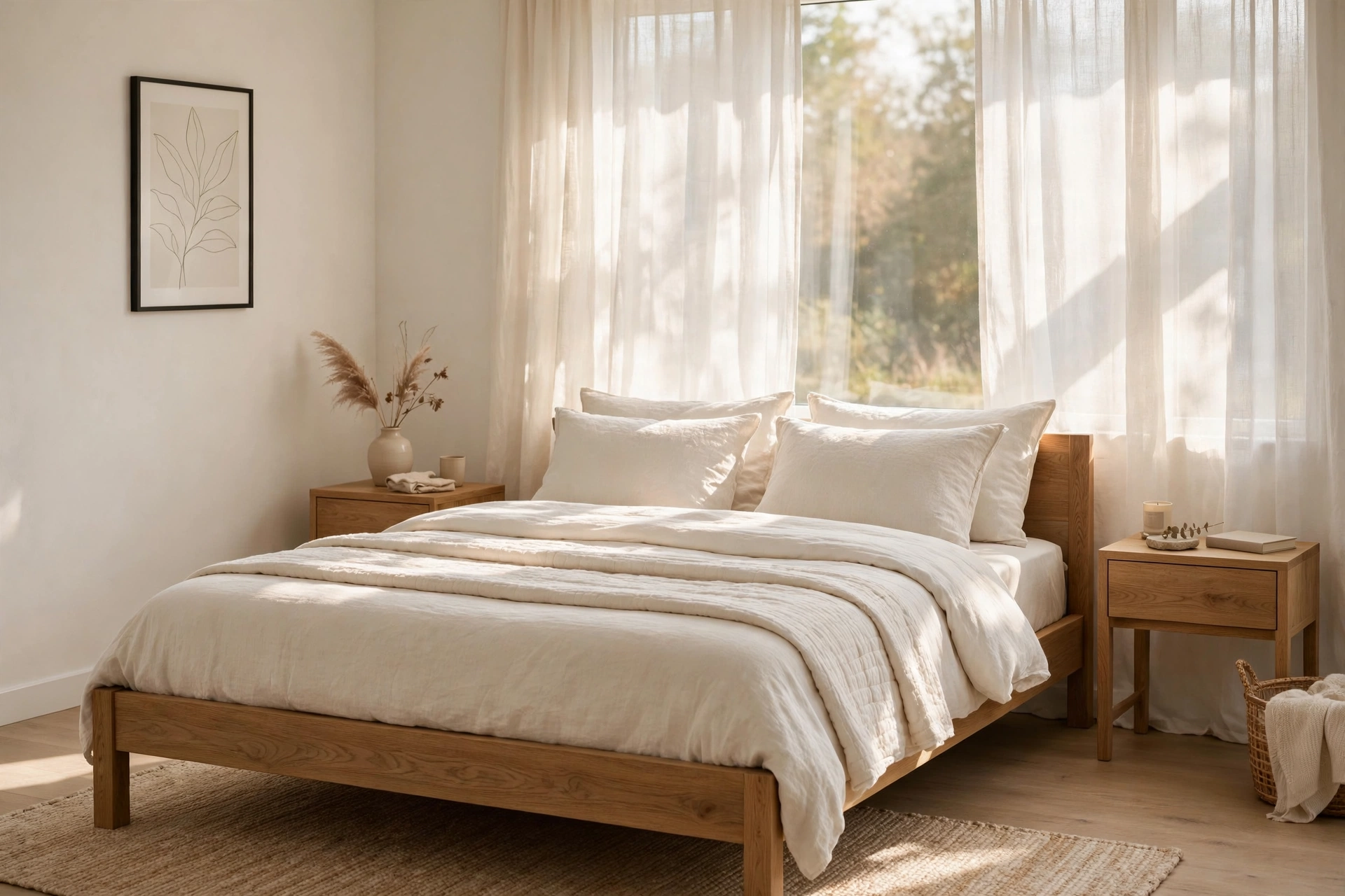
1. Warm White + Natural Oak
Warm white walls with natural oak furniture is the palette that never fails — soft, sunlit, and endlessly calming. Choose a white with a creamy undertone (think Benjamin Moore White Dove style, $45–$60 per gallon) rather than stark blue-white, which can feel clinical in a bedroom. Pair it with light oak nightstands, a natural-finish bed frame ($200–$500), and ivory linen bedding ($60–$120). The warmth comes from the wood grain, so let it show: skip heavy stains and keep finishes natural or lightly oiled. Pro tip: paint the ceiling the same warm white as the walls — it erases the visual boundary overhead and makes even a low 8-foot ceiling feel taller and airier.
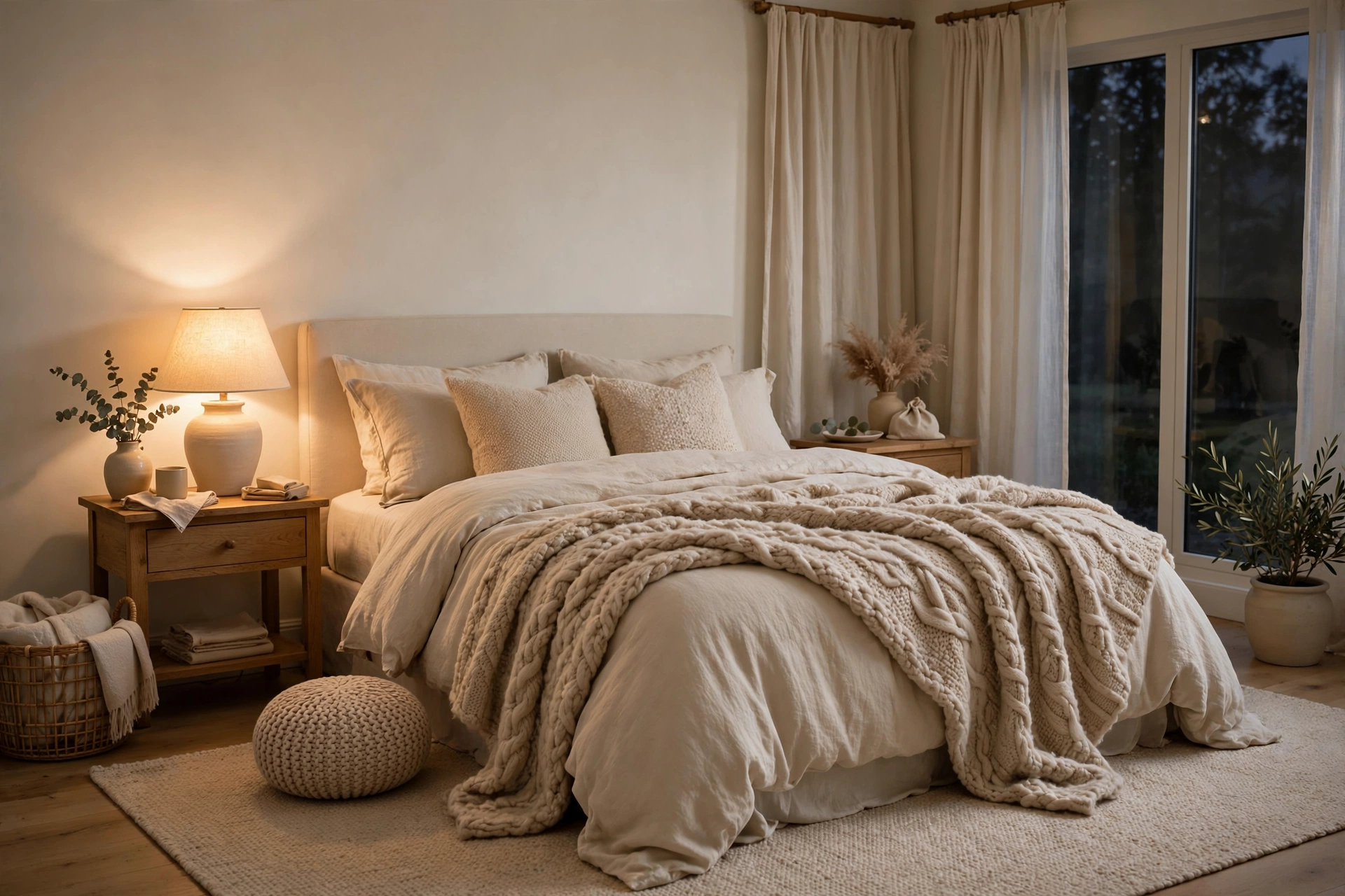
2. Ivory + Soft Beige
Ivory walls layered with soft beige textiles create a cocoon-like bedroom that feels like a deep exhale. This palette works beautifully in rooms with limited natural light, because the warm undertones bounce what light exists instead of absorbing it. Start with ivory walls ($40–$55 per gallon), then layer beige in three textures: a nubby wool throw ($35–$70), linen duvet cover ($70–$130), and a low-pile beige area rug ($80–$160). Keep the layers tonal — within two shades of each other — so the room reads calm, not flat. Pro tip: add one slightly darker beige accent, like a lumbar pillow or throw at the foot of the bed, to give the eye a place to land; all-one-tone rooms can feel unfinished without a single anchor.
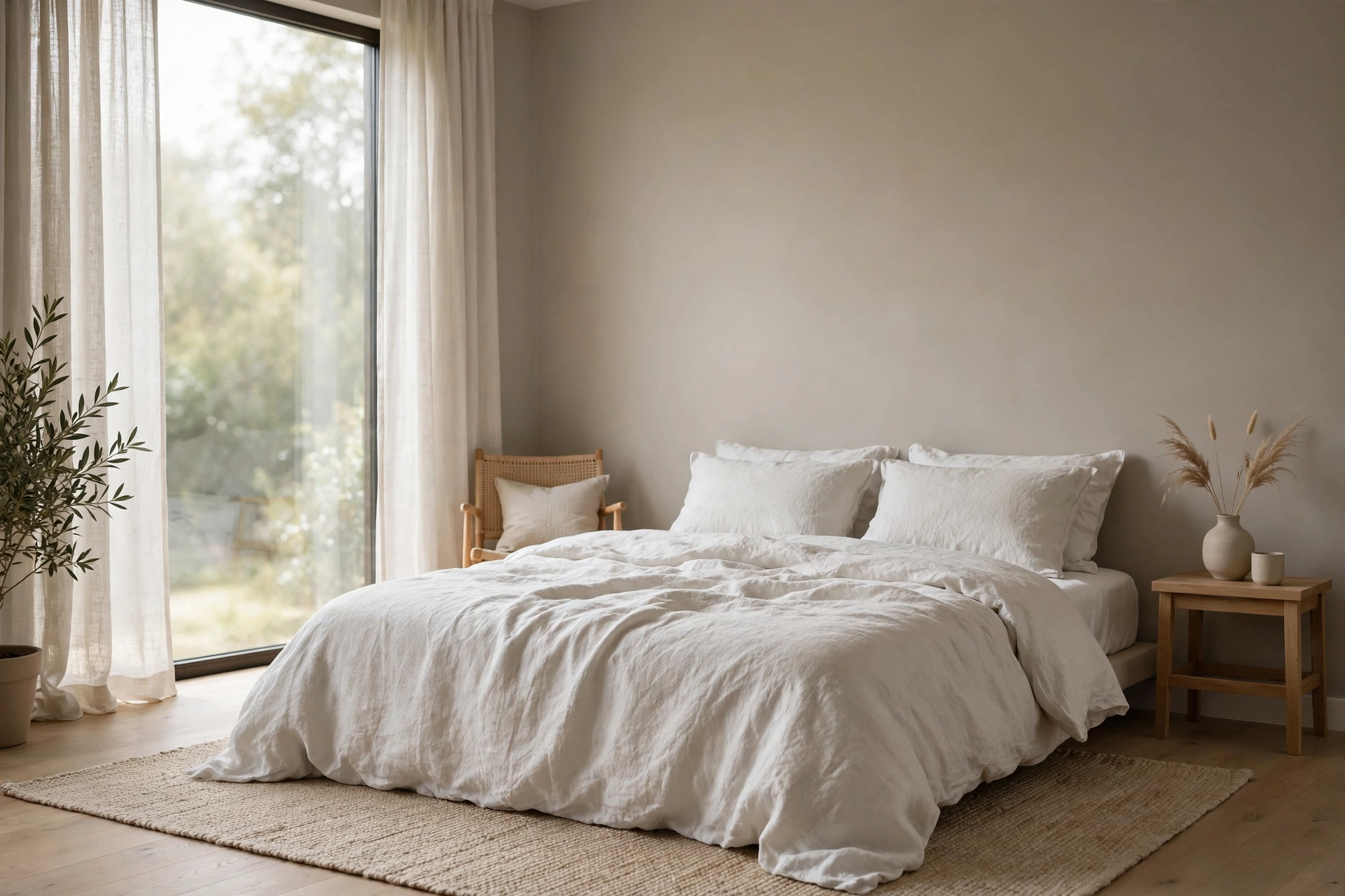
3. Greige + Linen White
Greige — the perfect marriage of gray and beige — is the modern neutral that flatters every skin tone and every wood finish. Paint walls a warm greige ($45–$60 per gallon) and dress the bed in washed linen white ($60–$110 for a duvet set). The magic of this palette is its chameleon quality: in morning light it reads fresh and airy, by lamplight it turns warm and enveloping. It pairs with our minimalist bedroom styling beautifully, since the palette itself does the decorating work. Pro tip: test greige swatches on two walls and check them at three times of day — some greiges swing pink or green in certain light, and the bedroom is the last place you want a surprise undertone.
4. Stone + Warm Gray
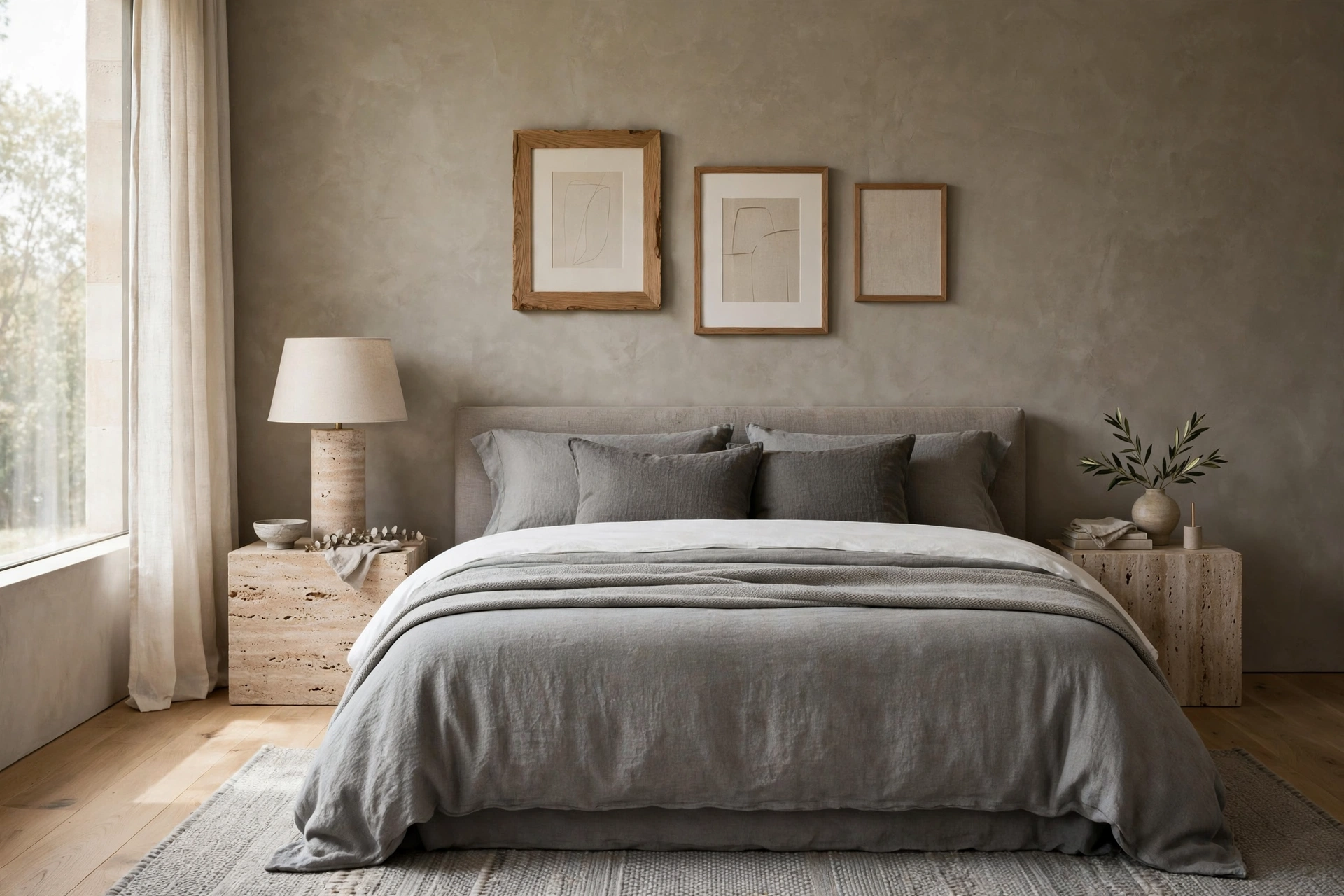
Stone — a mid-tone warm gray with earthy depth — gives bedrooms a grounded, architectural calm that pale neutrals can’t quite reach. Use it on all four walls ($45–$60 per gallon) or as a single accent wall behind the bed if you’re cautious. Layer warm gray bedding in a slightly lighter tone than the walls, then add contrast with crisp white sheets peeking at the top ($25–$45). Natural textures keep it from feeling flat: a travertine lamp base ($40–$80), a wool throw, raw oak frames. Pro tip: in a north-facing bedroom, choose a stone with a distinctly warm (yellow-beige) base — cool grays in cool light can read as gloomy, while warm stone stays inviting even on gray mornings.
5. Cream + Honey Wood
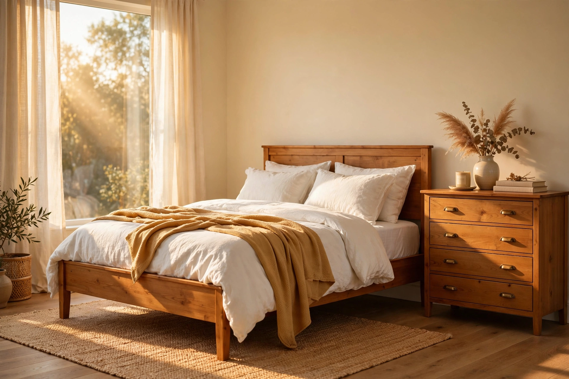
Cream walls with honey-toned wood is pure golden-hour, all day long. This palette glows — the yellow undertones in both the paint and the wood create a warmth that feels like permanent late-afternoon sun. Paint walls a buttery cream ($40–$55 per gallon) and choose honey oak or pine for the bed, dresser, and mirror frames ($150–$450 for key pieces). White bedding keeps it fresh; a honey-toned throw adds depth without breaking the warm spell. This is one of the most forgiving palettes for older rentals with dated trim, because the warmth harmonizes with almost any existing woodwork. Pro tip: use warm-white bulbs (2700K) exclusively in this room — cool daylight bulbs will fight the cream walls and make everything look slightly green.
6. Alabaster + Jute Tones
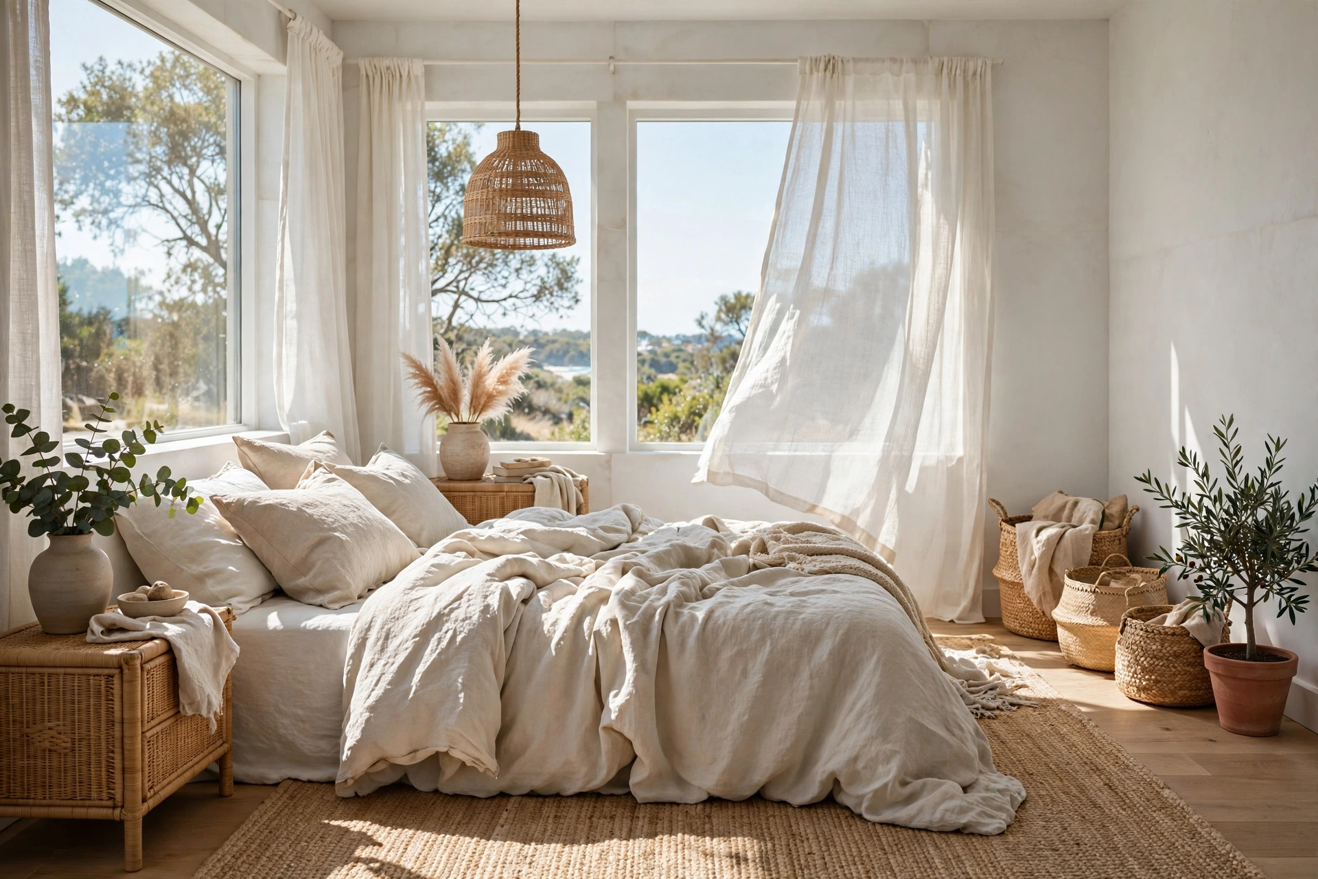
Alabaster walls — soft white with the faintest warm blush — paired with jute and natural fiber tones create a breezy, organic bedroom that feels like a high-end coastal retreat. The palette is built on texture rather than color: a jute area rug ($60–$130), woven seagrass baskets ($20–$45 each), a rattan headboard or pendant ($50–$120), and rumpled alabaster-toned bedding. Because the colors are so quiet, every texture reads clearly, which makes the room feel rich without a single bold hue. Pro tip: keep jute and natural fibers out of direct daily sun — UV bleaches and brittles them over time, so position the rug away from the brightest window patch or rotate it seasonally.
Nature-Inspired Greens
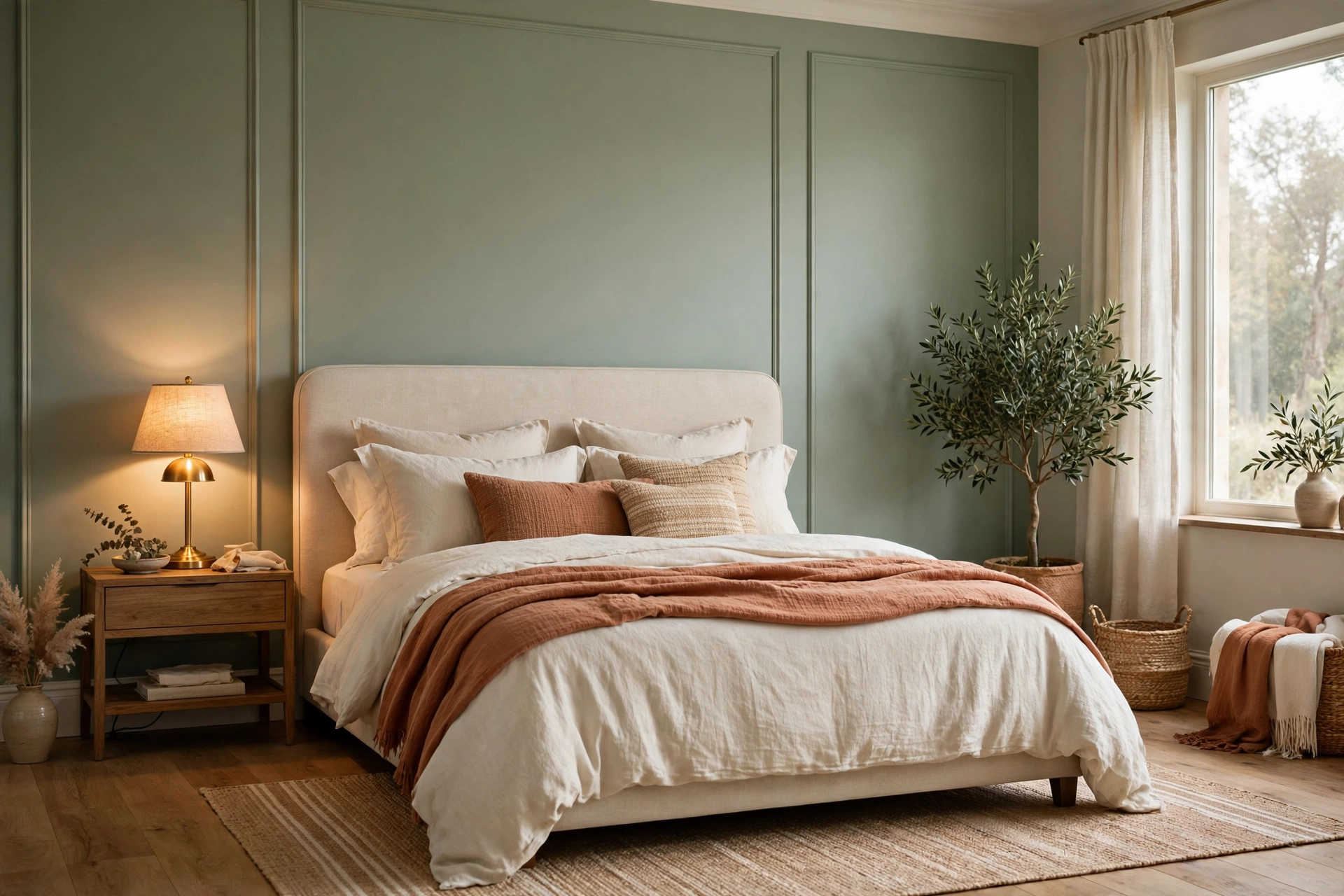
7. Sage Green + Cream
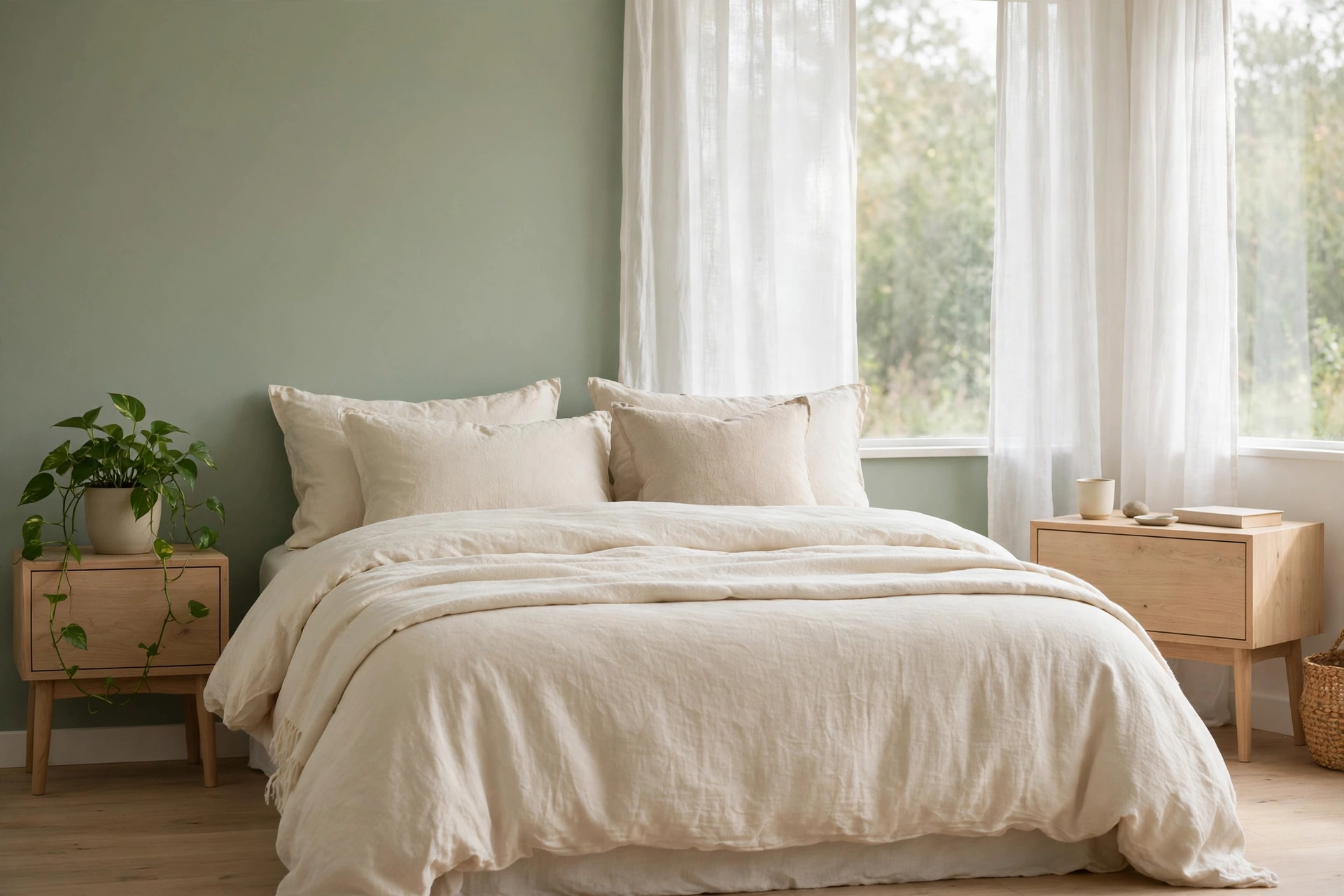
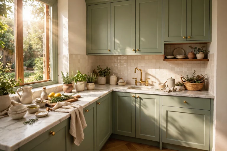
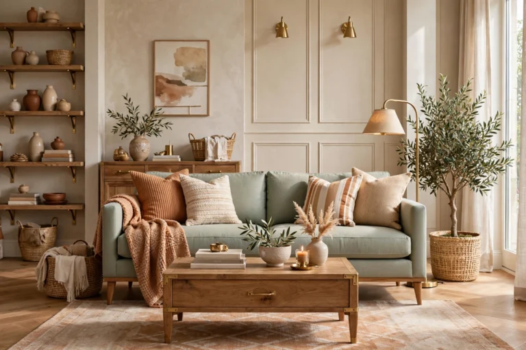
Sage green is the bedroom color of the decade for good reason — it’s restful without being boring, natural without being literal. Paint walls a soft sage ($45–$60 per gallon) and balance it with cream bedding, white curtains, and light wood furniture. The green brings the calm of the outdoors in, which studies consistently link to lower stress and better sleep. If full sage walls feel bold, try it on just the wall behind the bed and keep the other three cream. Pro tip: sage loves real plants — a pothos on the nightstand or an olive tree in the corner ($25–$60) deepens the palette and makes the whole room feel alive rather than merely painted.
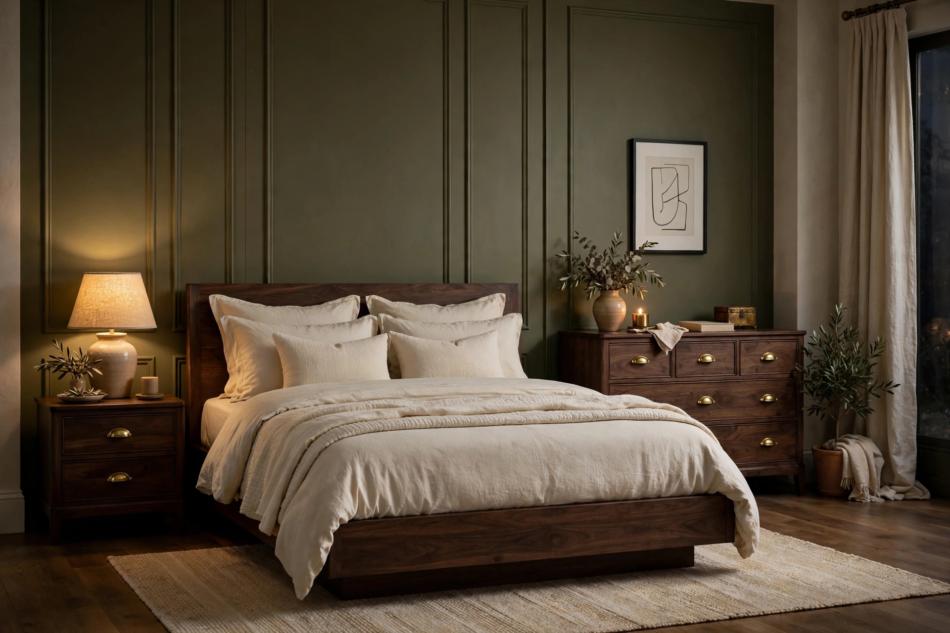
8. Olive Green + Walnut
Olive green with dark walnut wood is the sophisticated grown-up version of green — moody, rich, and quietly luxurious. Use olive on an accent wall or in bedding and drapery ($50–$110 for curtain panels), and let walnut furniture (bed frame, dresser, $250–$600) provide the deep brown counterpoint. Brass or antique-gold hardware ($3–$8 per pull) bridges the two beautifully. This palette shines in rooms with good natural light, where the olive shifts from khaki-bright at noon to deep and enveloping by evening. Pro tip: olive can go muddy under cool LED lighting — stick to 2700K warm bulbs and, if possible, a dimmer ($15–$25) so the evening version of the room is the best version.
9. Eucalyptus + Stone
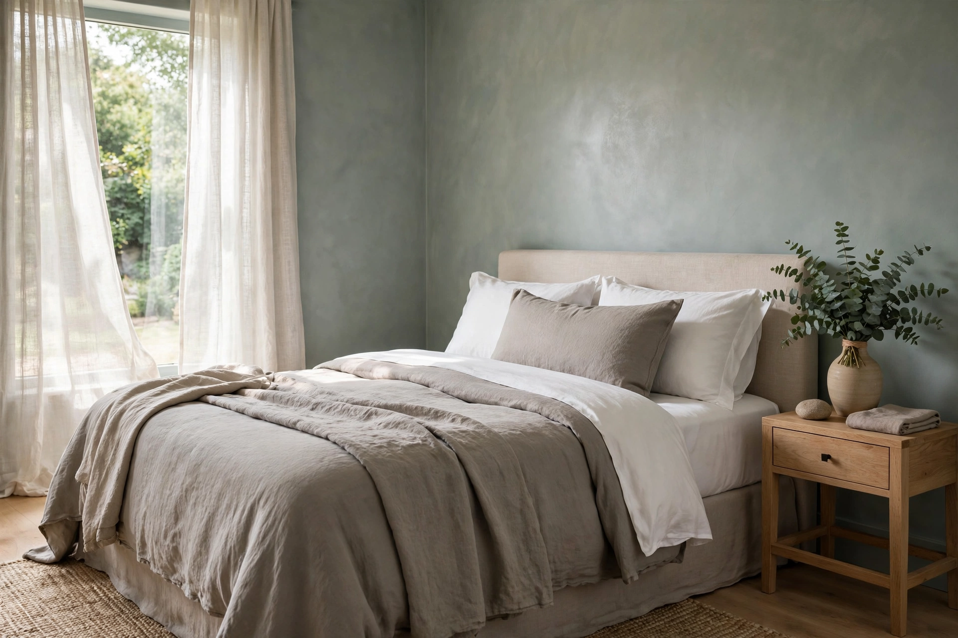
Eucalyptus — a silvery blue-green — paired with warm stone gray creates a spa-like bedroom that feels both fresh and grounded. It’s the palette of high-end boutique hotels: calming, clean, and just interesting enough. Paint walls eucalyptus ($45–$60 per gallon), layer stone-gray bedding, and add white towels-style crisp sheets for contrast. A eucalyptus bundle in a vase ($8–$15, lasts weeks) doubles as decor and subtle aromatherapy. This combination flatters small bedrooms especially well because neither color advances aggressively. Pro tip: keep the stone elements warm-toned rather than cool gray — eucalyptus already brings the cool note, and the room needs the stone’s warmth for balance, especially in north-facing light.
10. Forest Green + Brass
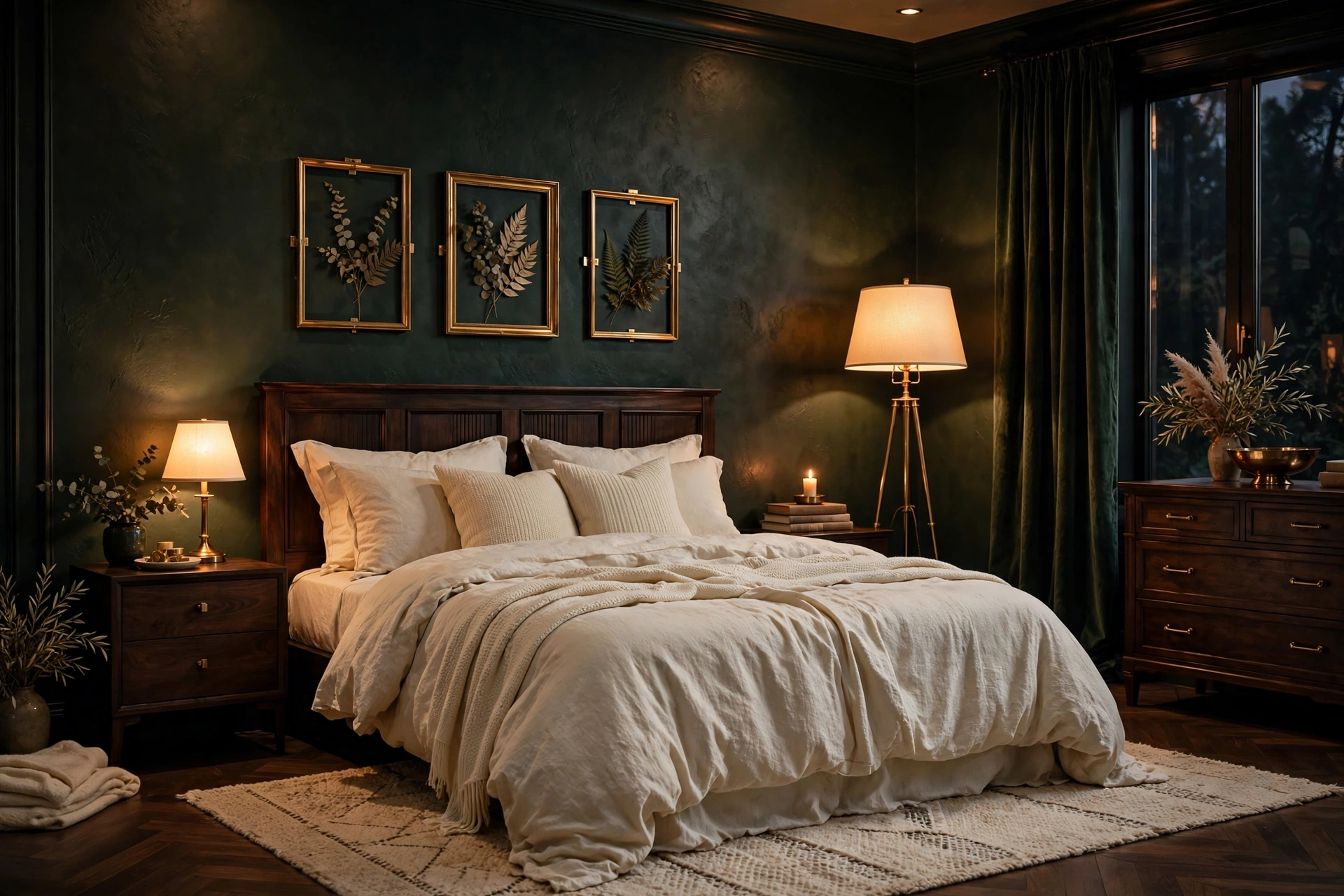
Deep forest green walls with brass accents is pure drama — the bedroom equivalent of a velvet smoking jacket. This is a commitment palette: paint all four walls ($50–$65 per gallon for good coverage in deep tones; plan on two coats plus primer) and let brass do the jewelry work — a brass floor lamp ($80–$180), picture frames, drawer pulls, a mirror frame. Cream or warm-white bedding keeps the room from closing in, and the contrast against the dark walls looks incredibly crisp. It pairs naturally with the layered lighting ideas that make dark rooms glow instead of cave. Pro tip: deep green needs at least three light sources (overhead, bedside, accent) — one lonely lamp in a forest-green room just makes shadows; layered warm light makes it cinematic.
11. Moss + Linen
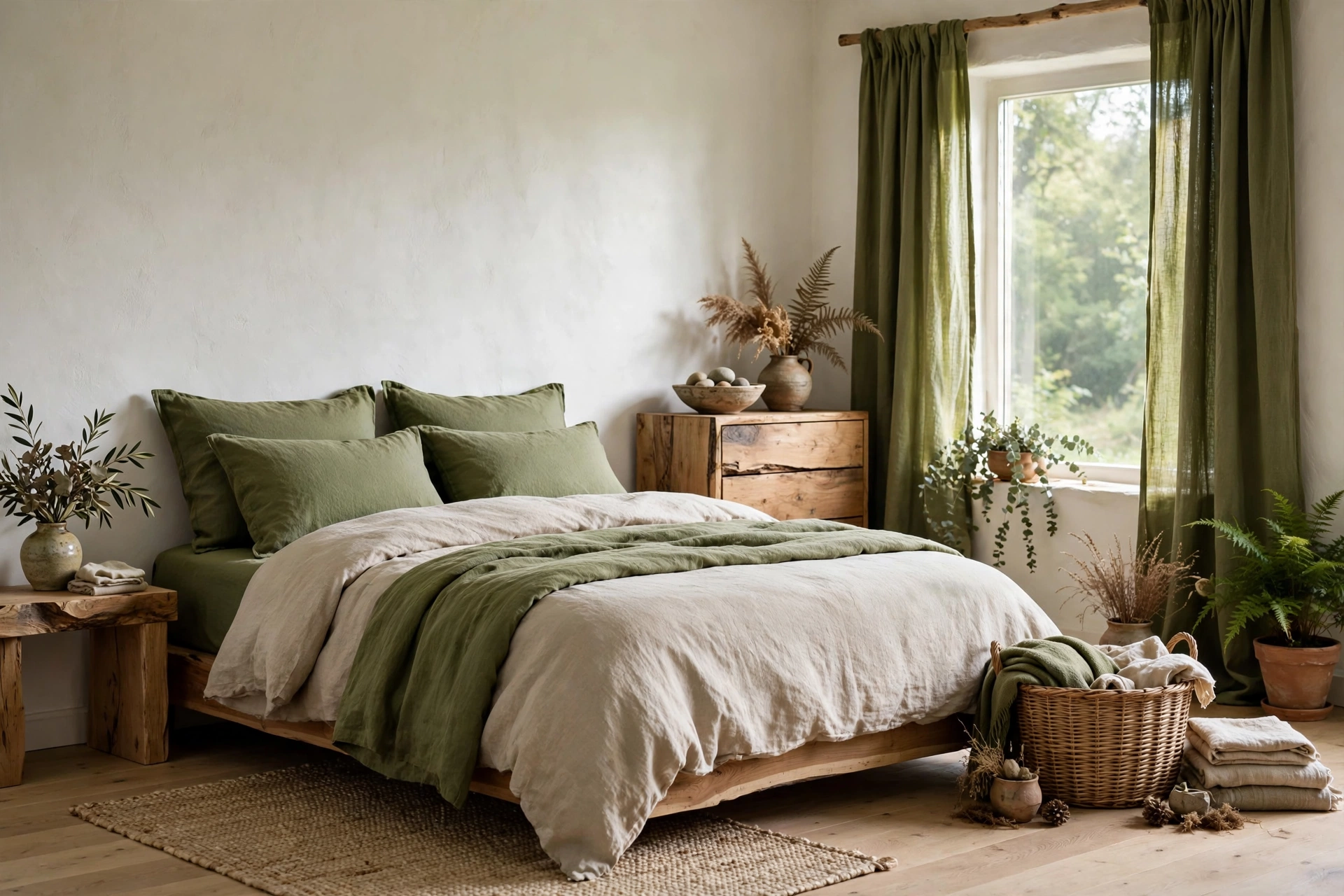
Moss green — deep, earthy, slightly yellow — with natural linen creates a woodland-calm bedroom that feels rooted and honest. Unlike sage (cooler) or olive (grayer), moss has a sunlit warmth that works beautifully with raw wood, wicker, and undyed textiles. Try moss on bedding and curtains ($60–$130) against warm white walls if you’re not ready to paint, or go all in with moss walls in a room with generous daylight. Unbleached linen bedding ($70–$140) is the perfect partner — its nubby texture echoes the organic feel. Pro tip: moss green deepens beautifully with age in textiles — wash linen bedding a few times before judging the color; it softens into an even more beautiful, lived-in tone.
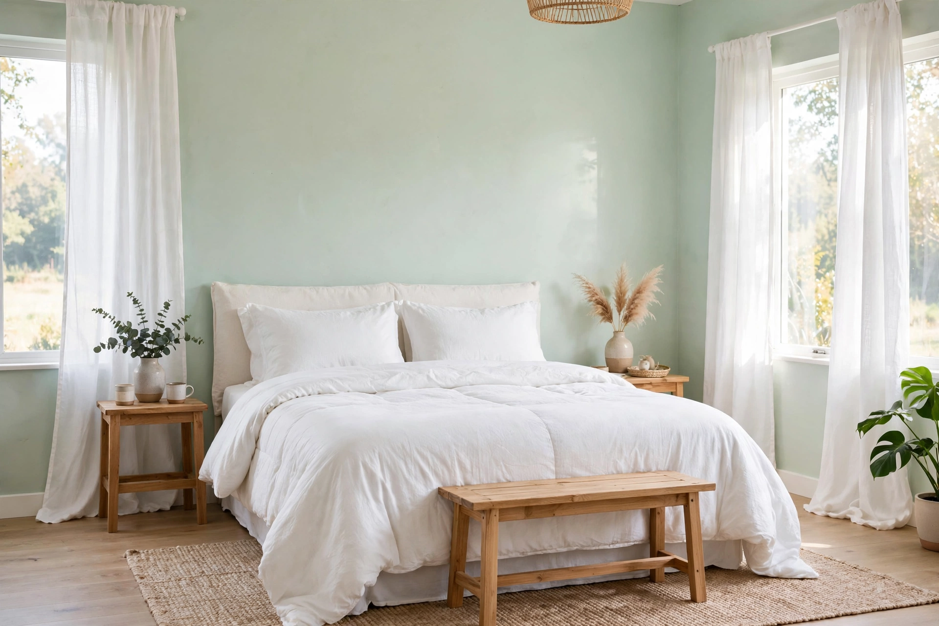
12. Mint + White
Mint green with crisp white is the freshest palette on this list — clean, breezy, and quietly cheerful without tipping into nursery territory. The key is keeping the mint pale and slightly grayed ($40–$55 per gallon), never candy-bright. White bedding, white curtains, and white trim keep it sophisticated; a single natural wood element (a bench, a frame, $30–$90) stops it feeling sterile. This palette is a gift for small, dark bedrooms because pale mint reflects light almost as well as white while adding actual personality. Pro tip: avoid pairing mint with cool gray — the combination can read icy and flat; warm white is mint’s best friend and keeps the room feeling like morning instead of a laboratory.
Warm Earthy Tones
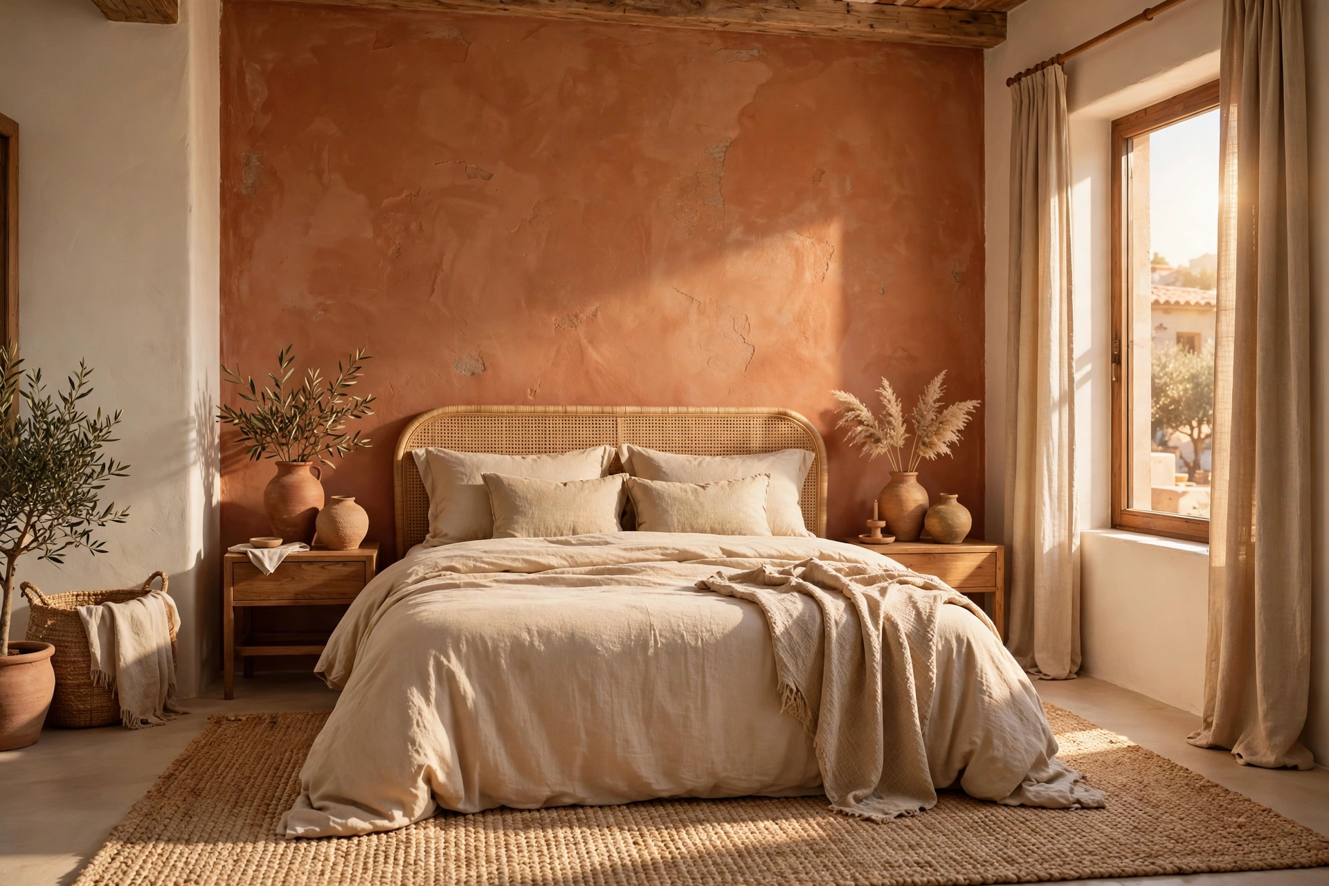
13. Terracotta + Warm Beige
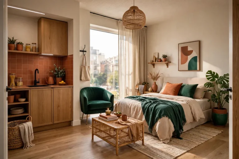
Terracotta walls with warm beige textiles bring Mediterranean sun-baked warmth into the bedroom — earthy, grounding, and surprisingly restful. A terracotta accent wall behind the bed ($40–$55 per gallon) makes the headboard zone feel intentional and cocooned, while warm beige bedding and curtains keep the overall effect soft rather than heavy. Natural materials complete it: clay vases ($15–$35), a woven jute rug, wooden beads. This palette practically begs for the rustic textures that make earthy rooms feel collected, not decorated. Pro tip: terracotta intensifies under warm lamplight — if you’re painting all four walls, go one shade lighter than the swatch you love, because evening light will deepen it considerably.
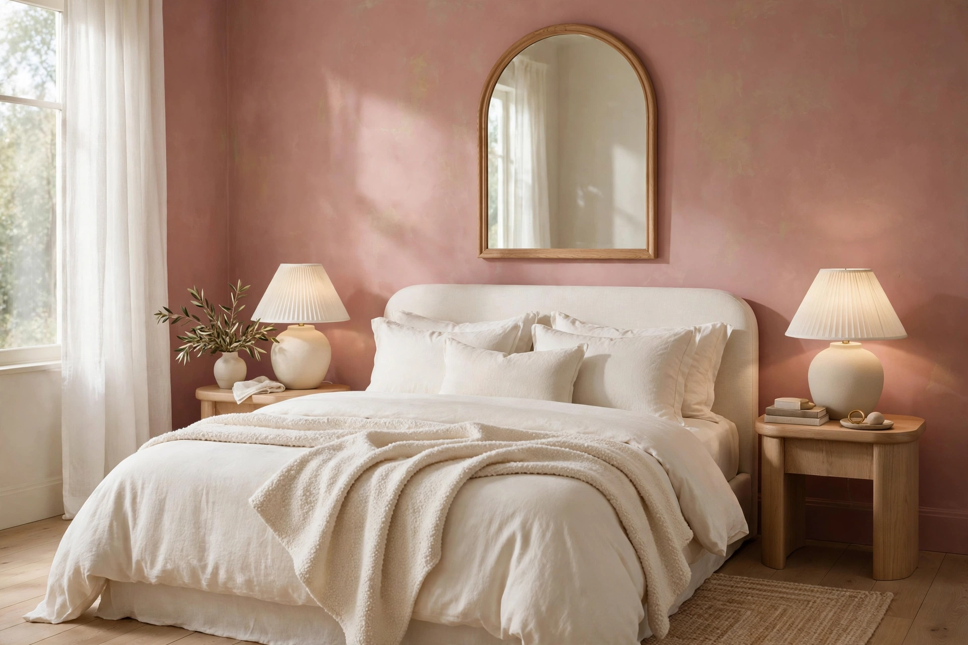
14. Clay + Ivory
Clay — softer and pinker than terracotta — with ivory is the gentler take on earthy warmth, romantic without being sweet. Clay walls ($45–$60 per gallon) glow beautifully in both morning and evening light, and ivory bedding keeps the look light and breathable. This palette loves curved shapes: an arched mirror ($60–$130), rounded ceramic lamps, a soft ivory bouclé throw ($40–$80). It’s a wonderful choice for bedrooms that need warmth but where terracotta would feel too bold or too dark. Pro tip: clay undertones vary wildly between brands — some lean orange, others lean pink; paint a large test swatch and live with it for 48 hours, because the pink-orange balance defines the whole room’s mood.
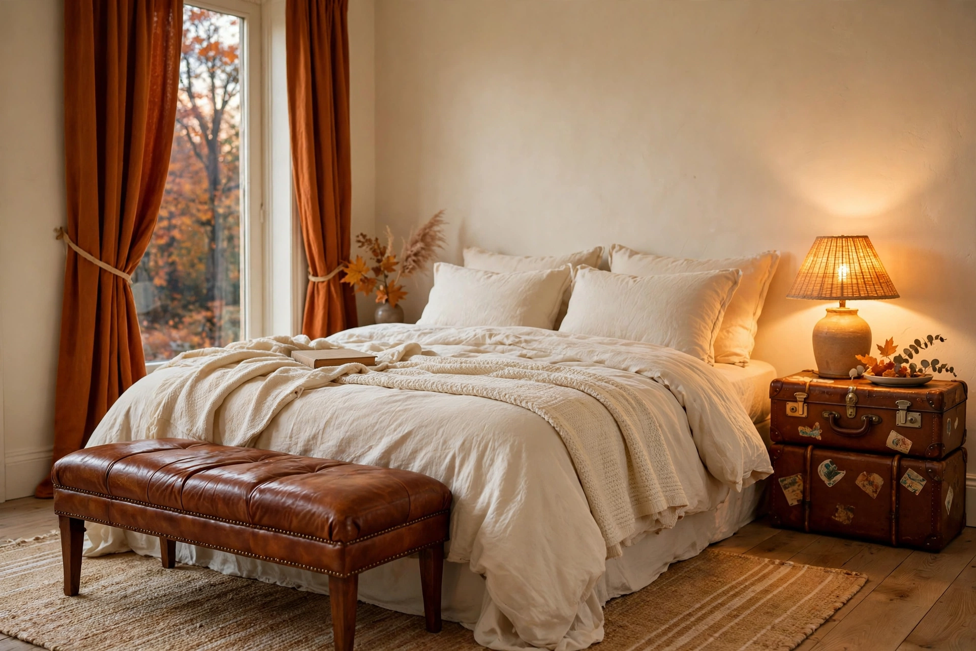
15. Burnt Orange + Cream
Burnt orange with cream is autumn permanently — rich, enveloping, and full of character. Because burnt orange is a strong color, use it strategically: an accent wall, a pair of curtains ($45–$90), or a statement armchair ($180–$400) against cream walls and bedding. The cream keeps the orange from overwhelming, and the contrast makes both colors look more intentional. Leather accents — a cognac bench or vintage suitcase nightstand ($50–$150 secondhand) — are burnt orange’s natural soulmate. Pro tip: burnt orange absorbs light, so this palette needs more illumination than a neutral room — add a second bedside lamp or a floor lamp in the corner to keep the cozy from turning cave-like.
16. Rust + Charcoal
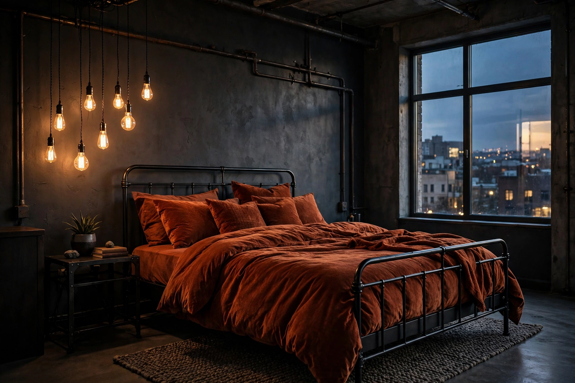
Rust with charcoal is the moody, masculine-leaning earth palette — industrial warmth meets tailored depth. Charcoal walls ($50–$65 per gallon) create a dramatic envelope, while rust appears in textiles: a rust duvet or throw ($50–$100), rust velvet cushions ($20–$40 each), maybe a rust area rug anchoring the bed. The combination feels curated and confident, never messy. Black metal bed frames ($150–$350) and Edison-bulb lighting complete the look. Pro tip: in a charcoal room, every light source matters twice as much — use warm 2700K bulbs everywhere and consider a dimmer on the overhead so the rust tones glow like embers in the evening.
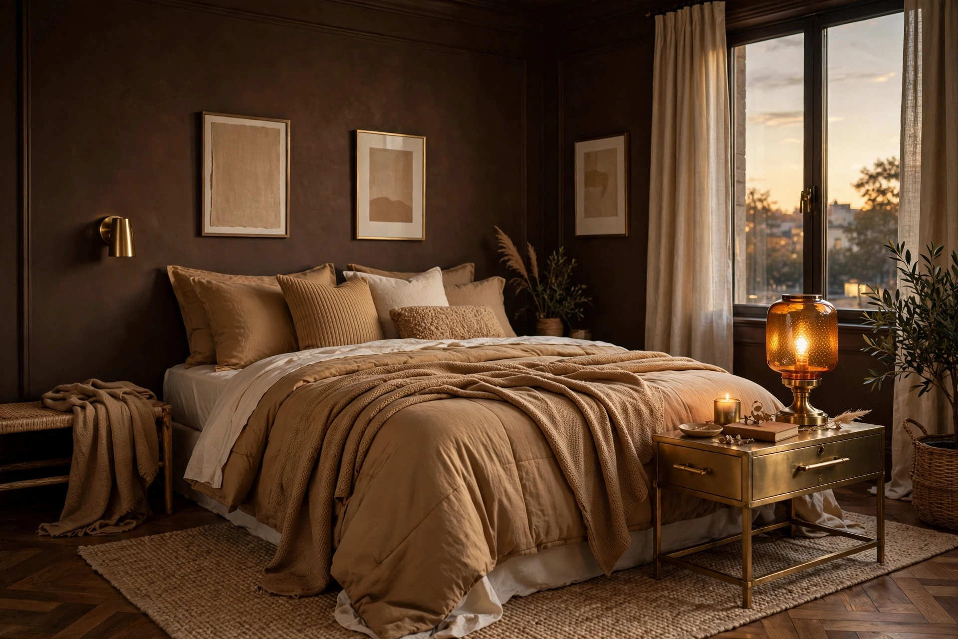
17. Amber + Chocolate
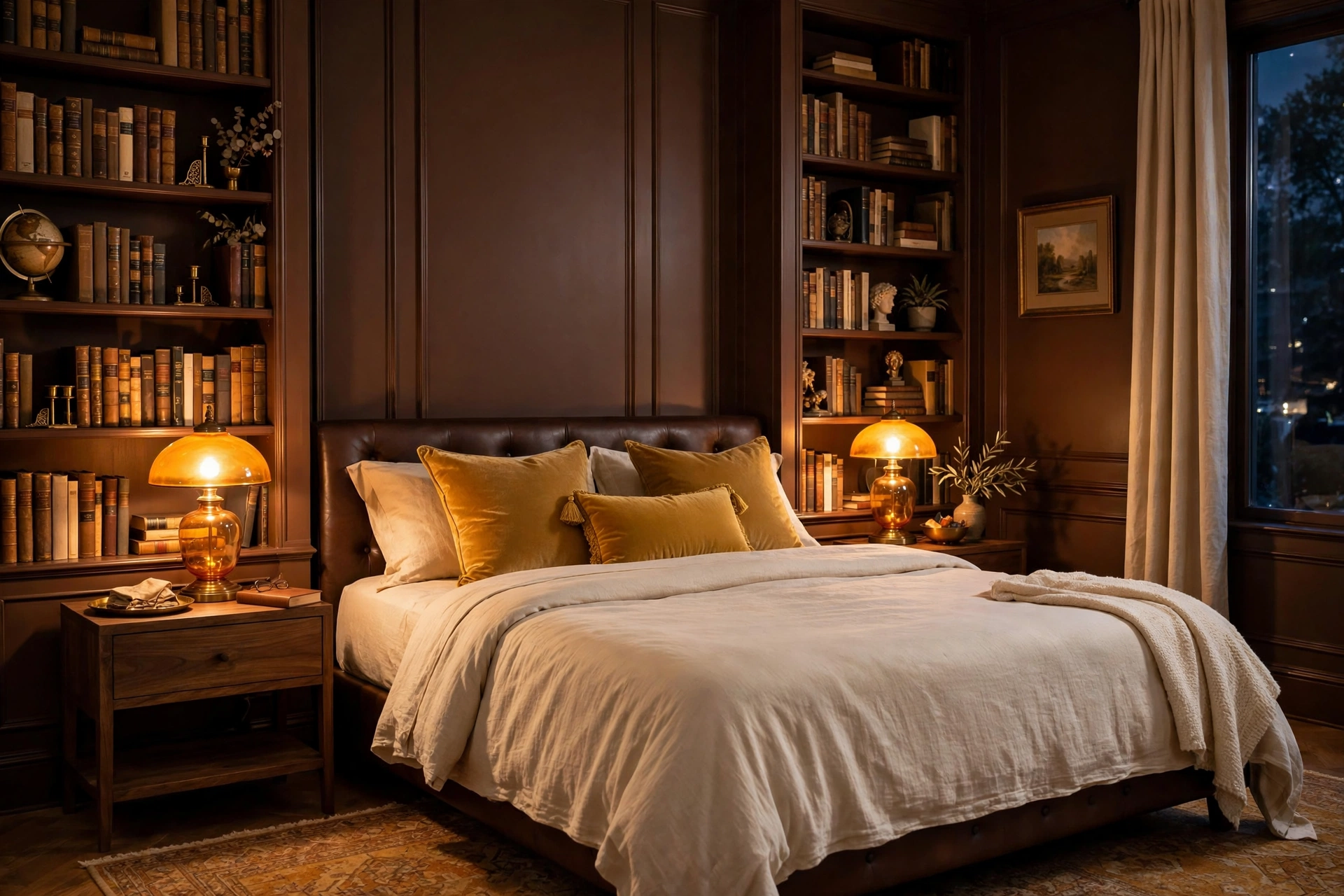
Amber with chocolate brown is pure warmth — like the inside of a well-loved library or a glass of good whiskey. Chocolate walls are a bold move ($50–$65 per gallon, two coats essential), but amber textiles — honey-toned throws, amber glass lamps ($30–$70), golden cushions — light the room from within like lanterns. Cream sheets provide the necessary contrast so the bed doesn’t disappear into the dark. This palette is at its best in bedrooms used mainly in the evening, where lamplight makes the ambers glow. Pro tip: chocolate brown shows every dust speck and fingerprint — keep a microfiber cloth handy and choose low-sheen (eggshell, not flat) paint so walls wipe clean without burnishing.
18. Copper + Cream
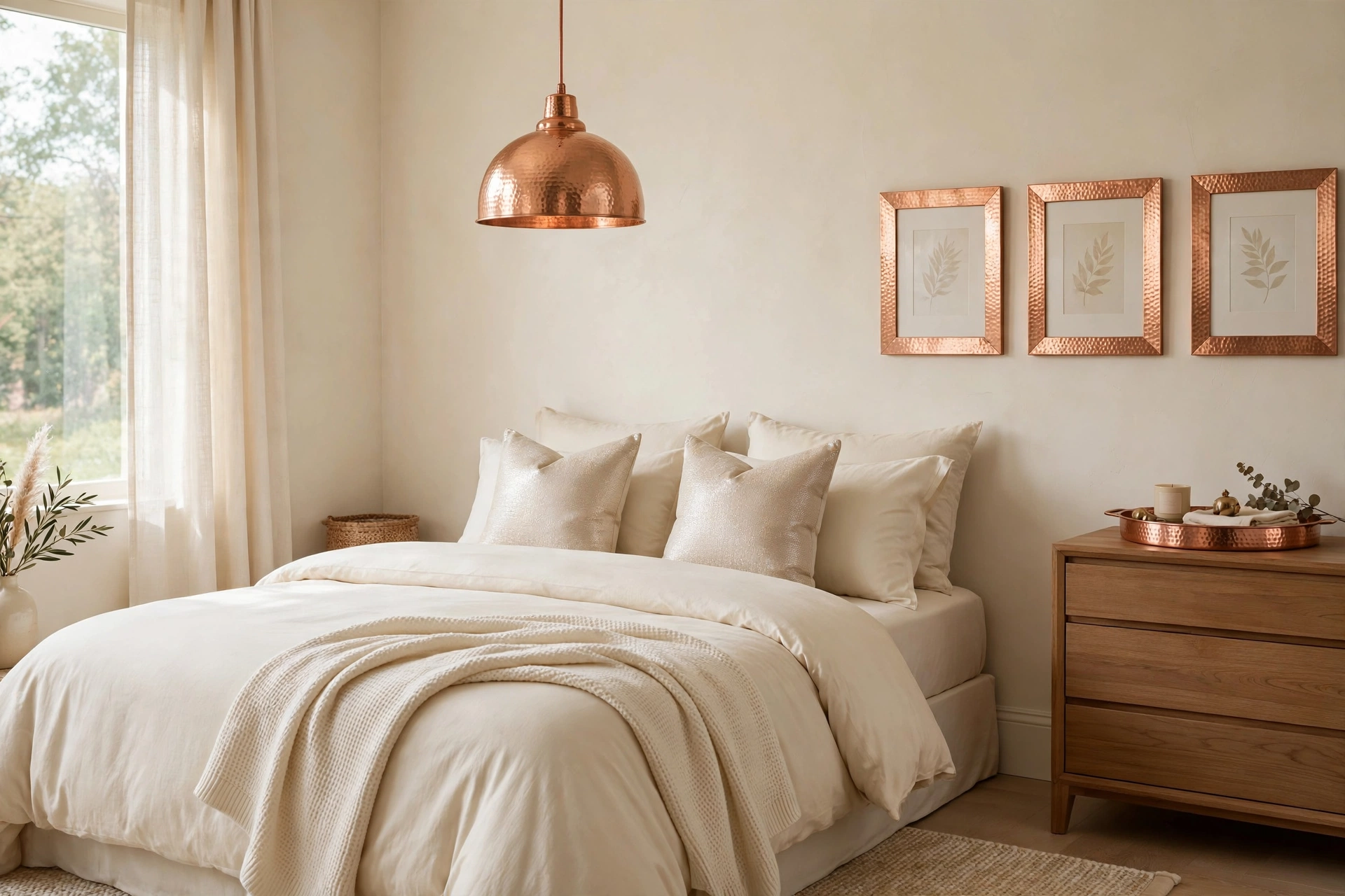
Copper accents against cream walls bring metallic warmth without the formality of gold or the coldness of silver. Keep walls and bedding cream ($40–$55 per gallon; $60–$110 for bedding) and let copper shine in the details: a copper pendant light ($60–$130), copper picture frames, a hammered copper tray on the dresser ($25–$50), copper-finished drawer pulls. The metal catches both daylight and lamplight, so the room subtly shimmers throughout the day. It’s an elegant palette that feels special but never fussy. Pro tip: mix copper finishes intentionally — all-polished or all-brushed reads deliberate, but a random mix of shiny and matte copper just looks like you couldn’t decide; pick one finish and commit.
Serene Blues
19. Navy + Brass + White
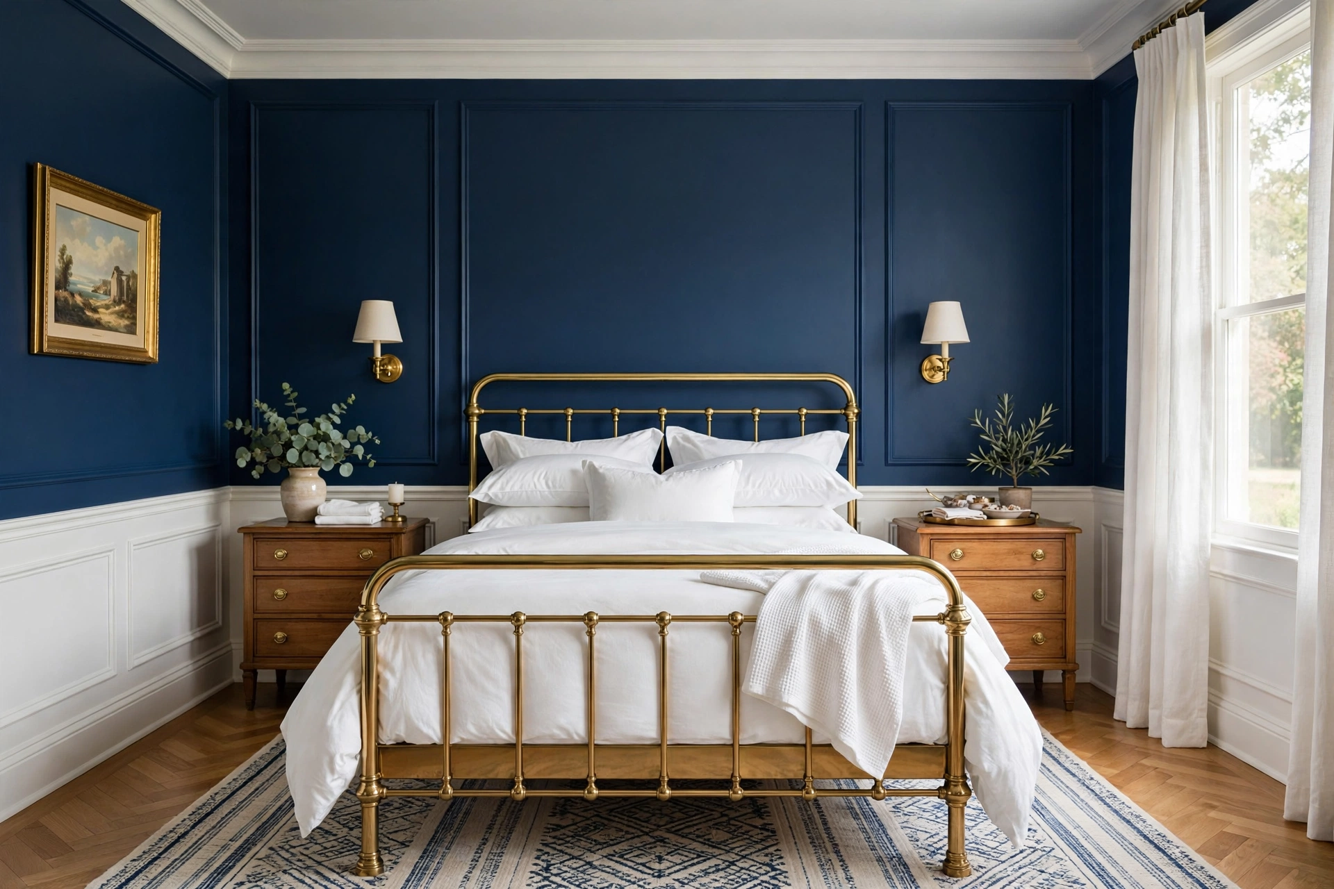
Navy walls with brass accents and crisp white bedding is the classic preppy-meets-traditional palette that always looks expensive. Navy ($50–$65 per gallon) brings depth and a cocooning feel that’s genuinely conducive to sleep — dark blue walls are among designers’ top picks for restful bedrooms. Brass bridges the dark and light: a brass bed frame ($300–$600), brass sconces ($40–$90 each), brass curtain rods. White bedding pops against the navy like stars. For more on making dark walls work, see our small-space layout strategies — dark colors need smart planning to stay cozy, not cramped. Pro tip: navy shows roller marks more than lighter colors — use a high-quality roller, maintain a wet edge, and don’t skimp on the second coat; the flawless finish is what makes navy look luxurious instead of DIY.
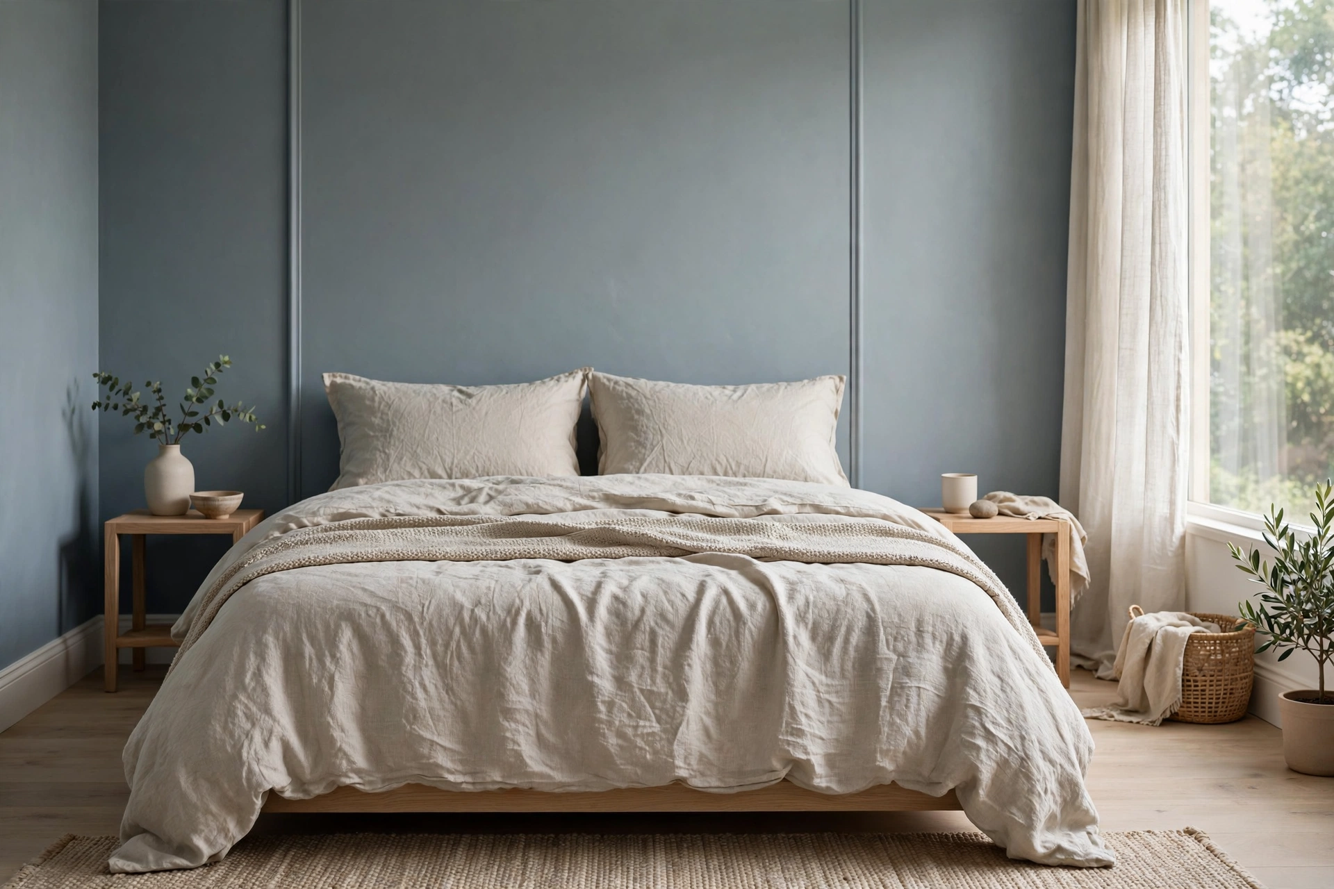
20. Dusty Blue + Linen
Dusty blue — soft, grayed, endlessly calming — with natural linen is the palette equivalent of a deep breath. It’s blue without the chill: the gray undertone keeps it sophisticated, the linen texture keeps it warm. Paint walls dusty blue ($45–$60 per gallon) or use it in bedding and curtains against white walls for a lighter touch. Natural linen in oatmeal or flax ($70–$130 for a duvet set) is the ideal partner — its slubby texture plays beautifully against the smooth matte wall. Pro tip: dusty blue is a chameleon that can swing lavender in certain lights — check your swatch next to a true gray and a true purple to see which way it leans before committing to four walls.
21. Slate Blue + Oak
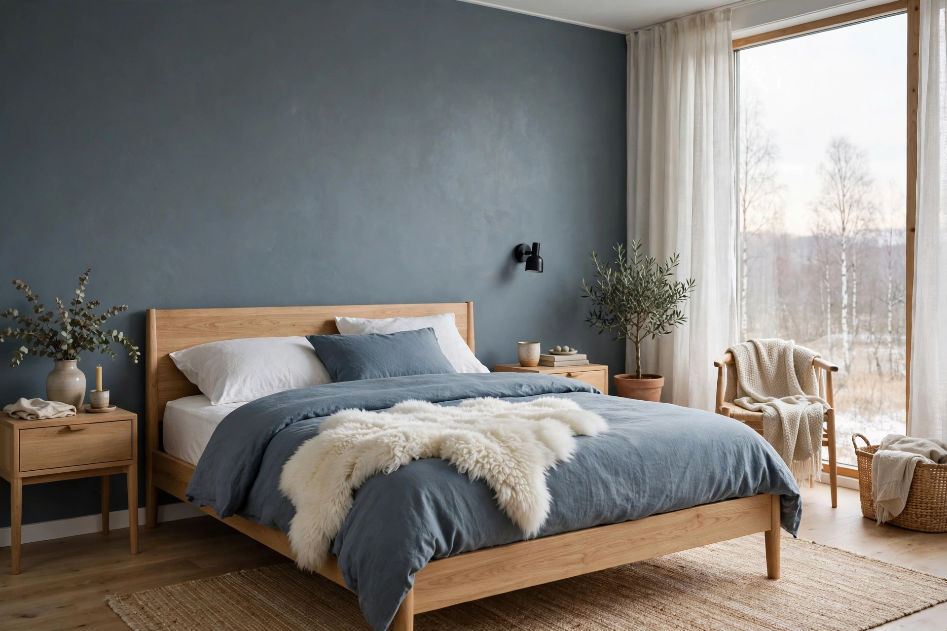
Slate blue with light oak is Scandinavian calm with a bit more personality — the blue-gray depth of slate keeps it from being another all-white Nordic room, while oak floors and furniture keep it warm and livable. Use slate on one or two walls ($45–$60 per gallon) or in a big dose of textiles: slate duvet, slate curtains ($45–$90 per panel), slate lumbar pillows. Oak nightstands and a simple oak bed frame ($200–$450) provide the warm counterweight. White sheets and a sheepskin throw ($25–$45) finish the hygge. Pro tip: slate blue deepens dramatically in low light — in a bedroom with only one small window, use it on a single accent wall rather than all four, so the room stays serene instead of somber.
22. Powder Blue + Gray
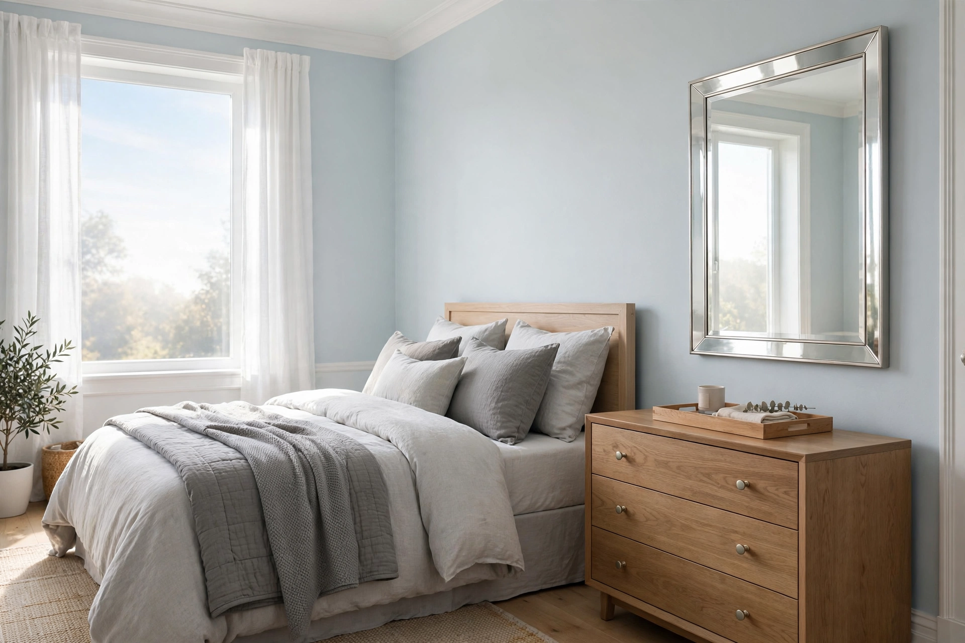
Powder blue with soft gray is light, airy serenity — the palette of clear morning skies. It works wonders in small bedrooms because the pale blue visually recedes, making walls feel farther away. Paint walls powder blue ($40–$55 per gallon), layer gray bedding in two tones (light gray duvet, darker gray throw, $60–$120 total), and keep trim bright white for definition. Silver or chrome accents — a mirror, lamp bases — add a cool polish. This is a naturally calm, Japandi-adjacent palette that suits uncluttered, peaceful styling. Pro tip: powder blue needs warm wood or warm metallics somewhere — without a single warm element, the room can feel chilly; even a small oak tray or brass knob collection restores the balance.
23. Denim Blue + White
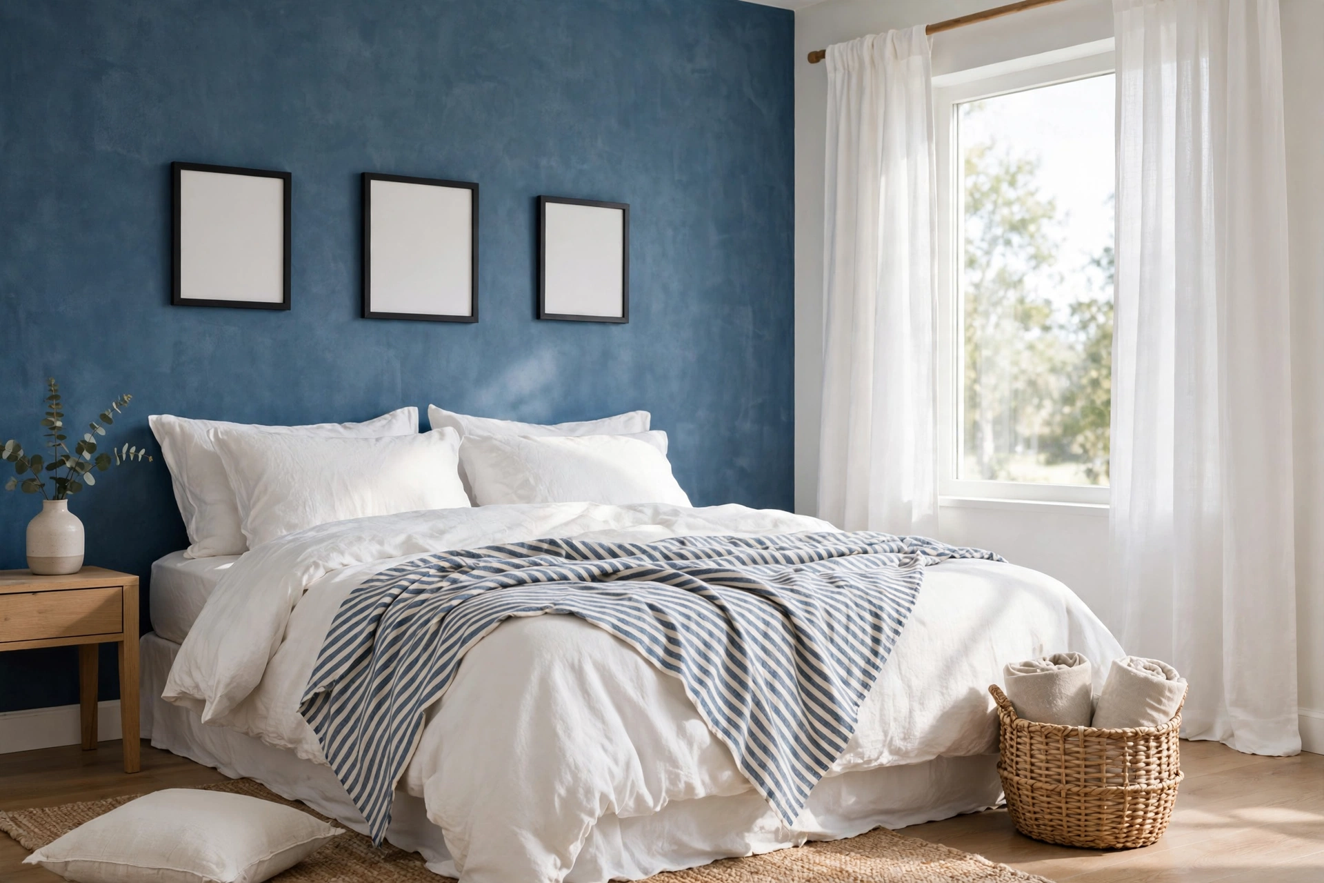
Denim blue with white is casual, unfussy, and universally flattering — the jeans-and-white-tee of bedroom palettes. A denim-blue accent wall ($40–$55 per gallon) or denim bedding set ($50–$90) brings relaxed color, while white walls, white curtains, and white trim keep everything crisp. It suits laid-back styles beautifully: add a striped throw, a woven basket, simple black frames. Because denim blue is a mid-tone, it adds interest without darkening the room — ideal for bedrooms that need personality but can’t afford to lose light. Pro tip: denim blue pairs terribly with beige — the combination reads dated instantly; stick to true whites, grays, and natural wood, and the palette stays fresh for years.
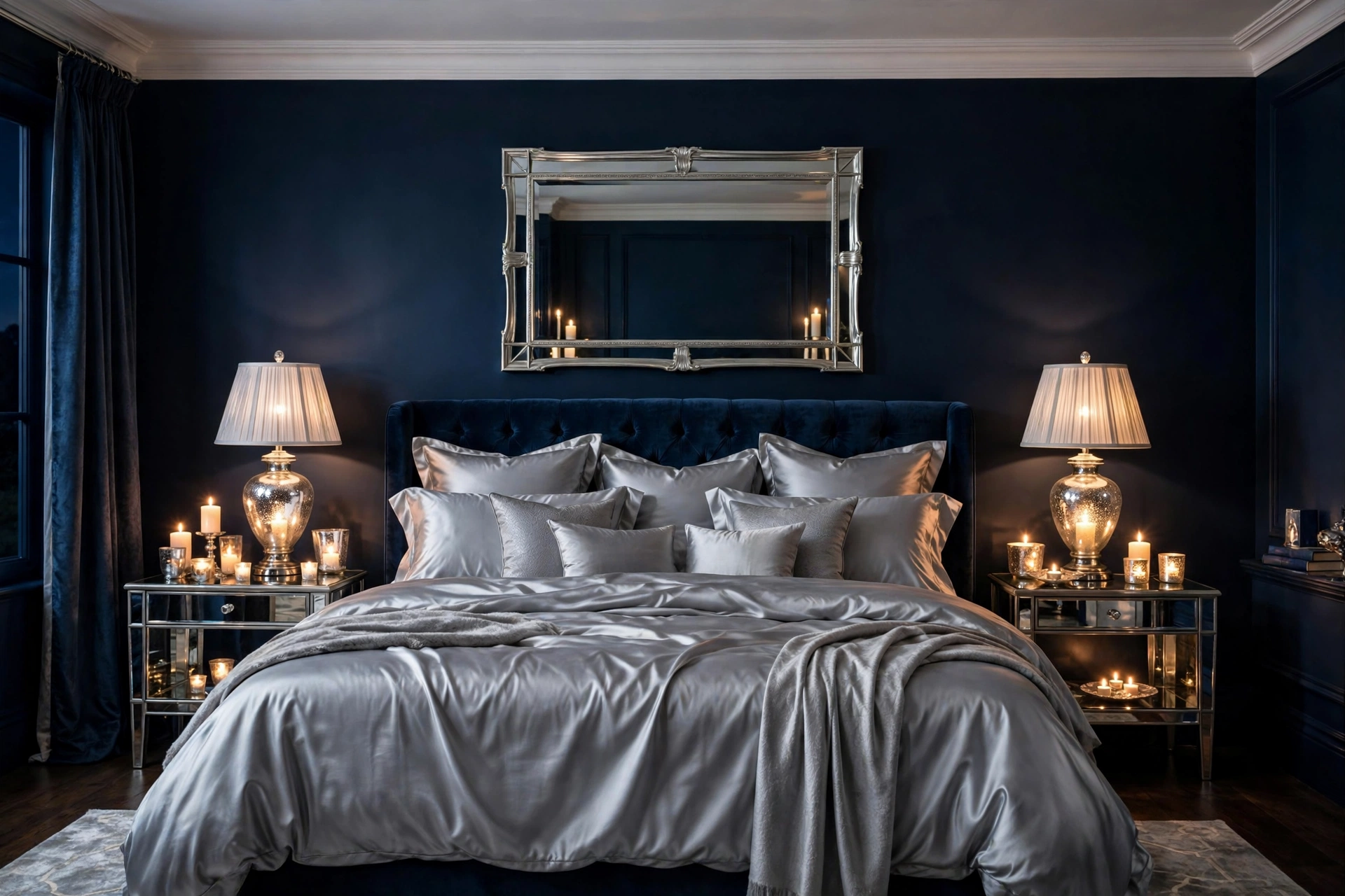
24. Midnight Blue + Silver
Midnight blue with silver is nighttime glamour — deep, shimmering, and unapologetically dramatic. Paint walls the darkest blue you dare ($50–$65 per gallon; midnight tones need primer plus two coats), then let silver do the talking: a silver-framed mirror ($50–$110), mercury-glass lamps ($35–$70 each), silver-gray silk or sateen bedding ($80–$150) that catches the light. White ceilings and pale bedding elements keep the room from feeling like a cave. This palette turns the bedroom into an evening sanctuary — it practically demands candles and low lamplight. Pro tip: midnight blue walls make a small bedroom feel smaller during the day but infinitely cozier at night — if you work from the bedroom by day, keep one wall white or add a large mirror to bounce daylight.
Romantic & Soft Hues
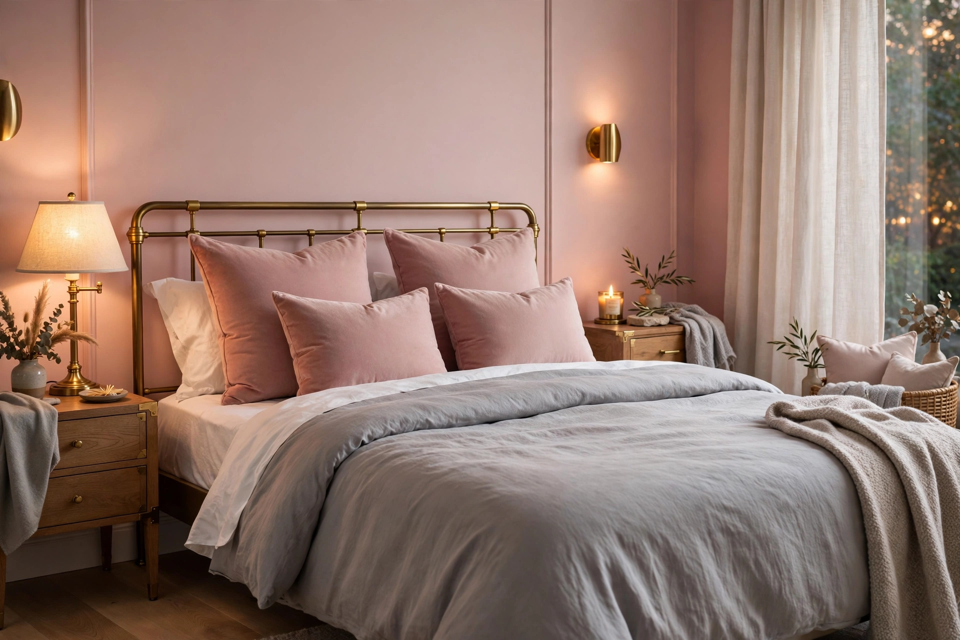
25. Blush Pink + Soft Gray
Blush pink with soft gray is the grown-up way to do pink — romantic, warm, and completely sophisticated. The gray keeps the blush from going sweet: paint walls a whisper of blush ($40–$55 per gallon) or use blush in bedding and curtains against gray walls. Gray bedding in a tone slightly deeper than the walls, white sheets, and blush velvet cushions ($20–$40 each) create the layered look. Brass or gold accents warm it further. This palette flatters everyone and photographs beautifully for listing photos if you ever rent the place out. Pro tip: blush undertones matter enormously — peach-blush reads warm and cozy, blue-blush reads cool and modern; hold swatches against your bedding fabric to make sure they harmonize before painting.
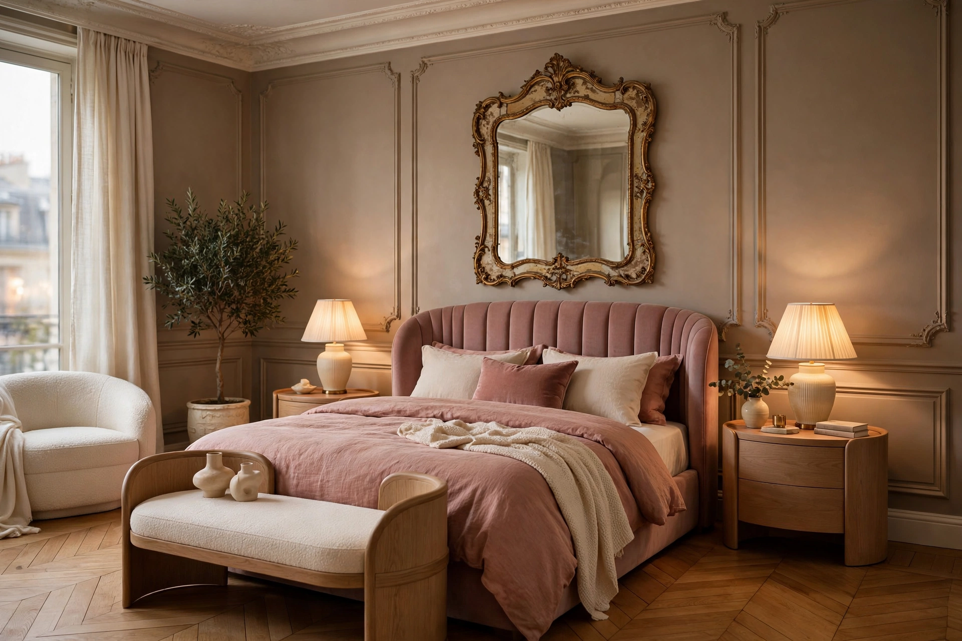
26. Rose + Taupe
Rose — deeper and dustier than blush — with taupe is quiet luxury: warm, enveloping, and richly neutral. Taupe walls ($45–$60 per gallon) provide the sophisticated backdrop while rose appears in bedding, an upholstered headboard ($150–$350), or drapery. The combination has a vintage Parisian feel that suits curved furniture, ornate mirrors, and soft lamplight. Cream accents keep it from going too dark. It’s a palette that makes every evening feel a little bit special. Pro tip: rose fades faster than most colors in direct sun — if the bedroom gets strong afternoon light, use rose in easily replaceable textiles rather than on the walls, and consider UV-filtering curtain linings ($15–$30 per panel).
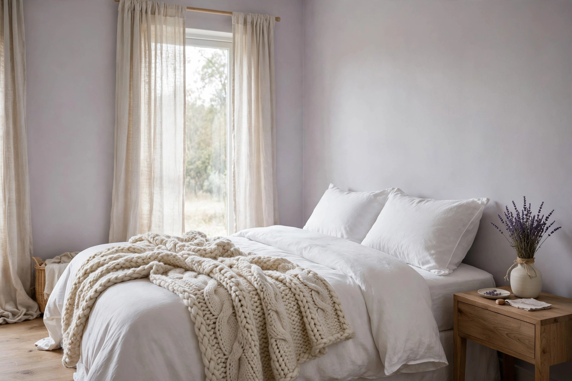
27. Lavender Gray + White
Lavender gray — barely-there purple with a gray base — with white is serene with a whisper of romance. It’s the most restful of the purple family because the gray mutes any sweetness. Paint walls lavender gray ($40–$55 per gallon), dress the bed in white, and add texture through a chunky knit throw ($35–$65) and linen curtains. Real or faux lavender bundles ($10–$20) on the nightstand tie the color story together and add a calming scent association for sleep. Pro tip: lavender gray is notoriously hard to photograph accurately — if you’re choosing from online swatches, order physical samples; screens shift purple tones more than any other color family.
28. Mauve + Cream
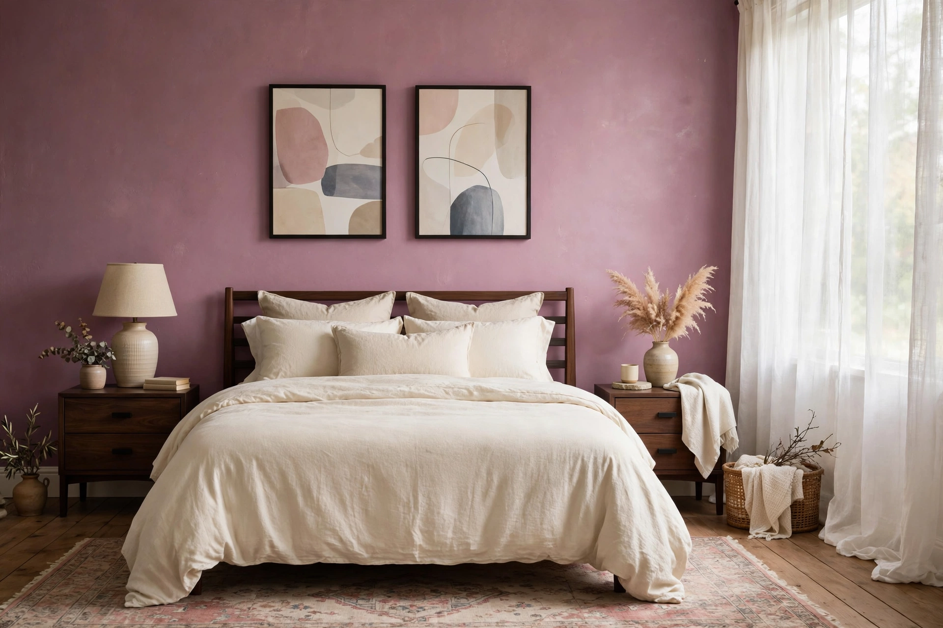
Mauve — the dusty pink-purple of vintage roses — with cream is nostalgic warmth without the granny associations, provided you keep the shapes modern. Mauve walls ($45–$60 per gallon) or a mauve upholstered bed, cream bedding, clean-lined modern nightstands, and a single piece of contemporary art keep it current. The palette loves soft, diffused light: linen shades, frosted bulbs, sheer curtains. It’s unexpectedly good in small bedrooms because mauve’s warmth makes tight quarters feel intentional and cozy rather than cramped. Pro tip: keep mauve away from orange-toned woods — the clash of pink-purple with orangey oak is jarring; pair it with walnut, black, white, or painted furniture instead.
29. Burgundy + Blush
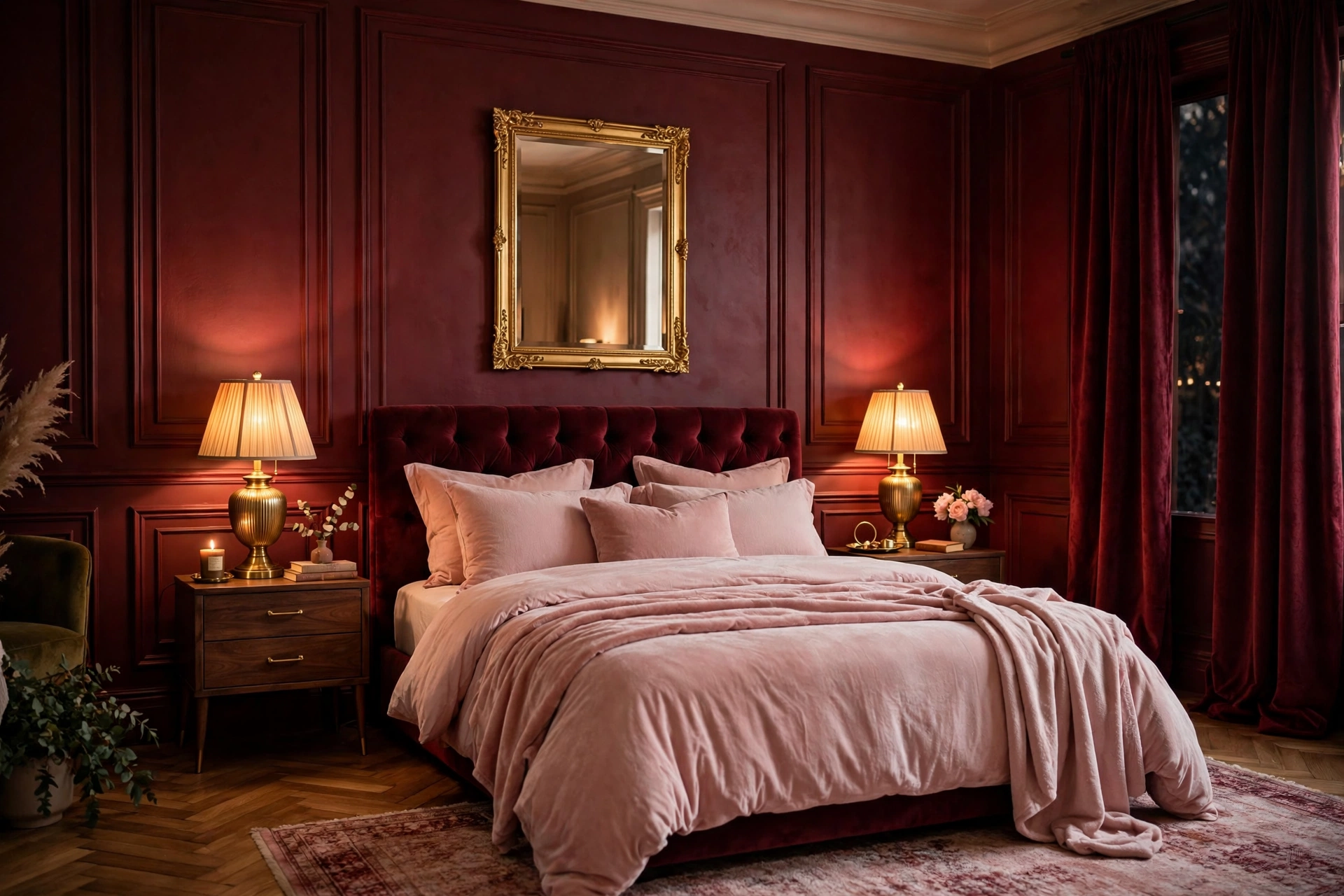
Burgundy with blush is pink’s dramatic older sister — rich wine tones grounded by soft pink lightness. Use burgundy boldly but sparingly: a burgundy accent wall ($45–$60 per gallon), burgundy velvet curtains ($60–$120 per panel), or a burgundy upholstered headboard against blush walls and bedding. The blush keeps the burgundy from feeling heavy, and the burgundy keeps the blush from feeling saccharine. Gold accents — a gold mirror, brass lamps — make the combination feel truly luxurious. Pro tip: burgundy is one of the hardest colors to touch up — walls in deep red tones show every patch; buy an extra quart at painting time and store it for future scuff repairs.
30. Periwinkle + Gray
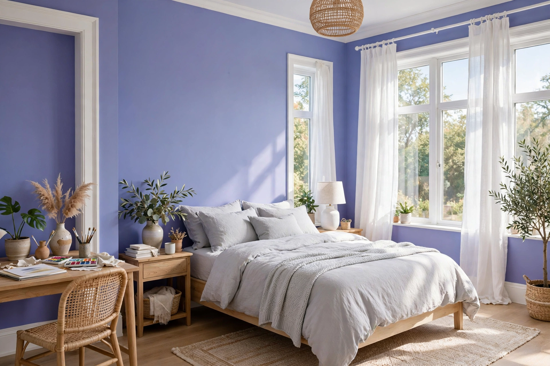
Periwinkle — the blue-violet of spring flowers — with gray is fresh, dreamy, and a little bit unexpected. It’s lighter and more playful than navy, more interesting than plain blue. Paint walls a soft periwinkle ($40–$55 per gallon) or use it in bedding against light gray walls. White trim and bedding keep it crisp; the gray grounds the sweetness. This palette suits creative personalities and guest bedrooms especially well — it’s cheerful without being loud, distinctive without demanding commitment. For budget-friendly ways to test it, start with periwinkle bedding and curtains before touching a paintbrush. Pro tip: periwinkle shifts dramatically between warm and cool light — check it under your actual bedroom bulbs at night, because the evening version is the one you’ll live with most.
Bold & Dramatic
31. Charcoal + Mustard
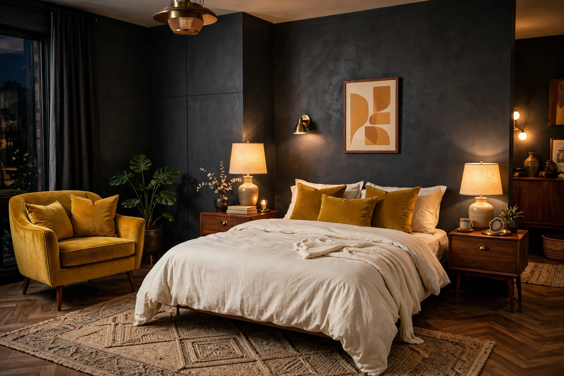
Charcoal walls with mustard yellow accents is mid-century drama at its finest — the dark envelope makes the golden accents glow like lamplight. Paint walls charcoal ($50–$65 per gallon) and bring mustard through a velvet armchair ($180–$350), mustard throw pillows ($20–$35 each), or bold mustard curtains. White or cream bedding provides the essential light contrast so the bed stands out against the dark. Walnut wood furniture ties the retro story together. This is a high-impact palette that makes a bedroom feel like a deliberate design statement. Pro tip: charcoal absorbs an enormous amount of light — plan for 3–4 light sources minimum, and choose bulbs at 2700K; anything cooler will make the charcoal look flat gray instead of rich and deep.
32. Chocolate Brown + Camel
Chocolate brown with camel is tonal richness — two browns, one deep and one light, creating a layered monochrome that feels incredibly sophisticated. Chocolate walls ($50–$65 per gallon) or a chocolate upholstered headboard ($200–$450), camel bedding and throws ($60–$120), cream sheets for contrast. The palette is warm, enveloping, and gender-neutral — it suits anyone who finds gray too cold and beige too bland. Brass or amber glass accents add glints of light. Pro tip: brown-on-brown needs texture contrast to avoid looking muddy — pair smooth sateen sheets with a nubby wool throw, sleek leather with woven baskets; the texture differences define the layers that color alone can’t.
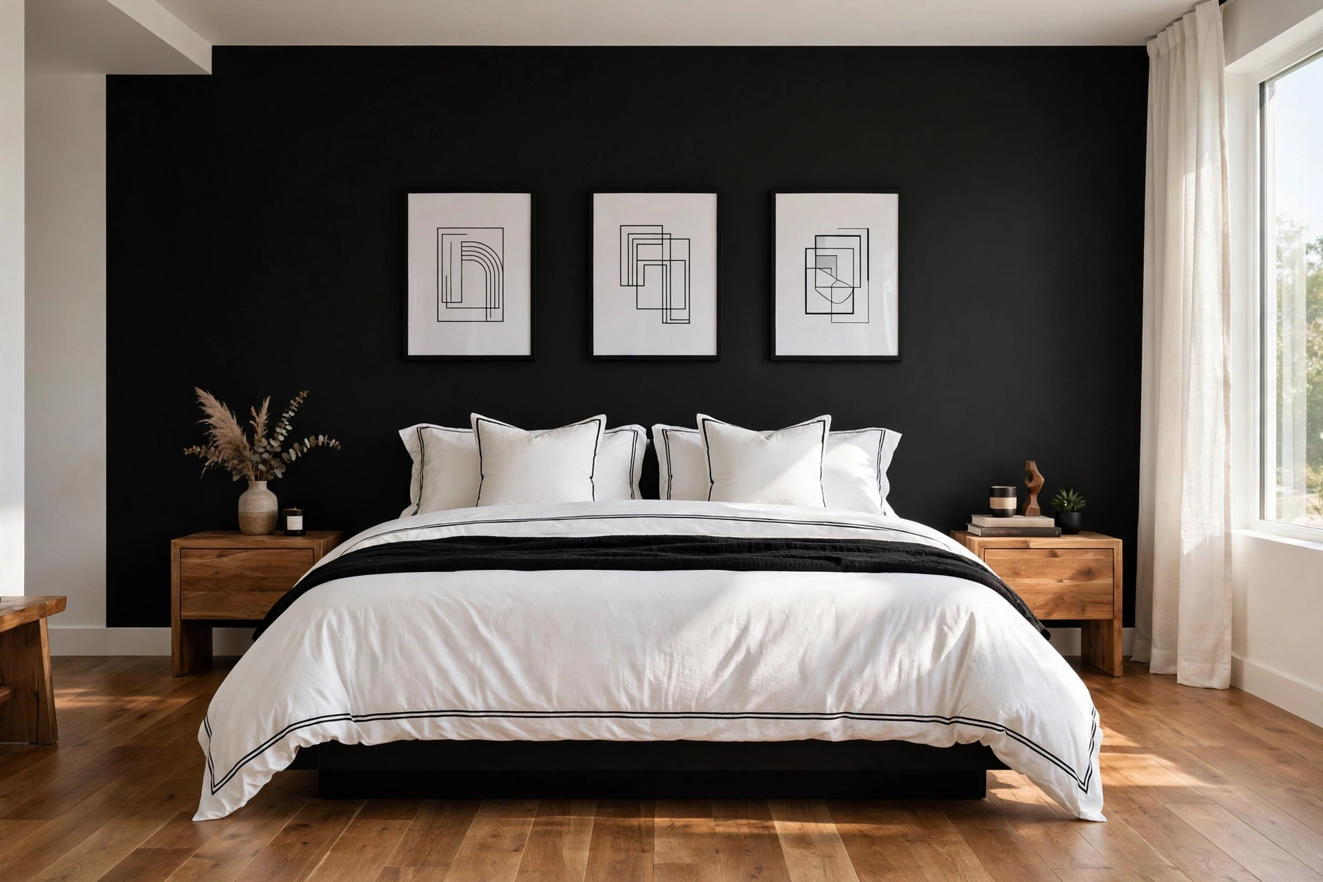
33. Black + White + Wood
Black, white, and natural wood is the graphic, high-contrast palette that never goes out of style — bold, clean, and endlessly adaptable. A black accent wall behind the bed ($45–$60 per gallon), white bedding with black piping or trim ($70–$120), and warm wood floors or furniture to soften the contrast. The wood is essential: without it, black-and-white can feel stark; with it, the room feels curated and warm. This palette is a dream for art lovers because the neutral backdrop makes every frame pop. Pro tip: in a black-and-white room, the “white” you choose matters — a warm white softens the contrast beautifully, while a blue-white makes the black look harsher; test both against your wood tones.
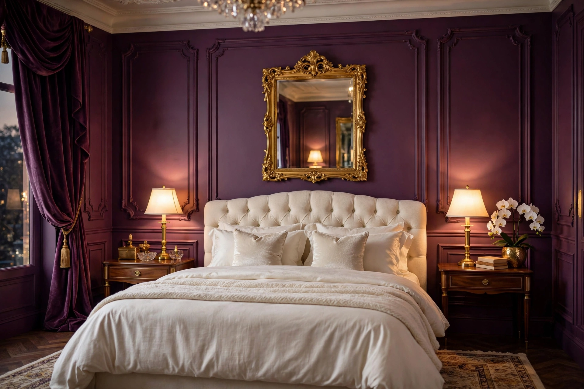
34. Plum + Gold
Plum with gold is regal without being stuffy — deep purple richness lit by metallic warmth. Plum walls ($50–$65 per gallon) create an enveloping, cocoon-like sleep space; gold appears in mirrors, lamp bases, curtain rods, and frame details ($30–$100 per accent). Ivory or champagne bedding keeps the combination luminous rather than heavy. This palette has old-Hollywood glamour energy and suits bedrooms with a touch of formality — think upholstered headboard, mirrored nightstands, a chandelier or statement pendant. Pro tip: plum can read almost black in low light, which is part of its magic — but make sure your closet and vanity areas have dedicated task lighting, because getting dressed in near-darkness gets old fast.
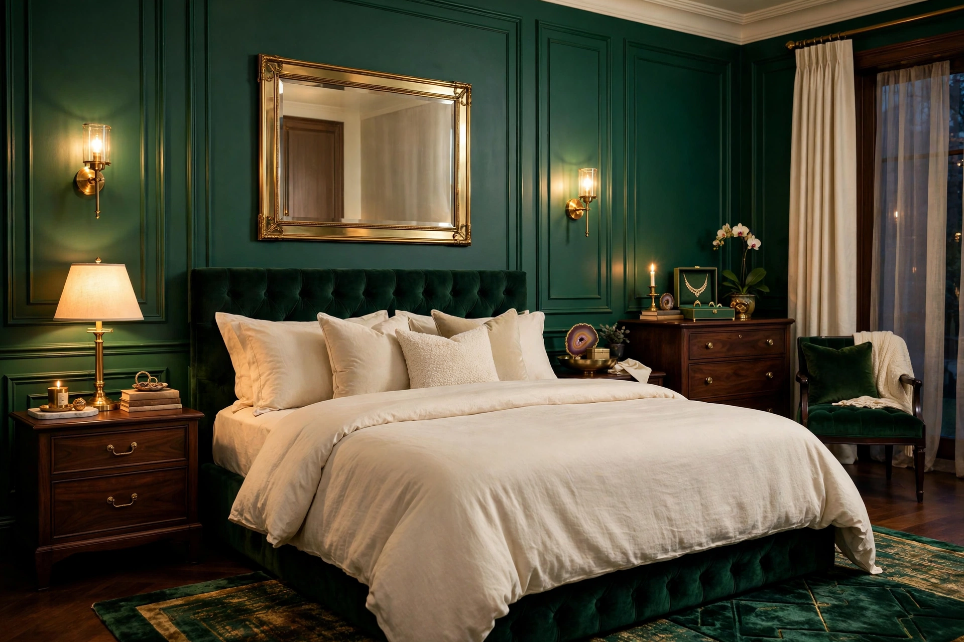
35. Emerald + Brass
Emerald green with brass is jewel-box luxury — rich, vibrant, and full of life even in a dark room. Emerald walls ($50–$65 per gallon) make perhaps the boldest statement on this list, but the payoff is a bedroom that feels like a private members’ club: intimate, glamorous, unforgettable. Brass fixtures, white or cream bedding, and dark wood furniture complete it. If full emerald walls feel like too much, try emerald velvet curtains ($70–$130 per panel) or an emerald headboard against warm white walls. Pro tip: emerald green is the most light-hungry color here — it needs generous natural light or excellent artificial lighting to show its true jewel tone; in a dim room it can collapse into near-black, so light it like you mean it.
36. Cranberry + Beige
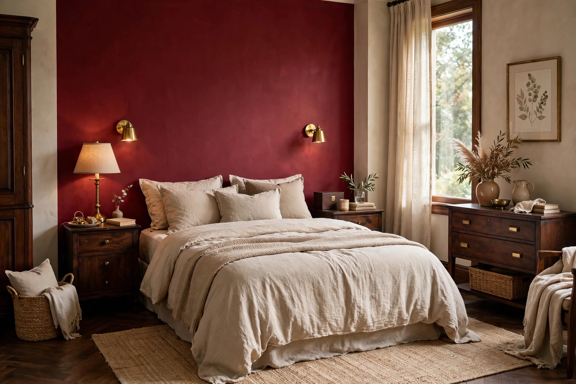
Cranberry with beige is festive warmth tamed into everyday elegance — the deep red-berry tone brings energy and richness while beige keeps it grounded and livable. Use cranberry in bedding, curtains, or an accent wall ($45–$60 per gallon); beige walls and natural textures do the rest. It’s a wonderful palette for fall and winter, but with the right balance it works year-round — the beige prevents the red from feeling seasonal. Dark wood furniture and brass accents complete the warm, collected look. Pro tip: cranberry is a strong color that can dominate small rooms — in a compact bedroom, limit it to textiles and one accent wall max, letting beige own the majority of the visual field.
Frequently Asked Questions
What is the most relaxing color for a bedroom?
Soft blues, sage greens, and warm neutrals consistently rank as the most relaxing bedroom colors in design research — they lower heart rate and feel naturally calm. That said, the “most relaxing” color is personal: if deep charcoal makes you feel cocooned and safe, it will relax you more than a pale blue that leaves you cold. The palettes in this guide span the full range so you can match color to your own nervous system, not just a trend.
Should bedroom walls be light or dark?
Both work — it depends on your room and your relationship with darkness. Light walls make small or dim bedrooms feel larger and brighter, and they’re more forgiving for renters. Dark walls (navy, forest, charcoal, chocolate) create an enveloping, intimate feel that many people find deeply restful, and they make a bedroom feel intentionally designed. If you’re unsure, try a dark accent wall behind the bed first: you get the cocoon effect where it matters most, with light walls keeping the room airy.
How do I choose a bedroom color palette that goes with my furniture?
Start with what you can’t easily change: the wood tone of your bed and dresser, the floor color, any fixed elements. Warm woods (oak, pine, cherry) pair best with warm palettes — creams, terracottas, olives, warm grays. Cool or dark woods (walnut, espresso, black) suit both warm and cool palettes but shine with blues, charcoals, and jewel tones. Then pick a wall color that flatters that wood, and choose bedding one to two shades lighter or darker than the walls for depth.
Can I use bold colors in a small bedroom?
Absolutely — small bedrooms can handle bold color beautifully; the key is commitment and lighting. A small room painted entirely in one rich color (navy, forest green, terracotta) feels intentional and cocooning, while a small room with one timid accent wall can feel unfinished. The real requirement is light: bold colors absorb light, so add layered lighting — bedside lamps, a floor lamp, maybe wall sconces — to keep the drama glowing instead of gloomy.
What colors make a bedroom look bigger?
Light, cool-leaning colors visually recede and make walls feel farther away: pale blues, soft greens, light grays, and warm whites all expand a room. Monochromatic schemes (walls, bedding, and curtains in close tones) also enlarge because the eye flows uninterrupted. But don’t rule out dark colors entirely — a dark accent wall at the far end of a long narrow bedroom can actually make the room feel wider by drawing the eye forward.
How many colors should a bedroom palette have?
Three to four is the sweet spot: a dominant wall color (60%), a secondary color in bedding and large textiles (30%), and one or two accents in decor, lighting, and small accessories (10%). Every palette in this guide follows that structure. More than four or five distinct colors in a bedroom tends to feel busy rather than restful — the bedroom is the one room where restraint pays the biggest dividends.
Final Thoughts
The perfect bedroom color palette isn’t the trendiest one — it’s the one that makes your shoulders drop the moment you walk in. Whether that’s the sunlit calm of warm white and oak, the enveloping drama of forest green and brass, or the quiet romance of blush and gray, trust your gut response to these 36 palettes. The one you keep coming back to is the one.
And remember: paint is the cheapest transformation in all of interior design. A $50 gallon and a free weekend can completely rewrite how your bedroom feels — no new furniture required. Start with the palette that speaks to you, test it in your actual light, and give yourself permission to love the result. Sweet dreams start with color.

One Comment